Ad of the Week: Chicken Licken transcends language and culture

by Oresti Patricios (@orestaki) Joe Public United and director Alan Irvin of They Shoot Films continue with fast-food brand Chicken Licken‘s tradition for quirky commercials that are big on story. This time it’s a fantastical tale about a boy who just can’t seem to make himself understood by the people who love him most.

The fast-food chicken business is a tough sector to advertise in. So much of the work is funny; so many of the commercials are really good — which means that creative directors must feel a bit of pressure when new campaigns are briefed in. But Joe Public seems to be taking the heat in its stride because it keeps on producing sterling work for Chicken Licken, its client since July 2016.

Having taken the brand to space for the Hotwings product promotion and then to Egypt for some soul-searching, Joe Public has set its sights on a location almost as remote: Iceland. The result is a story that is both quirky and strange, and all the more funny for its straight-faced delivery.


Pinterest icon View all the Ads of the Week at a glance on our #AdoftheWeek Pinterest board!
YouTube icon Watch our 2017 #AdoftheWeek playlist on YouTube


“Icelandic Boy” takes the form of a beautifully crafted actuality film that explores an invented mythology. It tells the story of a young boy, Björgvin Rafnkellson, born in Vík í Mýrdal, a small seafront village in Iceland. We learn that this desolate place is known for its black beach and interesting rock formations, as well as that it’s built adjacent to a glacier that covers an inactive volcano.

Shot documentary style, with various ‘interviewees’ telling the story, young Björgvin’s family talks about how he started acting strangely and ‘speaking some weird language.’ The camera reveals Björgvin playing barefoot with his mates, who are all dressed up warmly. In a scene where his mother calls him for supper in Icelandic, Björgvin replies, “Ek kom, Ma!” which elicits puzzled expressions from his family who cannot understand a word he’s saying.

In a scene with a doctor, Björgvin identifies a picture of a banana as “piesang” and, when playing soccer, he lines up to take a penalty kick which sails over the crossbar.

In another scene, he’s built a braai and is cooking boerewors using a pair of snowshoes as a griddle.

Björgvin’s mother explains that the doctor believes that he has “memories from a previous life”. His sister comments: “He said that he has some condition, but I think he’s just weird.”

Everyone is quite typically Nordic in demeanor: pragmatic and taciturn. The little boy’s strange mannerisms are seen as something to be endured with stoicism and patience.

“And in the end,” the doctor says, “You will not be able to communicate with him anymore.”

Joe Public United and They Shoot Films for Chicken Licken - Icelandic Boy screengrab 03But, one day, there is a knock on the door. A stranger enters, bearing a Chicken Licken meal. It’s a new burger, dubbed “The Double Chik’n Boerie Burger”. Björgvin starts talking. The stranger responds. At last, the young Nordic boy has found someone who speaks the same language as him! The stranger is speaking isiZulu, and it appears that, with just one bite of Chicken Licken’s best, the youngster has a tongue for that language, too.

The premise of this story is fantastical but incredibly endearing. Imagine if all it took were the bite of a burger to appreciate another person’s culture and language. Imagine what worlds would open up to us if we could suddenly start speaking Afrikaans, isiZulu or isiXhosa.

Language and culture open up worlds and minds which is, in part, why I find this commercial so powerful. It works on so very many levels and is way more than just a laugh.

The commercial ends with the slogan, “For those truly South African at heart”, and this drives home the message that Chicken Licken is a South African brand with a connection to people that goes beyond mere borders. It’s national pride.

The filming took place in Iceland, according to publicity material from Joe Public, and this lends a tremendous amount of authenticity to the mock-documentary style of the ad. The cold and desolate village is captured extremely well, the filming accentuated by using a blue-grey look that only becomes warm when the Chicken Licken meal arrives.

It is such a beautiful, hopeful, wonderful story that is shot in the best cinematic tradition. The film work is very reminiscent of an award-winning Icelandic film I recently saw called Hrútar (“Rams”). If you haven’t seen this movie, I’d strongly suggest you do. But back to the ad. The performances are all very sensitively directed. The Icelandic people are ‘real’ people, and their interactions with the camera seem genuine; the slight stammers and accents also add an air of authenticity.

Congrats to Joe Public United and Chicken Licken; you’ve done it again!

Credits

Brand: Chicken Licken
Client: Chantal Sombonos van Tonder
Group chief creative officer: Pepe Marais
Agency: Joe Public United (ATL & Digital)
Chief creative officer: Xolisa Dyeshana
Creative group head: Natalie Walker
Senior copywriter: Marjolein Rossouw
Group account director: Amber Mackeurtan
Agency TV producer: Yash Raidu
Production company: They Shoot Films
Director: Alan Irvin
Director of photography: Adam Bentel
Executive producer: Darren Gordon
Production company (Reykjavik): Truenorth Productions
Post-production: Left Post Production
Editor: Saki Bergh
Colourist: Craig Simonetti
Online operator: Keno Naidoo
Audio: Lorens Persson, Sterling Sound


Oresti PatriciosAd of the Week, published on MarkLives every Wednesday, is penned by Oresti Patricios (@orestaki), the CEO of Ornico, a Brand Intelligence® firm that focuses on media, reputation and brand research. If you are involved in making advertising that is smart, funny and/or engaging, please let Oresti know about it at clientservice@ornicogroup.co.za.

Sign up now for the MarkLives email newsletter every Monday and Thursday, now including headlines from the Ramify.biz company newsroom service!

Shelf Life: Joburg Philharmonic Orchestra strikes new note

Cheryl Hunter (shelflife at marklives.com)’s weekly pick of all things new — product, packaging, design, insight, food, décor and more!

  • Brand Union brings JPO logo alive
  • Woolies launches summer campaign
  • Jack Daniels launches on DStv

Bringing movement to music

When Brand Union was commissioned to create a new logo for the Johannesburg Philharmonic Orchestra (JPO), the brief included capturing the energy of Johannesburg city and visually distinguishing the JPO from other orchestras. This has resulted in a striking image that captures the movement of the orchestra itself.

Johannesburg Philharmonic Orchestra new logo 2017The JPO had experienced financial difficulties over the last several years and had successfully come out of business rescue, appointing Bongani Tembe as chief executive and artistic director. This has resulted in a revitalised vision, and a board of directors comprising credible business and community leaders and led by Justice Dikgang Moseneke. According to Tembe, the JPO aspires to be internationally recognised for its artistic excellence, innovation, education initiatives and community engagement programmes: “Our vision is based on the affirmation of the value and transformative power of music to inspire and build connections among Johannesburg’s diverse population, thereby contributing to nation-building.”

The brief then, was to reestablish the JPO as a credible cultural force that is relevant to a wider, younger and more diverse South African audience, and to balance cultural excellence and sophistication with modernity and vibrancy. The new look had to create a sense of place clearly of and for the city, capture the energy of Johannesburg, and visually distinguish the JPO from other leading orchestras.

Says Tembe, “Johannesburg has its own distinctive rhythm — a natural beat and energy. The new logo is an extension of this through the dynamic interpretation of the Nelson Mandela Bridge, which is synonymous with the city.”

Explains Mathew Weiss, MD of Brand Union Africa, “Our team chose the bridge as the heart of the new logo, because it is an iconic Johannesburg landmark, but also because a bridge is a metaphor for connections. In a city too often known for its divisions, music is something that brings us together. This is an inspiring and unique story for an orchestra to tell.”

Its visual hooks are the strings and the movement of a conductor’s hand in leading the orchestra. With its gold and black touch, the new JPO logo conveys a message of dynamic energy and confidence — themes that are synonymous with the City of Gold (eGoli).

The logo defines the marriage of art, music and a city that carries pride.

brandunion.comFacebookTwitter
jpo.co.zaFacebookTwitter


Woolies wellness

Woolies has launched a multi-channel marketing campaign to support its summer food range, focused on living and eating well and with a strong underlying message that good health is about people, communities, animals and the planet.

Its internal agency and brand team has designed the campaign to meet the target audience where they’re at: content has been strategically crafted for Facebook, Twitter, Instagram and YouTube, as well as various media channels, radio and TV.

Insights around consumer behaviour have been used to create the #startswith challenge, a Facebook event designed to motivate and support all participants. The challenge invites people to take part in a seven-week balanced living challenge, driven by their own personal goals.

Four women who represent true South African bodies and lifestyles — body positivity activist Thick Leeyonce; momtrepreneur Elana Afrika-Bredenkamp; fitness fan and lawyer Tracey-Lee Lusty; and chef and blogger Luyanda Mafanya — provide the motivation.

Says Glenda Philp, Woolworths head of brand for foods, “Our customer-led campaign invites the audience straight in. We’ve seen incredible uptake in responses and robust engagement, which has resulted in a motivated community of Woolies challengers being born.”

A series of TVCs showcasing a world of wellbeing, plus in-store visuals and messaging, are intended to add value to the social campaigns.

Fred Benistant, Woolworths head of creative, explains, “The agency also ensured that Woolies brings authority in further content pieces which feature trusted food suppliers unpacking their responsible farming and fishing practices. The intent behind the campaign was to motivate a nation. It’s a call to action to live a better, healthier life.”

woolworths.co.zaFacebookTwitter


Finding the gentleman in Jack

Jack Daniels’ new TVC for Gentleman Jack, which began airing on DStv channels yesterday, Monday, 9 October 2017, is reminiscent of a Vanity Fair photo shoot, featuring actual Jack Daniel’s distillery employees dressed in sophisticated formal wear and striking glamourous poses.

Gentleman Jack

The ads are meant to demonstrate the special ingredients that make a Jack Daniel’s Tennessee Whiskey — the pride and craftmanship of the people of Lynchburg, Tennessee.

Introducing viewers to a series of employees, beginning with foreman, Chris Grizzard Junior, who has worked at the distillery for 13 years alongside his father, Chris Grizzard Senior, who has been at the distillery for 44 years, the ad uses the Grizzard family to represent the smooth transition from Jack Daniel’s Tennessee Whiskey to the double mellowed Gentleman Jack. Chris Junior’s love for family is highlighted. Meticulously dressed alongside his father, they share a generational moment that characterises the overall hard work and care they together invest into crafting Gentleman Jack.

The idea is for consumers to take away the true friendliness of the people at the distillery when they see the personalities and pride that go into the making of the whiskey.

The campaign, created by Arnold Worldwide, presents a town where honest, authentic living and family values are a priority, and places this as synonymous with the making of Gentleman Jack.

jackdaniels.comFacebookTwitter
arn.comFacebookTwitter


Cheryl HunterShelf Life is MarkLives.com’s weekly column covering all things new. Notify us of yours at shelflife at marklives dot com. Want to sponsor Shelf Life? Contact us here.

Cheryl Hunter (@cherylhunter) has written for the South African media, marketing and advertising industries for more than 15 years. A former editor of M&M in Independent Newspapers and contributor to Bizcommunity, AdFocus, AdReview and the Ad Annual, she has also produced for various television networks and currently consults on communication strategy and media liaison.

Sign up now for the MarkLives email newsletter every Monday and Thursday, now including headlines from the Ramify.biz company newsroom service!

Post Truth: Functional truth in marketing

by Marguerite de Villiers. In a post-truth era, a time where intuition trumps intellectualism, consumers are looking to connect with products that they can relate to — something that resonates with them. It’s time to transcend the boundaries of consumer and product truths, and look for those universal motivators behind consumer behaviour: the human truth.

The truth is…

A product truth is often a message communicated about, well, the product: what it is and what it does. It’s intended to assist consumers in forming or altering their perspective and opinion of a product or brand. A human truth goes beyond the product and category; it explores the socio-cultural world of the consumer to try and understand what motivates their behaviours and perceptions of products and brands.

Inspired by growing interest globally in genetics, heritage, and lineage, Marmite in the UK recently released a “Marmite Gene Project” advert. This shows a series of scenarios in which different families receive the results of a Marmite test, which determines whether they were born loving or hating Marmite.

As a product, Marmite knows that it is either appreciated or despised for its distinctive taste. As a brand, it has often drawn on this, its very own human truth. It so cleverly resonates with both lovers and haters of the product that it becomes irrelevant, whether or not you like it. The brand and its communications connect more strongly with something that goes beyond personal taste.

https://youtu.be/AjivUDIawLI

Alternatively, if the product or brand doesn’t speak to a universal human truth, there’s the option of applying culturally relevant research and communication methods. Ethnographer and researcher, Anya Evans, used Tinder as a methodological tool to reach people who were difficult to connect with. Applying the principals of Tinder (namely, the way it operates by gathering data about individuals, and connecting those individuals with people in search of specific criteria), Evans was able to navigate through the restricted field (Occupied Palestinian West Bank) and interact with the people within it.

Imagine the possibilities for market researchers and advertisers looking to communicate with hard-to-reach consumers by simply using the technology that people are already using.

IKEA catalogue 2017Why be limited to human truth and cultural method; why not use both? IKEA is on a mission to “put people first”. In an extensive ethnographic study, IKEA sent researchers on home visits around the world to better understand what “domestic bliss” looks like culturally and geographically. This hasn’t only informed its product innovation; it’s given it them a clearer idea of who its consumers are.

We all have basic needs, desires, and preferences that manifest in different ways. It’s up to the marketer to uncover these human truths; it’s the task of the advertiser to effectively communicate them; and it’s the brand’s mission to connect with a human truth.


Marguerite de VilliersMarguerite de Villiers is an anthropologist at strategic marketing consultancy, Added Value. “Post Truth”, her new regular column on MarkLives, addresses marketing in the post-truth era.

Sign up now for the MarkLives email newsletter every Monday and Thursday, now including headlines from the Ramify.biz company newsroom service!

Media Future: Apple is great, but no ecosystem

by Arthur Goldstuck (@art2gee) One of the most-common myths of pairing smartphone and computer choices is the idea of needing to buy into an ecosystem. Here I explain the fallacy.

You hear it most commonly from iPhone users: “All my gadgets are from Apple, because they are all compatible and work together so seamlessly.” Usually, they are referring to the combination of iPhone, iPad and MacBook. Usually, they are delighted with their choice of ecosystem, as there are few brands that produce as consistently excellent products as Apple does across all categories. And, because of this delight, usually they also fall completely for the marketing hype about the ecosystem.

The reality is that there is almost no difference in the ecosystem experience of an iPhone user or Android phone user who also uses a MacBook, whether an Air, Pro or plain vanilla version of the iconic notebook.

Battery life

Full disclosure: I’ve been an enthusiastic MacBook Air user for at least the past six years. It is the ultimate machine for long trips, ultra-portability and instant access: it is so thin and light, has amazing battery life, and goes instantly from sleep to work mode merely by opening the lid. The significance of the battery life is that I have never been on an international flight where I have run out of power. Even on the longest single-leg flights from South Africa, which would be up to about 16 hours, I would be sleeping or have the device packed away during meal times more than half the time, meaning that I can work on the machine for the entire rest of the flight. This is a massive benefit in countering the loss of productivity that results from international travel.

Even taking aircraft out of the equation, one often finds that local events such as conferences aren’t planned with notebook computers in mind, and one can often go a full day without access to a power point. The MacBook Air is the only device that has allowed me to remain connected and fully productive throughout such events.

But the magic of the device doesn’t extend to the ecosystem within which it functions. Its operating system, the Mac OS, is so ancient, it’s still resting on the laurels of the 2001 launch of Mac OS X. What was described back then as a “radical departure” is now an old revolutionary pulling the wool over the eyes of acolytes with its fading activist credentials. The acolytes are caught up in a reality distortion field similar to the trance into which Steve Jobs was able to place anyone trying to argue with him about Apple products — or almost any other issue. Reality, for them, is less important than their perception of reality.

Perception

That perception is fuelled by the iPhone and iPad indeed being deeply integrated, completely symbiotic and compatible to the extent that the very same app version may sometimes be used on both. Working on one device allows seamless transition, in the same app, to the other. The experience of the iOS operating system is almost identical on the two.

Like that seamless transition, perception also makes a seamless transition across to the MacBook, which is believed by many to integrate equally tightly with the iPhone. The reality is that it’s an entirely different operating system, one that is a decade overdue for an overhaul, and one that requires workarounds for true compatibility. Just as it does with Android devices. Yes, Apple’s iCloud for backup and syncing is seamlessly accessible on all three categories of product. But then so is Microsoft’s OneDrive and Google Drive. Apple’s horrible Mail client can sync across all three, but then so does Google’s more-evolved Gmail.

Here’s the real dirty secret of device ecosystems: the mortal enemies, Microsoft and Google, have better software ecosystems than Apple and, aside from their operating systems, are almost totally device-independent. This means that the Microsoft Office suite, as well as its OneDrive cloud service, may be experienced with almost full functionality on any Apple, Android or Windows machine. Apple’s productivity suite may only be used on Apple devices — or via a web browser, meaning it is a limited experience.

Messaging apps

The last shot from Apple fans is usually that the FaceTime and Messages video, voice and chat apps are also compatible across all three categories of device. This is one area where Android and Windows cannot compete, as the apps aren’t available on other platforms.

But that is equally a negative: it means that users of those apps are locked out of the rest of the device universe. Users of WhatsApp, Skype and other non-denominational chat apps, however, may find kindred souls on any mobile device.

It’s not that it’s a mistake to stick to the Apple family of products. Mostly, the experience will only be good. But the bottom line is that you don’t have to be locked into Apple to have a satisfying device family life.


Arthur GoldstuckArthur Goldstuck (@art2gee) heads up World Wide Worx and is editor-in-chief of Gadget, a personal technology magazine. He is a consulting editor to MarkLives.com and our media tech columnist. This article has been republished from Gadget.

Sign up now for the MarkLives email newsletter every Monday and Thursday, now including headlines from the Ramify.biz company newsroom service!

BREAKING: Alistair Mokoena to lead Ogilvy South Africa

by MarkLives (@marklives) Ogilvy South Africa has announced the appointment of Alistair Mokoena as its new chief executive officer, with immediate effect. Abey Mokgwatsane left as its CEO at the end of September 2017 to join Vodacom as its new managing executive for brand and communications.

Mokoena’s career includes experience at blue chip brands such as SAB, Unilever, Tiger Brands and Mondelez. He joined Ogilvy Johannesburg as MD in 2014 from FCB Johannesburg. He is a lawyer by training and has both MBA and chartered marketing qualifications.

Comments Moss Mashishi, Ogilvy South Africa chairman, “Alistair brings a deep passion for client-centricity and he has led Ogilvy Joburg during one of its most creatively prolific periods. He has proved his ability to engage with senior marketers [and] has shown himself to be a skilled brand builder.”

Sign up now for the MarkLives email newsletter every Monday and Thursday, now including headlines from the Ramify.biz company newsroom service!

Marketers needs to learn Luis von Ahn’s language

by Herman Manson (@marklives) Luis von Ahn (@LuisvonAhn) is an associate professor in the Computer Science Department at Carnegie Mellon University. He is also a well-known tech entrepreneur and a disruptor; certainly, the tech and ‘new’ business press (what’s left of it) has put his name on so many lists that you could make listicles just of that (including “Brilliant Scientist”, “Young Innovator”, “Most Influential”, “Most Creative” — you get the drift). But let’s put substance before the bullshit. Von Ahn just feels like that kinda guy human; at least he did when I saw him in action as a speaker at the 2017 Design Indaba held earlier this year.

In MarkLives’ coverage of the amazing talk given by Ayse Birsel, author of Design the Life You Love: A Step-by-Step Guide to Building a Meaningful Future, we noted how design thinking may sound simple but is actually pretty profound and complex. Von Ahn’s design thinking feels similar, in spite of the mind-boggling math that probably goes into coding his solutions.

Luis von Ahn
Luis von Ahn

CAPTCHA and reCAPTCHA

He was involved in the development of CAPTCHA, the Completely Automated Public Turing test to tell Computers and Humans Apart, which helps websites filter bots from humans on everything from comment sections to contact forms. Noting that tens of millions of people are typing text into the CAPTCHA system a team, which included Von Ahn, thought, ‘Well, why not use those millions of key strokes to add value beyond telling humans from spam bots?’ Enter reCAPTCHA: basically CAPTCHA but now tweaked to digitise and translate millions of books. Von Ahn says 200m CAPTCHAs display every day, which digitise 100m words a year. This, in turn. translates into 2m books being digitised very year.

His team has taken something that works and has added value; has imagined additional functionality and has made it do more, better. How would your business look and change if you applied the same principle? For example, Vodacom and MTN still compete with one another in ripping off consumers when WhatsApp has emerged as the real threat to their voice services. It makes data do more and better; there’s one way to trump that and it doesn’t feature full-page newspaper ads. Just putting that out there.

Today, Von Ahn’s focus has shifted his attention to Duolingo, a free language-learning platform.

Gamifying language learning

Around 1.2bn people across the world are busy learning another language, mostly English. Immigrants, travellers, young professionals  — the range is broad and the exercise expensive and time-consuming. Since its launch, 150m of these learners have started using Duolingo to learn a new language using game-like experiences over the website or app.

According to Von Ahn, 34 hours of language training on the site equals a semester course at college. Take your pick from Catalan, Czech, Danish, Dutch, English, Esperanto, French, German, Greek, Hungarian, Irish, Italian, Japanese, Norwegian, Polish, Portuguese, Russian, Spanish, Swedish, Swahili, Turkish, Ukrainian, Vietnamese or Welsh. A host of other language courses are under development, including Russian, Korean, Indonesian, Hindi and even Klingon. Zulu will be on its way soon, he says.

Duolingo uses its extensive database to learn how people learn, and to apply that knowledge to enhance its course material. As your new language skills progress, more units gets unblocked. It keeps people engaged and, through continued experimentation, the service keeps on improving the learning experience. More than 6bn exercises are completed every month.

Transformative

The Duolingo English Test provides scientifically proven language certification to learners (at a cost of US$49). Duolingo for Schools, meanwhile, offers Duolingo adapted for groups of students and their educators (the app should be zero-rated by data providers, frankly).

The service is potentially transformative and certainly disrupts the language-education industry. It’s a great case study in how gamification can go beyond gimmicks to actually produce meaningful results. How might this be applied to corporate training,and who will do it first?


Herman Manson 2017Herman Manson (@marklives) is the founder and editor of MarkLives.com.

Sign up now for the MarkLives email newsletter every Monday and Thursday, now including headlines from the Ramify.biz company newsroom service!

Eyeballs & ideas — marketing in a digital age

by Gau Narayanan. If a tree falls, and no one hears it, does it make a noise? This is my go-to analogy when we talk about ideas in this era of marketing in a digital age. Why do we think that brands need to pay for eyeballs when they appear on the large screen in our living room, yet assume that these same eyeballs come free on the small screen in our pockets? Nothing goes viral, unless you’re Psy, a skateboarding cat or something (more sinister) that the internet was made for.

As always, you need great content but, equally importantly, you also need to think about distribution. Given the sheer volume of content that is consumed and given most of it will be dreadful, great content is critical; however, it’s not enough. You need to think about the distribution of the content at the same time you conceive the idea. This difference requires a mindset change in creative and in media agencies. It requires creatives to let media in and for media planners to understand the creative process. Platforms, namely Facebook and Google, have stolen a march, with teams of creatives, media strategists and data people. Agencies, take note: the frenemy is assembling.

Five tips

If you accept the above, the rest of this column is a practical look at how to go about campaign-planning, distribution and idea-generation. Below I outline five tips that may be helpful.

  1. TV versus AV?

Let’s start with the media issue. It’s not either or, but both and. Some refer to is as TV+, others call it reach+, but the principle is simple:

  • make sure you drive the right reach in terms of your story telling at scale;
  • relevant reach in terms of how you amplify and deepen this story across platforms at a more-targeted, contextual and programmatic level;
  • and responsive reach in terms of encouraging people to take action.

The debate of TV vs online AV should be behind us. I imagine this stems from agency remuneration and fighting over clients budgets, and isn’t helpful. It’s better to look at it all as AV because that’s how our audiences look at our stories — they don’t distinguish between content on TV, a pre-roll on YouTube or an Insta-story.

  1. The emergence of communications planning

With the importance of media and creative collaboration, there is a new competency emerging in creative agencies. Strategic planning (or brand planning) is about getting a relevant and resonant message that will persuade; communications planning (comms planning) is about getting to the mechanics, operations and tactics of a campaign to get that right message in front of your audience (Julian Coles and Larissa Hayden offer helpful explanations).

Comms planning aims to close the gap between idea and distribution, audience and touchpoints, message and medium. Another reason comms planning exists in advertising agencies is that media planning is often split among several agencies which tend to focus on their silo or expertise and there isn’t anyone looking at the overall picture.

  1. Theatre vs stand-up

I heard a wonderful analogy that I’ve found useful… campaign planning is moving from a theatrical performance to a stand-up show. A theatrical experience is moving, mesmeric and clearly live, but it seldom changes during a show’s run. Stand-ups, though, has to change their routine all the time depending on what’s happening in the news or the reaction or engagement from the audience. The routine evolves all the time, getting better with feedback.

This is now our world.

Long gone are the days of launching a campaign and waiting to see the results in a month, or a quarter. This is done on a daily and weekly basis because data is available in real time. However, just because we can measure it, doesn’t mean we should. We need to better understand what we’re measuring and why. Doubling the view-through-rate by halving the content length doesn’t help, but AB testing two films and moving money from Facebook to YouTube because of the relative performance could be the difference between success and failure. Try to ladder data points to an agreed KPI or objective and ensure you look at the bigger picture: the impact on the brand and, importantly, the business.

Finally, allocate an optimisation budget. Keeping money aside so that you can react and drive that reach behind a specific piece of content could give your campaign a new lease of life.

  1. Earlier. Longer

Creative agencies have always been protective about the idea and narrative. They just can’t do this anymore. The interdependency between agencies has never been greater as the line between message and medium blurs. I’m not just talking about the need for a thumb-stopping opening; I’m talking about the time-lengths, the narrative structure and the shape of the content. For this to work, we need better and earlier collaboration between media and creative. We also need to involve Facebook and Google earlier as they are best-placed to advise on how best to optimise for each platform (these partners need to ensure that the medium and format don’t kill the idea, execution and narrative. Great content is still key).

And these decisions are not fixed; they are dynamic and will change as the campaign rolls out. Agencies are not used to this. The more we do this, the better each agency becomes, and the better the result for the brand and business.

  1. Integration — easy it ain’t

When marketing in a digital age, the difficulty increases because of the above reasons. There are two challenges and both have commercial roots.

First, the agencies need to deliver value for clients. In order to do so, they need to check their egos and agency P&Ls at the door and serve the customer of the brand, not the client. Reciprocally, clients need to remunerate their agencies more appropriately, taking the time and effort of integration into account.

Secondly, even if there is a lead agency, the client needs to be in control, and the business needs to recognise this. This means CEOs and CMOs freeing up their people to fully lead a project, including constant optimisation and course-correction after launch. More time and resources are needed. This is challenging when the business wants more for less from everywhere, including the marketing department — more complex work, more projects, more ROMI — with reduced headcount.

Finally, the key to integration is a collaborative culture. We see the cast list for any creative endeavour, from a new mobile phone to an Oscar-winning-film or the latest video game release, is increasing. So, successful integration comes from working with partners without an outdated sense of idea-ownership, and for the integrator to play the role of conductor, rather than controller.

Everything has changed. Nothing has changed.

I hope the above observations are helpful. The principles haven’t changed that much but how we apply them, how we work, and how we need to work together in a more-immersive way, for longer, has changed dramatically. The speed at which it will continue to change will only accelerate, too

https://youtu.be/XpaOjMXyJGk

A great example of this is Dove Sketches. You’ve seen the case study but you may not have seen this talk from Fernando Merchado, the marketer behind it. Look at how the comms planning worked, and how data was used, and listen to Merchado’s account of the operations and the way the agencies and clients worked together.

https://youtu.be/WqU1W8Lk4gY

It should give us all some inspiration to work like this and to create something equally inspiring and impactful.


Gau NarayananGautham “Gau” Narayanan is regional director at BBDO Africa and managing director of Net#work BBDO. He joined Net#work BBDO at the end of 2014 after 13 years at AMV BBDO London, and has helped the BBDO agencies across Africa land several new business wins, focuses on talent development across the four BBDO offices and runs BBDO’s regional accounts.

“Motive” is a by-invitation-only column on MarkLives.com. Contributors are picked by the editors but generally don’t form part of our regular columnist lineup, unless the topic is off-column.

Sign up now for the MarkLives email newsletter every Monday and Thursday, now including headlines from the Ramify.biz company newsroom service!

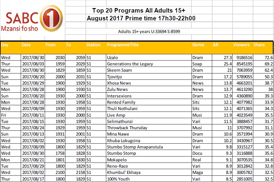
SA TV Ratings: SABC 1 — primetime top 20 for Aug 2017

by MarkLives (@marklives) The hottest primetime television shows on SABC 1 in South Africa revealed: TV ratings for August 2017.

In 2016, the Broadcast Research Council of South Africa (BRCSA) changed its policy about giving away TAMS and now only monthly reports, highlighting the top 20 or 30 primetime shows on several popular channels, are available.

SABC 1 August 2017

BRCSA TV Ratings August 2017 primetime SABC 1Source: BRCSA August 2017

Broadcast Research Council of South Africa


The Broadcast Research Council of South Africa (the BRC) is a non-profit, industry body that was incorporated in 2015 to cater to the audience research needs of the radio and television industry in South Africa.

Sign up now for the MarkLives email newsletter every Monday and Thursday, now including headlines from the Ramify.biz company newsroom service!

Cover Stories: Thoughtfulness in design (6 Oct 2017)

by Shane de Lange (@shanenilfunct) Let’s delve into great media design from South Africa and around the world:

  • Golf Digest — local/print
  • Mayday — international/online/print
  • Speak — iconic
  • The Afropolitan — local/print
  • The California Sunday Magazine — international/print/online
  • Wired — international/print

Find a cover we should know about? Tweet us at @Marklives and @shanenilfunct.
Pinterest icon Want to view all the covers at a glance? See our Pinterest board!


Print

Golf Digest (South Africa), October 2017

Golf Digest South Africa, October 2017 - Thomas Pieters

Dynamism, movement, precision, focus, kinetic, energy; this is the language spoken by the October 2017 cover of Golf Digest South Africa. With hints of Italian and Russian futurism, particularly the work of Fortunato Depero, the vibrant use of typography here is effective and illustrative. It allows the spread to contain physics and dimension, filling nearly all the negative space available, while remaining flat, static and two-dimensional. The considered use of a complimentary colour palette, further reminding one of the futurists, is supported by a keen eye for composition and placement, and a key choice of font — that has just the right bearing when it comes to weight and scale — communicates speed, power and progress. Credit here to the creative direction of prolific Cape Town-based editorial designer, Mark Serra.


Wired (US), October 2017

Wired US, October 2017 - Ryan Gosling, Harrison Ford, Denis Villeneuve and Ridley Scott

Blade Runner is back, as declared in the most-elegant manner by the October 2017 cover of Wired magazine. The sequel to the 1982 cult sci-fi motion picture, Blade Runner 2049, is presented here with an arresting warm, saturation green, group portrait — the work of photography director, Anna Alexander, and creative director, David Moretti. Unencumbered by graphic clutter, thanks to a textbook use of the grid and a finessed monospace typeface, the scene includes actors Ryan Gosling and Harrison Ford, and the film’s director, Denis Villeneuve, accompanied by infamous auteur, and director of the original Blade Runner film, Ridley Scott. To any diehard fan, this cover is nothing less than awe-inspiring: a subtle hint at what this futurist sci-fi story can tell us about society today, suggesting an immanent dystopic future, and a foreboding post-human era.


The Afropolitan (South Africa), Issue 51, October 2017

The Afropolitan, issue 51, October 2017

The 51st issue of The Afropolitan, themed “Afropunk”, comes with a new editor, Kojo Baffoe. This lifestyle magazine embraces a broader cultural dynamic within urban spaces, modelled upon the notion of community and aiming for authenticity and originality. Emphasising a sub-theme of “collaboration”, this issue focuses on the collective power of various people working together in different ways, moving away from oft-quoted and over-used coin phrases to describe urban African culture, such as Afropop or Afrofuturism.

The theme, Afropunk, implies hybridisation, a splice between a sense of being African and the sub-culture of punk rock while suggesting a metamorphosis from older forms of identification for urban culture in Africa. By merging the unadulterated rawness of being African with the expressive creativity of punk, the cover echoes a pluralist approach to different cultures and ideas; it promotes the idea of the “Afropolitan”, individuals who embrace people’s differences and accept all cultures and aren’t imprisoned by the confines of tradition but rather free to express themselves as free-thinking and empowered, no matter what creed they might be or to which clan their roots belong.


Online

The California Sunday Magazine (US), October, 2017

The October 2017 edition of The California Sunday Magazine is tastefully crafted, sustaining a quiet aesthetic with minimal interference and communicating a strong message. It is the result of a collaboration between creative director, Leo Jung, and director of photography, Jaqueline Bates. This cover sets a similar tone to the 2012 Buckle up. Stay Alive print campaign created by Lg2 in Canada for Quebec Automobile Insurance Society, under the art direction of Jean Lafrenière and creative direction of Luc du Sault, which exhibits even greater sensitivity to light, colour, timbre and tonality.

This issue is a conversation about the political awakening of Silicon Valley, exploring the relationship between California’s pioneering technology-driven geographies and Donald Trump’s Washington. The magazine’s website, in particular, depicts the clash between the two: the archetypal computer geek is symbolised by a red tracksuit jacket; in stark comparison, the politician is portrayed as a slick Washington suit. Both images are succinctly connected by one icon: a pin of the American flag — a gentle reminder of American liberty and freedom.

This conversation poses many important questions. Notably, what happens when leaders in technology view the current system as broken? And why would a country be run like a business, where politicians and corporations treat societies and cultures as if they were startups, or some form of retail? Serious banter, quietly crafted, both visually and journalistically.


Mayday (US), Issue 1, September 2017

Collage - Mayday, US, Issue 1, September 2017

This, the first issue of Mayday magazine was released on 1 September 2017 in print and online. Independently published, Mayday is a biannual cultural magazine about the often extreme and uncertain realities that societies the world over have to deal with today. A rare combination of substance and surface that celebrates all that is the obscure and unorthodox, Mayday is the progeny of Trouble, an experimental studio based in Copenhagen, Denmark. The studio prides itself on its search for the next ‘new’ new, and anything out there today that remains unexplored.

Mayday is for non-conformists who critically engage with difficult ideas surrounding our unpredictable and erratic future, encompassing a broad cultural spectrum from art to technology. The magazines online presence is of particular interest, with its stark use of colour, animated contrast between typography and drawing, and its inventive use of parallax scrolling. Disruptive to a tee, Mayday declares that the future belongs to creativity.


Iconic

Speak (US), Issues 5, 7, and 9, 1997–1998

Collage - Speak Spring issue 5, Speak Fall issue 7 and Speak Summer issue 9

Old-school print first published in 1995, Speak magazine had a bumpy start and initially struggled to find its niche, even employing the expertise of David Carson (for #2) in order to find direction. Eventually the magazine settled on a clear identity and direction by #10, under the art direction of Martin Venezky, speaking to the combined traditions of dada, futurism and the general grunge genre of the ’90s. Arguably, the best covers existed after the first of two relaunched logos, between #2 and #9, which were designed without advertising in mind and catering to an eclectic, pluralistic and diverse crowd.

To its predominantly youthful audience, Speak became one of the more-relevant sources for alternative culture. True to its name, the publication found its feet as a non-commercial, borderline brutish yet glossy quarterly which consisted of long-form interviews, fiction, essays and various features for audiences in search of reading that was provocative and critical. All the while, it represented the zeitgeist of the time, pushing digital typography into new directions. Despite its relevance, the publication came to an end in 2001.


Shane de LangeShane de Lange (@shanenilfunct) is a designer, writer, and educator currently based in Cape Town, South Africa, working in the fields of communication design and digital media. He works from Gilgamesh, a small design studio, and is a senior lecturer in graphic design at Vega School in Cape Town. Connect on Pinterest and Instagram.

Cover Stories, formerly MagLove, is a regular slot deconstructing media cover design, both past and present.

Sign up now for the MarkLives email newsletter every Monday and Thursday, now including headlines from the Ramify.biz company newsroom service!

Ad Exec: Disruption starts with you

by Tom Fels (@thomasfels) At a time when marketing requires and demands change, are the people and organisations within it willing to disrupt everything they know to champion the future?

Safety in the ‘known’

We are creatures of habit and relax into situations that feel safe and familiar, yet we exist in an industry that continually urges us to leap out of our comfort zones and creatively stretch the realms of possibility.

Given this quest for constant exploration, the reassuring familiarity of operational processes, timelines and output expectations provide some form of stability to the needy habitual mind. What we must question, however, is whether even these keep us from embracing the real shift that is required for marketing (inclusive of agencies) to thrive in an uncertain world?

More than one kind of transformation

Recently here on MarkLives.com, Jarred Cinman wrote very articulately about the MAC Charter and the necessary impact that it is having on the future of diversity within agencies. In itself, this is a form of disruption for many organisations — challenging their mindset, their approach to the responsibility of more-equal representation in the workplace and, indeed, to the very notion of ownership and the transfer of wealth.

On a more output-based level, we see marketing organisations gearing themselves up for an accelerated digital future, once ‘far away’ and now knocking down the door. In doing so, they are set to reevaluate areas of investment, internal structures, the role of data and orienting with a customer-first mindset. These are tectonic shifts because of the pace with which they are impacting brands, opening up opportunities for consultants and insourcing while raising questions around agency aptitude in this new mix.

Finally, operationally, the idea of dedicated office space over remote working, commuting and flexi-time, permanent employment (or the lack thereof — particularly in the emerging, talented millennial set) and the shortening of the power distance in organisations should have ad-industry leaders completely reevaluating what the agency of the future looks like. If Uber doesn’t own cars, should agencies not also be looking to become platforms, rather than cumbersome hold-alls?

No choice at all

We already know for certain that the pinnacle moments of human achievement are not witnessed in times of languid comfort, that to actually go beyond what is known or believed possible requires us to shake off the shackles of doubt and familiarity.

All around and in front of us, we also know that there is no success to be found in repeating what has been done before, which is both exhilarating and daunting. Exhilarating because, yes, in testing our limits we’ll find both the best version of ourselves and our organisations, and daunting because the lessons we learn will be taught the hard way.

When confronted with the choice of whether or not to adapt and change, one will realise that it’s not a discretionary choice at all. It is a necessary commitment to both survival and success. As Yoda would say, “Do. Or do not… there is no try.”


Tom Fels 2016With a history of local and international experience in leading brand consulting, design, shopper marketing and integrated advertising roles, Tom Fels (@thomasfels) has gained a deeply relevant understanding of the marketing ecosystem. His skills are now put to work daily as chief executive of digital technology and performance-marketing business, Nurun (www.nurun.com). He contributes the monthly “Ad Exec” column to MarkLives.

Sign up now for the MarkLives email newsletter every Monday and Thursday, now including headlines from the Ramify.biz company newsroom service!

Online CPD Courses Psychology Online CPD Courses Marketing analytics software Marketing analytics software for small business Business management software Business accounting software Gearbox repair company Makeup artist