#CannesLions: Cannes Virgins report — the wrap #GlennJefferyHarvey

by Jeff Harvey (@JefferyMess) & Glenn Jeffery (@GlennJeffery2) We’re now back in Joburg and, although the afterglow has almost worn off, we’re proud to have popped our cherries. We’ve also had time to reflect on our first time, check out the work we didn’t see, and gather the photos and videos we haven’t shared yet.

Cannes Virgins wrap collage. Credit: Glenn Jeffery.
Top L-R: Just like a movie set. Five steps to hack advertising courtesy of Burger King. The (in)famous Gutter Bar. It’s a Cannes life. The Palais and the yachts. The Trash Isles passport. What 170 Debris looks like. What 170 Debris looks like. Credit: Glenn Jeffery.

Grands Prix winners

Without a doubt, Cannes Lions is worth visiting at least once in your career. Apart from the buzz of just being there, the talks are inspiring, the parties are a jol, and the setting is as charming as the French accent itself. I won’t go through all the work or I’ll be here till Cannes 2019 but I’ll just give my two cents on some of the Grand Prix winners.

I loved the It’s a Tide Ad campaign. It’s a genius insight that owns any ad showing a human being wearing clean clothes (which must be 99% of them). Beyond that, the hilarious imitation of the wide range of generic advertising made for a flawless execution of this novel idea. When I watched the other P&G Grand Prix winner, The Talk, I felt like I got something in both my eyes at the same time. Very emo. And highly topical.

There were a lot of save-the-dolphins, heal-the-world, feed-the children finalists and, while they’re all noble causes, it’s not good enough to just create awareness — it has to actually create a solution to do well. Trash Isles, for example, didn’t just make everyone aware that plastic is ruining the oceans (obviously), but forced other nations to clean it up by taking advantage of United Nations law. If I compare that to the Palau Pledge, which compelled visitors to sign a pledge but without being enforced, it didn’t have the teeth of Trash Isles. The Savlon Healthy Hands Chalk Sticks didn’t merely tell kids to wash their hands; the campaign ensured they did so by putting soap in chalk they would use and wash off anyway. That’s true creative effectiveness.

As a copywriter, on the one hand, I really appreciated the Kiwi long-copy ad, Ali, the undisputed Industry Craft Grand Prix winner; the tone nailed Muhammed Ali’s swagger. It was also refreshing to read long form in our modern low-attention society. On the other hand, the McDonald’s billboards were perfectly reductionist: three colours, at the most three words, and not even the entire logo, and yet the message is unmistakably clear.

2018 Cannes Lions Grand Prix - Kiwi Shoe Care - Ali
Click to enlarge to view clearly

Anyway, those were some pieces that stood out for me.

See also


2018 Cannes Lions Virgins posterBorn in Durban, raised in Joburg and seasoned in adland, Jeff Harvey (@JefferyMess) has a fetish for fresh ideas and clear, clever writing. After meeting a copywriter while studying business science at UCT, he got an itch for ads that only an internship at King James could scratch. Since then, he’s worked at Saatchi & Saatchi, Havas, Switch and Grey. With over a decade’s experience as a copywriter, he’s snared numerous awards, including a D&AD Pencil, Gold Cannes Lion and Gold Loerie.

After starting his career in Joburg as a designer, Glenn Jeffery (@GlennJeffery2) made a move to London, where he spent 104 weekends seeing as much of the world as possible. London also persuaded him to get into advertising. Upon returning to South Africa, he worked at Volcano and Grey South Africa on numerous global brands, winning some awards along the way. Glenn is executive creative director of Grey.

— One subscription form, three newsletters: sign up now for the MarkLives newsletter, including Ramify headlines; The Interlocker, our new monthly comms-focused mailer; and Brands & Branding, launching soon!

Cover Stories: Airbnbmag, Art Licks, Caleo, Design Times & De Stijl

Shane de Lange (@shanenilfunct)’s weekly analysis of media design — both past and present, print and online — from South Africa and around the world:

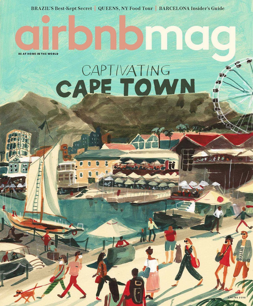
  • International/print: Airbnbmag showcases Cape Town in all its glory using the work of local artist, Kirsten Sims
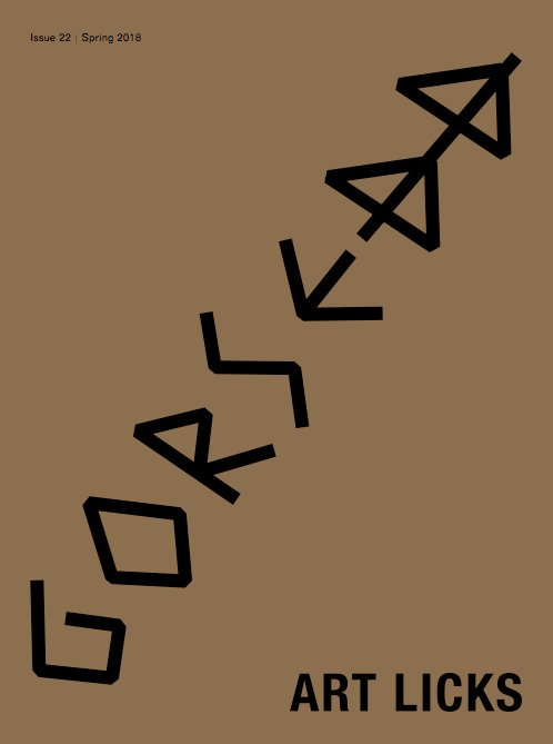
  • International/print: Art Licks supports emerging artists, working at grassroots level to create opportunities within the world of art
  • Online: Caleo attempts to redefine contemporary representation of the ‘urban man’
  • Local/print: Design Times continues to advocate great illustration from South Africa, featuring the work of Pretoria-born, Cape Town-based, Gerhard van Wyk
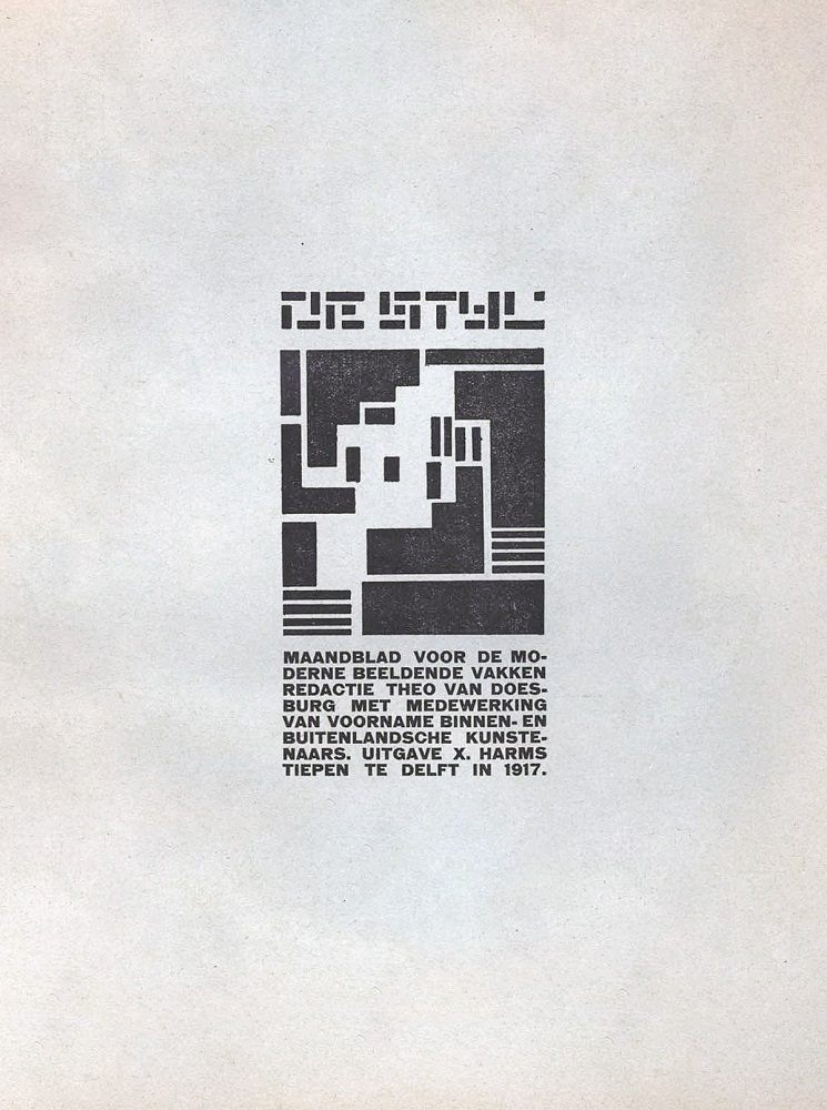
  • Iconic: De Stijl contributed to our definition of modernism, and influenced the style of the Bauhaus and the international style in architecture.

Find a cover we should know about? Tweet us at @Marklives and @shanenilfunct.
Pinterest icon Want to view all the covers at a glance? See our Pinterest board!


Print

Heart-Love-Polygon-Geometric-Flat-Design-Icon-Illustration by lekkyjustdoit courtesy of FreeDigitalPhotos   Design Times (South Africa), July 2018

Design Times, issue 65, July 2018Since the start, Design Times has been known to support great illustration work on its covers, especially from talented local artists — many of whom fly under the radar and often go unnoticed. The current issue features one such little-known illustrator: Pretoria-born, Cape Town-based, Gerhard Van Wyk. As opposed to other commercially renowned illustrators, such as Clint Campbell (Studio Muti), Dylan Jones (Jones & Co.), Kris Hewitt (Studio Kronk), Gerhard Human, Karabo Poppy Moletsane, and Hylton and Chantelle Warburton (Studio Warburton), Van Wyk seems to steer away from the limelight. Despite seemingly being one of the overlooked illustrators out there, Van Wyk’s work stands up against the best and easily fits the bill alongside his more-popular contemporaries. This cover suggests an overlooked fact: many top local illustrators stem from either Pretoria or Durban. Why these two cities are able generate such great talents, and why these talents leave these cities for either Johannesburg or Cape Town, is an anomaly that still needs to be properly scrutinised.


Heart-Love-Polygon-Geometric-Flat-Design-Icon-Illustration by lekkyjustdoit courtesy of FreeDigitalPhotos   Airbnbmag (US), Spring 2018

Airbnbmag, Spring, 21 March 2018It’s not difficult to imagine why Airbnb’s ever-growing global community would demand a devoted publication of some sort. Sporting the tagline, “At Home in the World”, Airbnbmag is all about tales that its users tell from various points of departure and arrival across the planet, imbuing each story with priceless local knowledge. As a lifestyle and travel magazine, Airbnbmag tries to showcase authentic experiences from travel writers and photographers globally. Every story reveals the special character of each geography, filtering through the static of tourist hotspots and placing importance on the quirks of every location, including its heritage, cuisine, and traditions — all from the informed perspective of locals.

The cover to the latest issue embraces South African culture, capturing Cape Town’s Table Mountain from the viewpoint of the V&A Waterfront in all its glory. Illustrated by South African artist, Kirsten Sims, relative to another contributor for this issue, Australian illustrator Marc Martin, the cover teeters on the edge of commercial illustration and fine art. Sporting oodles of shelf appeal, Sims’ work can’t be separated from the work of her local contemporaries, the equally capable Mia Chaplin and Michael Taylor.


¯\_(ツ)_/¯   Art Licks (UK), issue 22, June 2018

Art Licks, issue 22, Spring 2018Art Licks is a visual culture platform that backs emerging and little-known creatives, working at grassroots level to create opportunities within the art world. Launched in 2010, it’s about emerging art and experimental happenings based in London. Meant to be a discursive platform for artists, curators and the like, all sharing their respective ideas and projects, Art Licks has a variety of manifestations: online, cultural tours, a learning and commissioning programme, and an annual festival.

The printed magazine is arguably its most intriguing manifestation. The cover for #22 — a weird hybrid of a death-metal album cover and a runic typographic relic — is based on the theme “GORSEDD”, translated as assembly present-day of bards (contemporaries of each other). It’s Welsh in origin, formerly meaning “throne”. As its theme and art direction suggests, contributors to this issue exchange ideas about mythology, mysticism, ritual, and folklore. Inspired by the past, with a tinge of medieval tonality, GORSEDD is an attempt to understand modern society while, at the same time, foretelling potential futures, fueled by uncorrupted creativity.


Online

¯\_(ツ)_/¯   Caleo (Germany), Summer, July 2018

Caleo Magazine online, July 2018With its credo, “Tomorrow’s Aesthetics in its Purist Form”, Caleo is a lifestyle magazine focused on contemporary men’s fashion. The latest issue is themed “Langage des Fleurs” (the language of flowers) and features Dutch model, Ton Heukels, on the printed cover and on the website landing page. With its emphasis on haute couture, Caleo’s visual language is meant to be a reaction against the superficiality of glossy, mainstream fashion magazines, and it succeeds in doing so, to a certain extent. Attempting to define a more-accurate representation of the ‘urban man’, choosing depth over surface, and placing substance before style can’t be an easy task when dealing with the perceivably artificial world of fashion. The design of the printed magazine doesn’t compare to its online sibling, with its dynamic dual-screen spread. The first screen is dedicated to art direction and photography, with a horizontal scroll to reveal for more content. The second screen is dedicated to the features, interviews, and articles, with a vertical scroll to access more content. Stylish, clean and neat, with clever design solutions to the overall experience of the site.


Iconic

¯\_(ツ)_/¯   De Stijl (Netherlands), 1917–1920

De Stijl, vol 1 no 1 Delft, October 1917Dutch for “The Style”, De Stijl was an avant-garde magazine produced by the founder and leader of the De Stijl movement, Theo van Doesburg. Based in the Netherlands, De Stijl focused on the philosophies and theories connected to Dutch mathematician, MHJ Schoenmaekers, which informed the work of Van Doesburg, and other exponents of the movement, including Piet Mondrian, Bart van der Leck, Gerrit Rietveld, and JJP Oud. to name a few. Following Schoenmaekers’ ideas, which were inspired by neoplatonic ideals (Plato’s realism and notion of universal truth), De Stijl’s core mantra was neoplasticism, essentially describing a new ‘plastic art’. Core principles in geometry — solid lines, squares and rectangles only, and asymmetry — coupled with relations between positive and negative space, primary colours (red, yellow, and blue), and neutrals (black and white) were strictly adhered to.

De Stijl, vol 1, no. 1, was first published in October 1917, in Delft, Netherlands. The non-objective and formalist approach of De Stijl, influenced by the mysticism of neoplatonism and quasi-spiritualism of early modernist movements such as cubism, was at the heart of what De Stijl stood for, with the aim to propagate the philosophies of the movement through the magazine. In his introduction to the inaugural issue of De Stijl, Van Doesburg implied that the magazine was a response to another Dutch magazine called Wendingen (briefly featured in Cover Stories, 1 December 2017 in relation to Icon magazine). The covers for the first 12 issues were designed by another important group member, Hungarian painter and designer, Vilmos Huszár.

De Stijl would go on to influence the style of the Bauhaus school, and the international style in architecture. After 1920, the nature of De Stijl began to evolve. Van Doesburg’s relationship with Bauhaus grew stronger, and the Russian constructivists — Alexandre Rodchenko, Kasimir Malevich, El Lizzitsky, et al — were arguably achieving greater relevance within the rubric of abstract art, leading to a decline in interest for De Stijl. Some cross-pollination between De Stijl and Dadaism, particularly a collaboration bewtween Van Doesburg and Kurt Schwitters (featured in one of the earliest Cover Stories in relation to Dada Data), also created confusion, making people question what De Stijl represented. By 1924, Mondrian had left De Stijl, due to Van Doesburg’s desire to introduce diagonal lines into the group’s philosophy — what he referred to as “elementarism” — citing that horizontal and vertical lines were not as imperative. With Mondrian’s departure, De Stijl slowly faded away.

References


Shane de LangeShane de Lange (@shanenilfunct) is a designer, writer, and educator currently based in Cape Town, South Africa, working in the fields of communication design and digital media. He works from Gilgamesh, a small design studio, and is a senior lecturer in graphic design at Vega School in Cape Town. Connect on Pinterest and Instagram.

Cover Stories, formerly MagLove, is a regular slot deconstructing media cover design, both past and present.

— One subscription form, three newsletters: sign up now for the MarkLives newsletter, including Ramify headlines; The Interlocker, our new monthly comms-focused mailer; and Brands & Branding, launching soon!

SA TV Ratings: DStv — primetime top 30 for Jun 2018

by MarkLives (@marklives) The hottest primetime shows on DStv in South Africa revealed: TV ratings for June 2018.

DStv June 2018

BRCSA TV Ratings June 2018 primetime DStv
Click to enlarge to view clearly

Source: BRCSA June 2018

In 2016, the Broadcast Research Council of South Africa (BRCSA) changed its policy about giving away TAMS and now only monthly reports, highlighting the top 20 or 30 primetime shows on several popular channels, are available.


Broadcast Research Council of South AfricaThe Broadcast Research Council of South Africa (the BRC) is a non-profit, industry body that was incorporated in 2015 to cater to the audience research needs of the radio and television industry in South Africa.

— One subscription form, three newsletters: sign up now for the MarkLives newsletter, including Ramify headlines; The Interlocker, our new monthly comms-focused mailer; and Brands & Branding, launching soon!

New MDs for Ogilvy Group, Ogilvy Cape Town

by MarkLives (@marklives) Ogilvy South Africa has announced three new senior appointments. Luca Gallarelli, former managing director of Ogilvy Cape Town, has been promoted to MD of the Ogilvy Group (South Africa); Vicki Buys is now Ogilvy CT MD; and Tassin Albertyn has been appointed head of delivery.

New Ogilvy logo 2018Under Gallarelli’s management, Ogilvy Cape Town was named MarkLives’ most integrated agency in Cape Town for five years running; it recently won a Cannes Lions Grand Prix for the Carling Black Label “Soccer Song For Change” campaign. Gallarelli has been a member of the Ogilvy holding board since 2016.

Buys has long been responsible for Ogilvy’s relationship with Volkswagen SA. She has served as managing partner and deputy MD at Ogilvy, and has been a board member since 2013.

Albertyn comes to Ogilvy from Old Mutual, where she was lead digital project/programme manager and responsible for managing project stakeholders, digital operations, and project and programme planning, among other disciplines. Besides project management expertise, she has experience in agencies, in print and online media, as she’s worked at Liquorice Africa, Highbury Safika, and M&C Saatchi Abel, plus Ogilvy.

“Strengthen Ogilvy’s ability”

“These appointments strengthen Ogilvy’s ability to put client needs at the centre of what we do,” says Alistair Mokoena, Ogilvy SA CEO. “With our recent refounding as a fully integrated global creative network, we now offer clients services like marketing, digital strategy, reputation management and business development with a single point of contact. This client-centric philosophy is geared to ensuring our client brands matter to their audiences, and that they retain remain culturally relevant at all times.”

— One subscription form, three newsletters: sign up now for the MarkLives newsletter, including Ramify headlines; The Interlocker, our new monthly comms-focused mailer; and Brands & Branding, launching soon!

Brands & Branding: The infinite loop of purposeful & agile brand-building

by Dr Carla Enslin. Consider the infinity loop, in all its seductive and sinuous elegance. But it can also be quite useful as a physical demonstration and metaphor when applied to strategic brand-building. Businesses and organisations aim to form mutually beneficial and self-regulating connections with stakeholder groups. Self-reflecting, too, much like the infinity loop. All of the brand’s contact points and journeys, involving all stakeholder groups, loop outside-in and inside-out to deliver a promise that is unique to the brand and of particular value to the stakeholder.

Infinite challenge

Herein lies the infinite challenge of strategic brand building — to remain ever-aligned as a business, and true to purpose, in all that is done. It becomes an endeavour that considers every contact point from the outside-in in assessing, planning and tracking its value in the contact journey from the inside-out.

The infinity loop serves as a symbolic guide for our brand-building strategies to address the complexity of internal models, systems and processes, all aimed at achieving the absolute simplicity of cohesive experience, gauged from the perspective of stakeholders, at and across all points of contact. The symbol visualises what needs to be achieved at every contact point, as well as what needs to be achieved collectively, in all contact journeys across the business or organisation over time — moments of truth in which the brand promise is made, delivered and ideally upheld to infinity.

General Electric

In order to become a global network to truly serve its purpose, that is, to find out what the world needs and then invent it, the leadership of General Electric has connected the brand’s 30 000 people, situated in 91 countries and 10 different businesses, in a virtual forum. In this way, GE’s cross-team councils, constituted of horizontal and vertical levels of expertise, are able to share key insights and solve problems faster. The GE aviation team in Singapore is able, for example, to initiate a contact solution for the healthcare business in Turkey.

Capitec

The South African retail bank, Capitec, pursues much the same strategic approach, connecting employees in an internal Facebook-like environment in which all, including top management, collaborate to develop processes and systems that result in simpler and more-transparent contact encounters, thereby upholding the promise that clients will always know what they get and pay for. Purpose-driven brand building is not located in one particular role or department; this responsibility vests everywhere and with all employees and strategic partners.

Moment of truth

In the 1980s, Jan Carlzon, then president of Scandinavian Airlines, introduced the phrase “moment of truth” to remind his management team that every form of contact with a business or organisation, however remote, shapes an impression.

For example, this principle, when applied to today’s online environment, may reveal that customers who click “buy” to purchase a particular product or service are often left feeling quite uncertain about the delivery and quality of their purchase. A company may send an email or text notification that the order has been shipped, and customers may be able to track its progress online, but the transaction remains a complex strategic process if customers are to be given those all-important cohesive post-purchase touchpoints that affirm the brand’s promise.

From the inside-out, this complexity is often amplified when additional outsourced, and lately also crowdsourced partners, systems and processes are involved. From the outside-in, though, customers draw no distinction between sources of origin and expect every point of contact to be true to the brand.

Yuppiechef

For this reason, brand oriented etailers, such as the kitchen accessories company, Yuppiechef.com, share its customer feedback about contact performance at all touchpoints and with all employees on a daily basis. The team at Yuppiechef is highly motivated to move from the outside-in while planning contact journeys from the inside-out. This requires cognitive agility and action that crosses units within the business and ensures that cohesive performance between points of contact remains the strategic priority. The management team at Yuppiechef clearly reasons that being trusted and favourably regarded by its community at every point of connection is as important today as it would have been in the past, in a 19th century physical marketplace where everyone knew everyone.

David Bowie

When our aim is to connect with people, however many or diverse in profile, we need to consider why connection matters, and what the most meaningful experience or form of contact might be. In his song, Sunday Lyrics, David Bowie tells us:

Everything has changed
For in truth, it’s the beginning of an end
And nothing has changed
And everything has changed

It may seem to be a superficial reference to the well-known French phrase plus ca change, plus c’est la même chose. Instead, Bowie does affirm real change, while affirming unchangeable, universal truth. His refrain is very relevant to the challenge of building enduring brand relationships in a world proliferated with touchpoints, platforms and propositions. We have the industry language as evidence that much has changed. We invest in data analytics, purpose strategies and seamless omnichannel plans, and deal with increasing complexity in the analysis and synthesis of brand and business models. Yet, nothing has changed. People continue to live engaged in their own lives to varying degrees, with expectations of solving the challenges they face, or not, and satisfying their desires, or falling short, as the case may be. There therefore exists an absolute simplicity in a brand that genuinely succeeds to connect meaningfully and adds value to how people live life, whether the brand in question is a public transport system or a favoured takeaway meal.

Discovery

A week in advance of Discovery’s 25th birthday on 10 March 2017, Adrian Gore, the group’s chief executive, sent a well-considered email to all employees. In his communication, he reflected on the remarkable journey of the brand and the leadership team’s sustained commitment to guard against a culture stifled by too-bureaucratic rules and a too-narrow pursuit of profit. Discovery’s success, according to Gore, is and will remain the result of being a purpose-driven business. “The simple idea of making people healthier and enhancing their lives has evolved into a sophisticated, shared-value business model that leads the industry globally, while our eight core values have ironically and importantly remained completely unchanged, but our ambition has grown from being the best health insurer in South Africa, to the best insurer globally by 2018,” said Gore.

Discovery’s shared-value model is engineered to manage large-scale complexity in the analysis and synthesis of contact performance across business units. As a result, the brand is able to remain true to purpose, in all that is done to incentivise people, to be healthier and to enhance and protect their lives. The contact journeys, involving all stakeholder groups, are purposefully planned and managed to loop outside-in and inside-out to deliver on the Discovery promise.

The practice and pursuit of outside-in and inside-out thinking in strategic brand-building should first and foremost be embedded in the leadership of the organisation, in order to permeate naturally into the brand-building culture of its people. Every person in every business unit should feel an instinctive inclination to engage with others and ultimately with stakeholders, fully aligned with the brand’s promise, because doing so is infinitely in the best interest of the business. For this reason, brand-led organisations and practitioners invest in platforms and processes that enable the sharing of contact journey insights and user experiences with all employees and then move ahead to address challenges, incorporating company-wide planning approaches, embracing all departments and functions.

Flash, StokFella

The McKinsey Quarterly (February 2017) points out that industries are, on average, less than 40% digitised, although this is a rapidly evolving situation. Brands are increasingly in constant interaction with their stakeholder groups through a myriad of processes, systems and platforms, many of which stream real-time data about customer experiences and business performance at various touchpoints. The South African brand, Flash, provides payment solutions that enable informal traders and consumers to pay suppliers from a Flash device, thereby removing the need to collect and transport cash. While providing an innovative trade solution, stakeholder behavior is continuously tracked to enhance touchpoint performance. Likewise, entrepreneur Tshepo Moloi recently launched StokFella, an app that assists stokvels (saving or investment societies) to administer savings and communicate stokvel activities via a smartphone. The real-time insights gained from user experiences will similarly enable this new venture to develop meaningful and creative contact opportunities in competing with traditional formal systems.

Establishing and retaining a meaningful advantage will become increasingly more dependent on an organisational culture in constant touch with stakeholder experiences and in a continuous collaborative flow to produce creative strategic solutions to obstacles and point to new opportunities. The infinity loop as a representation of a real-time flow in outside-in an inside-out planning encourages a strategic agility, capable of producing moments of truth that truly resonate. When contact encounters are deeply understood in context of stakeholder expectation and brand performance, the organisation with an agile, collaborative culture is able to produce points of contact that present a perfect expression of the brand’s purpose and promise, both in form and function.

Donald Trump

Documentary producer, Michael Moore, flagged such a contact resonator or moment of truth in the 2015–2016 election campaign of president Donald Trump of the US. According to his analysis, this touchpoint reinforced brand Trump’s purpose and promise in form and function, continued looping expertly throughout the campaign, and might even resonate well into the future as a commemorative piece. This is the ubiquitous red baseball cap, or trucker hat, with the slogan “Make America Great Again”. As Moore argues, this may quickly have become the subject of meme and parody among Clinton campaigners, but equally rapidly established itself as a powerful anti-establishment expression for ‘middle America’, and an absolute resonator of brand Trump. Voter behaviour analytics and models of campaign disruption looped outside-in and inside-out to culminate smoothly in a red cap, a slogan and a compelling point of resonance.

Notwithstanding this example, it remains a challenge to apply the continuous pursuit of outside-in and inside-out thinking and planning to an entire organisation and in all of its contact journeys. As argued, the ideal is an organisational environment that facilitates an infinite expression of resonance, at all touchpoints, with all stakeholder groups. Conversely, it stands to reason that where the leadership and internal culture constrains agile contact management, or fails to introduce contact planning at the most primal level, the brand and its stakeholder relationships are negatively affected.

United Airlines

At a US congressional committee hearing in May 2017, United Airlines chief executive, Oscar Munoz, described an incident in which a passenger was forcibly removed from a flight, as a “mistake of epic proportions” and apologised for failing to lead with an immediate and constructive response. Munoz outlined contact areas where United Airlines failed to perform, posing some critical challenges, considering the brand’s promise that every flight, every day, to every destination is an experience of flying ‘the friendly skies’. The contact failures ranged from inaccurate implementation of safety and security policies and no clarity of compensation measures for passengers to deficient onboard service delivery. At “that moment”, the chief executive acknowledged, “for our customers and our company, we failed.”

The scope and complexity of contact planning and management is in itself infinite and can only be facilitated properly if led and supported by a leadership and culture in touch with contact journeys from the outside-in and instinctively agile in alignment with the brand promise from the inside-out.

Airbnb

The leadership at Airbnb use an internal metaphor, referred to as ‘spotting duck-tape’, to encourage agile strategic-thinking and -action throughout the organisation. Teams at Airbnb are continuously on the lookout for any and all points of disconnect to be transformed into opportunities for brand contact resonance. The brand’s purpose is to use technology to bring people together, to create communities so that anyone may belong somewhere. In doing so, Airbnb taps into “the universal human yearning to belong—the desire to feel welcomed, respected, and appreciated for who you are, no matter where you might be.” Moving from the outside-in to assess and plan journeys of resonance from the inside-out, Airbnb connects those with the money to travel with those who have the space to host, as well as those who have special experiences to offer. Airbnb’s resonance is further enhanced as it tracks and responds to current conditions that impact its community. Moving outside-in to identify opportunities to serve purpose, the brand navigates complex systems and processes from the inside-out, such as connecting those willing to offer space for short-term stays with those who find themselves as refugees, disaster survivors, and relief workers in foreign environments.

The infinity loop is a useful guide to conceptualise what needs to be achieved across contact journeys over time to ensure a brand promise is made, delivered and upheld. It encourages brand builders to plan and invest from the outside-in and the inside-out in order to align the business seamlessly, to ensure that it performs true to its purpose in all that it does. It promotes an agile organisational culture that is ever-aware of stakeholder experiences and that collaborates across departments and units to grow the brand’s contact resonance. In the pursuit of moments of truth and a cohesive contact experience everything changes while, as far as universal truths are concerned, nothing changes.

References


Brands & Branding 2017Dr Carla Enslin is head of strategy and new business development at Vega and a founder member of the school. Her interest and experience include brand strategy, the design and implementation of brand identity systems and contact strategies. Carla also serves on the Brand Africa Council and is a research associate at the University of Stellenbosch Business School. She acts as a consultant to and trainer for companies, both local and international.

The article first appeared in the 2017 edition of Brands & Branding in South Africa, an annual review from Affinity Publishing of all aspects of brand marketing — consisting of case-studies, profiles, articles and research — which may also be accessed at the brand-new Brands.MarkLives.com. Order your copy of the 2017 edition now!

— One subscription form, three newsletters: sign up now for the MarkLives newsletter, including Ramify headlines; The Interlocker, our new monthly comms-focused mailer; and Brands & Branding, launching soon!

Fragments: Decoding behaviour — human vs cultural conditioning

“Every [hu]man bears the whole stamp of the human condition.”
—Michel de Montaigne

by Marguerite Coetzee. In order to understand consumer behaviour on a deep and meaningful level, it requires an exploration of the underlying macro-sociological drivers (external forces) and the micro-psychological needs (internal motivators) — and an understanding of what makes us human. Similar to the ‘nature vs nurture’ debate, we could argue that there are two overarching driving forces: the human condition (nature) and cultural conditioning (nurture).

What makes us human

In my view, the human condition is a set of truths that is applicable to all of humanity, regardless of person, place or time. It is the foundation of what makes us human — what connects us. Theorists the world over have generally identified the ‘essentials of human existence’ as: birth, growth, emotion, aspiration, conflict, and death.

We all experience these phenomena, in different ways and to varying degrees. We generally assess if our environment and experiences are dangerous or safe, and then respond to it in the ways that we have been ‘conditioned’ to. I don’t mean conditioning here in the way that Pavlov conditioned his dogs to expect food when a bell rang, but rather ‘conditioning’ in the way that culture socialises us, teaches us socially acceptable behaviour, and helps us navigate the world.

What drives us

Common needs drive human behaviour. This goes beyond Maslow’s hierarchy of needs (self-actualisation, esteem, belonging, safety, and physiological needs). Psychologist Marshall Rosenberg developed a list of around 30 universal human needs, such as: survival, security, freedom, connection, meaning, and more. We often draw on these needs as inspiration for brand truths, roles and purpose.

One such example is when South African beer, Castle Lager, created a “share a Castle, make a friend” campaign. The concept has its origin in the idea of friendship, the human need for connection. In the human condition — the quest for survival — friendship (community, allies, bonding) is one of the ways in which we survive. At the same time, we have tensions that try and pull friends apart: money, differing values and priorities, political disposition, cultural background, and more. Castle Lager encouraged people to find the similarities within one another — to connect on a human level.


Marguerite de VilliersMarguerite Coetzee is an anthropologist at strategic marketing consultancy, Kantar Consulting. Fragments, the latest series in her regular column on MarkLives, explores the application of symbolism and production of meaning in a consumer’s world, inspired by semiotics and semiology (the scientific study of signs, symbols, and communication systems within sociocultural contexts).

— One subscription form, three newsletters: sign up now for the MarkLives newsletter, including Ramify headlines; The Interlocker, our new monthly comms-focused mailer; and Brands & Branding, launching soon!

Social media reacts to Absa’s new logo

by MarkLives (@marklives) Absa has launched its new corporate identity, following its divorce from Barclays. Barclays Africa Group has officially been rebranded and started trading under its new name, Absa Group, and new share code (ABG) on the Johannesburg Stock Exchange today, Wednesday, 11 July 2018. OgilvyRED (New York), Grid Worldwide and Yellowwood consulted on the brand change.

The new group has a presence in 12 African countries and plans to open international offices in the UK and the US.

“New purpose and strategic direction”

New Absa logo 2018“Our new name and brand are an expression of our new purpose and strategic direction, which commits us to growing in Africa,” says Maria Ramos, Absa Group CEO. “We are rallying around a shared sense of purpose and identity while celebrating our diversity. We would like to build the brand as a bank that Africa’s people can be proud of, a truly independent African bank with global scalability.A single brand will enable us to unite behind a single identity, purpose and strategy; we are excited by the enormous opportunity we have to create a bank that Africa can be proud of.”

The rollout of the new Absa brand design in South Africa will be completed in 2019. It will also be rolled out to Absa Group’s Barclays banks in Botswana, Ghana, Kenya, Mauritius, Mozambique, Seychelles, Tanzania, Uganda and Zambia by mid-2020, subject to approvals including from regulators in those countries. Product and service functionality will not be affected by the rebranding programme.

Social media reacts

https://twitter.com/tumisole/status/1017006955439755264

https://twitter.com/curious_lauren_/status/1017028684157542400

https://twitter.com/Kaliyaana/status/1017028174427893760

https://twitter.com/KatlegoMotlhabe/status/1017011690607607810

https://twitter.com/keletsokowa/status/1016961066050387969

https://twitter.com/The_Londwa/status/1016955851385528320

https://twitter.com/_Serofo/status/1016953716736479232

https://twitter.com/ThinkTrends/status/1016950150630174723

https://twitter.com/FlopNochang/status/1016945999913340928

https://twitter.com/Siphokazi_J/status/1016946968340426752

https://twitter.com/moqyt/status/1016943957786361856

— One subscription form, three newsletters: sign up now for the MarkLives newsletter, including Ramify headlines; The Interlocker, our new monthly comms-focused mailer; and Brands & Branding, launching soon!

The kings, James & Al, on trebling agency in last decade

by Herman Manson (@marklives) King James Group has established itself as one of the creative drivers in the South African agency market, with standout — even iconic — work for brands such as Allan Gray, Santam and Sanlam.

Retained independence

Launched in 1997, the agency was founded by James Barty and Alistair King as they exited the then-Ogilvy & Mather Rightford Searle-Tripp & Makin (O&MRS-T&M — today, thankfully, simply Ogilvy).

Starting with the founding agency in Cape Town, it has also founded a successful public relations agency (Atmosphere Communications) with Nicola Nel as managing director. Its Johannesburg agency, King James IIlaunched with partners Rob Mclennan and Graeme Jenner — managed to win back Allan Gray for the group after the Cape Town agency had to resign the business to avoid conflict work. It successfully pursued a strategy of digital integration, recently merging digital agency Punk and social media specialists, Society, into King James Digital, home to 90 digital specialists.

Five companies

Today, the group consists of five companies — Atmosphere (PR), King James (Cape Town), King James II (Jozi), King James Digital and Hammer Live Brands (events) — but share a single creative department for conceptualisation, which then gets executed by the expert units. The different companies helps the group to handle conflict work; Atmosphere is able to work on Capitec, and the main agency on Tyme Digital (the new online bank launching soon).

This year, the agency has celebrated its 20th year in business. It shot its now-iconic Allan Gray ad, “Beautiful”, just after its 10th birthday, an ad that helped define both the brand and the agency. According to King, the ad even recalibrated the agency’s ambitions and vision for itself. Suddenly, expectations — inside and outside the organisation — rose substantially.

On digital integration, King says the agency had intuitively moved towards integrated campaigns but, from 2010 onwards, it set about doing on purpose what it’d been “doing by mistake” up to that point. Creative directors from the various disciplines were moved into the same space six years ago, and the different agency systems (eg traffic) collapsed into a single unit to serve all the specialist units. Briefs go agency-wide; they don’t sit in a silo. Work needs to maximise return, says Barty; one recent campaign had a R10m budget but created R50m in value for the client.

Uniquely South African

According to King, the last decade presented the agency with trials and opportunities as the style of advertising, and the agency model, evolved. It’s risen to the meet the challenges presented by both, as its WhatsApp drama for Sanlam, Uk’shona Kwelanga, shows. Covering film, experiential, mobile, app and PR, the campaign resulted in a 140% increase in policy sales. It was a unique, and uniquely South African, piece of work.

The agency has trebled staff count over the last decade. It is producing the level of work King is happy with, and not lost its culture in the process. Revenue has hit R220m per annum.

If there’s one point in which King James lags, it would be black ownership. Barty freely admits that black-owned agencies will be the ones which take business away from incumbents in future. According to him, the agency is “in an advanced stage of concluding an additional BEE shareholding transaction, bearing in mind that we have had a shareholding structure for our black staff (which owns 26% of the agency) in existence for some time already.”

Startup advice

King James Group is currently incubating a small black-owned and-managed agency from Soweto, named Cognitive, at its (now second set of) Joburg premises. King’s advice to the new wave of startups is to say that, when they themselves started, they were told that the Cape Town market was already crowded with new agencies. It didn’t stop them. “There is no good time or bad time to start an agency,” he says. “Do what you do well and your business will grow. Trust your work and your ambitions.”

Barty adds that they didn’t work on two- or five-year plans when the business launched. They took a much more intuitive approach, putting their faith in their work, which he describes as the shop window of any agency. Managing culture and the moving parts of a business are where the real challenges in growth lies.

On retaining its independence, Barty says that all networks want to buy a minimum 51% of an agency upfront, instead of starting at a lower number and then participating in a journey, possibly towards majority-ownership. Sale of equity is a trigger for agency founders and management to exit, rather than for growth, which he describes as a perverse business model.

Surprising the market

Continuing on its growth path, King notes that the agency was widely expected to have peaked as an independent some 10 years ago, yet it’s consistently managed to surprise the market, most recently by managing to onboard the massive Pick n Pay account, as well as that of Sanlam.

The group has recently won Netflix in SA, plus Spotify*, a recognition of the agency’s digital and ideas skills, as well as its agility, says Barty.

The group has grown to around 300 people, of which two-thirds sit in Cape Town and roughly one-third are digital specialists. King James II is especially strong on technology and developing business processes, as well as IT infrastructure builds. It’s already pulling in consulting work on the UX/IT nexus, meaning it’s bumping up against the management consultancies.

Growth

Barty sees potential for growth in a number of sectors where the agency is not yet represented; it doesn’t currently hold a car or a petroleum account. The agency is also seeing positive growth in its analytics and digital-media-buying side, albeit off a low base.

Barty and King both agree that the agency is maintaining positive momentum. Their best work, both insist, is still coming.

*Correction made on 11 July 2018: Spotify, not Shopify. We regret the error.


Herman Manson 2017Herman Manson (@marklives) is the founder and editor of MarkLives.com.

— One subscription form, three newsletters: sign up now for the MarkLives newsletter, including Ramify headlines; The Interlocker, our new monthly comms-focused mailer; and Brands & Branding, launching soon!

Shelf Life: Zola Nene quality • Go 4th TVC • US whiskey imports surge

Cheryl Hunter (shelflife at marklives.com)’s weekly pick of all things new in retail — consumer products launches, retail news and FMCG campaigns!

  • Foodies love winter
  • Go 4th and connect
  • Consumers drive whiskey imports

Rhodes Quality drives choice with Zola

Rhodes Quality foods has partnered with Zola Nene, South Africans celebrity chef and food stylist to launch its “For the Love of Winter” campaign for driving brand awareness, relevance and choice.

According to Tamara Patel, Rhodes Quality marketing manager, the campaign is an extension of the overall brand strategy, which talks to the real emotional connection that people have with food: “By leveraging the brand platform, we are able to translate this into different food occasions and bring these occasions to life in an engaging way that is meaningful to our audience.”

Conceptualised by Saatchi & Saatchi, the new campaign asks consumers to share their Rhodes Quality recipes and photos using a hashtag — and entrants stand the chance to win weekly cash prizes and potentially go into the draw for the grand prize and the opportunity to have Nene cook their recipe, if chosen.

Nene was chosen as a partner to drive engagement and gain wider reach: “Zola’s approach to cooking fits the brand perfectly, and being able to leverage her knowledge of styling and simple tips for consumers gives us the opportunity to give our audience advice and simple recipes that can be enjoyed by the whole family. Using Zola, we will share recipes that are hearty and wholesome with good quality ingredients that don’t break the budget.”

South Africans may access recipes developed by Nene specifically for winter, as well as how-to tutorial videos to make their food Insta-worth during July and August 2018, and will see one lucky R100 000 grand prize winner and weekly winners of R5 000 each.

rhodesquality.co.zaFacebookInstagram
saatchi.co.zaFacebookTwitterInstagramRamify


Singh & Sons connect 4th Street Wines

Voted as the fastest-growing wine brand globally by the International Wine and Spirit Research (IWSR) Top 100 Wine Brands for 2017, 4th Street Wines has launched a new TVC to emphasise its brand positioning, Go 4th and Connect. The aim is to encourage a new generation of wine drinkers to spontaneously connect with each other.

https://youtu.be/kXoLAk-oOFM

Created by Singh & Sons and directed by Mfundo Mkize of Ola! Films, the TVC portrays a day and night in the life of a young man who has no plans but. through a series of unplanned connections, he and his newfound friends end up having a fun night out and meeting new people along the way. The TVC is shot in reverse, revealing how it all started with an invitation over a bottle of 4th Street Wine — at the end of the commercial.

Dè-Mari Shaw, 4th Street brand strategy manager, says: “With the new TVC, we hope to connect to our youthful, upbeat, urban consumer even further. We’ve attempted to showcase a 4th Street world that is relevant to a new generation of wine drinkers, who aspire to the sophistication of wine, without its daunting complexity, and who prioritise friends and fun.”

The commercial was shot in various locations in downtown Johannesburg, with a cast that represents the modern generation of wine drinkers and fashionable 4th Street consumers.

Roger Paulse, Singh & Sons executive creative director, says: “Shooting the ad in reverse required precise planning and clear storytelling. Ola! Films made sure that what could have been a purely technical exercise was an interesting, entertaining and understandable commercial.”

4thstreet.co.zaFacebookTwitterInstagram
singhandsons.co.za
olafilms.tvFacebookInstagram


US whiskey imports surge

According to the trade association Distilled Spirits Council of the US, American whiskey imports to South Africa grew by more than 17% from 2016 to 2017, and from US$8.9m to over US$10.5m last year.

Pouring whiskeyThe growth was in line with an upward trend on all American distilled spirits imported to SA over the past year.

With the top five markets for US spirits still the UK, Germany, Brazil, France and Spain, American whiskey exporters are showing new interest in SA as an export destination. The key export growth drivers for US spirits are Tennessee Whiskey and Bourbon, particularly in the premium and super premium categories, while the more-specialised American rye whiskey is also starting to show strong growth.

Christine LoCascio, Distilled Spirits Council SVP international issues and trade, says: “Consumer tastes for premium American spirits and favorable exchange rates are supporting global sales, particularly as American whiskeys are driving the fast-growing cocktail market. International adult consumers are also exploring more expensive US spirits, driven by their fascination with American whiskey’s heritage and its versatility in cocktails.”

distilledspiritsusa.co.zaFacebookTwitter


Cheryl HunterShelf Life is MarkLives.com’s weekly column covering all things retail. Notify us of yours at shelflife at marklives dot com. Want to sponsor Shelf Life? Contact us here.

Cheryl Hunter (@cherylhunter) has written for the South African media, marketing and advertising industries for more than 15 years. A former editor of M&M in Independent Newspapers and contributor to Bizcommunity, AdFocus, AdReview and the Ad Annual, she has also produced for various television networks and currently consults on communication strategy and media liaison.

— One subscription form, three newsletters: sign up now for the MarkLives newsletter, including Ramify headlines; The Interlocker, our new monthly comms-focused mailer; and Brands & Branding, launching

African Echo: Uganda — how do you localise when we’re all similar?

by Siwe Thusi (@Siwe_Thusi) “Siwe, you are going to Uganda to workshop The Big Easy.” “Uganda”. “Siwe”. These were two names that I never in my dreams, nor my ancestor Shaka’s wildest imaginings, thought would live so comfortably together in a whole sentence. What in the world would Siwe, a South African, relate to in Uganda?

Doing the opposite

I think everyone can relate to the notion that stepping out into anything that isn’t familiar will inevitably bring something else. That “else” is somehow always expected to be ‘different’. As my stay in Kampala unfolded, I found it more and more fascinating that traditional marketing has taught us to look for the differences between people, so that differentiation can happen — when we should be doing the opposite. Innately, we should intuitively be looking for things that help us to relate or find a commonality between each other as human beings. This is how universal insights are born.

Let me list a few of my lightbulb moments:

  • Colour: Against a backdrop of red dust hung, or pierced, an insatiable use of colour. I think Africans gravitate to colour — through clothes, aspirant statement tees, fabrics, brands painted on walls — because it is a signaler of hope and aspiration against a backdrop of hardship and dire straits. Whether you are in Entebbe, Uganda, or in Nongoma, South Africa, same same.
  • Language: How was it that, even when I found myself miles from home, I could still figure out what my Ugandan sister was saying in her mother tongue? The Nguni dialects stretch all the way from the South African coastlines to just north of the equator and this somehow gets lost in the yellowed pages of our high-school history textbooks. Knowing the African migration story is an interesting one because, by understanding it, we as advertisers can start making considered ‘dialect’ advertising from the premise of similar-sounding words.
  • Community: There’s no language without community. I discovered the word “okulanga”, which describes the “announcement culture” within the proximity of an informal community radio platform through which the community can say and hear the latest community ‘news’ that floats loudly through the air. Ugandans respond well to megaphones. Ugandans love noise. SA rural or township culture? same same. My mind fetches the files of the announcement culture of the specials outside of Jwayelani Butchery in Empangeni.
  • Getting around: The first word I was armed with before the actual trip was “boda-boda”. Little did I realise how much currency knowing that word is. Boda-boda is the scooter taxi system that literally weaves commuters through the streets to their next hustle. SA would call it “iLocal”.
  • The government’s ability “to keep up”: “I’ve only seen one president in my entire life.” is what my new-found Ugandan colleague commented during our insights-sharing session to shape the context that help us land our strategies. Government has failed to keep up in different respects and that’s probably why Africans have a love-hate relationship with their respective governments. Infrastructurally, the Ugandan government has failed to keep up. And, in many, many parts of SA, the same is true — where corruption and incompetence undertones are visually depicted through the infrastructure we see.

Shared motivations and behaviours

There are things in Uganda from a communication, visual and contextual point of view that are the more or less the same 4 823kms away, in SA. When I think about the challenge of finding universal human insights, this is where it begins. It’s not about a geographical consideration… but more about shared motivations and behaviours.

So, now that we have established a case for ‘same same but different’, what implications does and should this have for localisation for marketers? First, what is localisation? And why does it always seem like an afterthought, instead of a considered exercise? Simply put, it’s the way in which we can tailor communication so that it’s received by the (international) audience in question.

Cross-cultural digital media advisor, Dr Nitish Singh, offers the following detailed definition: “In an international marketing and advertising context, localisation pertains more specifically to adapting company offerings and communications to locale-specific expectations. Thus, marketing localisation is more specifically analysed in context of the four Ps (product, placement, price, and promotion). But in terms of digital media, and more specifically the web, localisation entails adaptation based on cultural, linguistic, functional, technical, and other locale-specific requirements.”

More work to be done

Aha! So, it’s definitely more than just slapping a local voiceover on the same ad (European car category ads LOVE doing this.) or just a toolkit/ad translation exercise. Uganda, Kenya et al are literally giving the ‘respect us’ side-eye to the communication that we give them to execute. There’s a lot more work to be done in terms of finding similarities… and then digging deeper.

How can the SA advertising industry do better? In Africa, cash is king but so is nuance. Even in similarity, there is nuance. For example, in a family structure, the members are of the same surname; there is nuance. Similarly, within Africans, there is nuance within our similarities. How do we find it? We have to create spaces to have meaningful, empathetic conversations. Why do we need to find it? Well so that we create work that also gives us returns. According to a Kantar Valued Added Thought leadership study, in 2017 just over 75% of marketers on the African continent didn’t believe that brands on the continent are marketing effectively to African women. That’s just to women; what about to African men and women as a whole?

Marketers and advertisers need to do a rigorous, well-thought-out job of finding similarity and then unearthing nuance. Because then work will not only be grounded in great universal insights and ROI, but brought to life in a way that, well, a Ugandan…and fellow Africans can recognise as their own.

Sources


Siwe ThusiSiwe Thusi (@Siwe_Thusi) is a qualified South African chartered-accountant-turned-creative-strategist at FCB Africa and a working photographer (all pics in the featured image are hers). She has three years’ experience in strategic planning on some of South Africa’s big brands in different categories and industries in the ATL space. African Echo seeks to unpack markets in Africa, highlight business opportunities and share insights into what works and what rebounds.

“Motive” is a by-invitation-only column on MarkLives.com. Contributors are picked by the editors but generally don’t form part of our regular columnist lineup, unless the topic is off-column.

— One subscription form, three newsletters: sign up now for the MarkLives newsletter, including Ramify headlines; The Interlocker, our new monthly comms-focused mailer; and Brands & Branding, launching soon!

Online CPD Courses Psychology Online CPD Courses Marketing analytics software Marketing analytics software for small business Business management software Business accounting software Gearbox repair company Makeup artist