Media Design: Ambrosia, Der Sturm, Taalgenoot, Bomb Blast, Rolling Stone

Shane de Lange (@shanenilfunct)’s weekly analysis of media design — both past and present, print and online — from South Africa and around the world:

  • Miscellaneous: Ambrosia travels the globe, exploring fine-cuisine from the worlds restaurant capitals and advocating food culture through a respect for difference, pluralism and diversity
  • Iconic: Der Sturm was an experimental avant-garde periodical that followed the Berlin-Paris axis of expressionism during the early 20th century
  • Local/print: Finweek and Taalgenoot attempt to find an original and creative approach to their respective covers, only to succeed in following already tired trends
  • Online: Outrider Bomb Blast and Nuclear Tests reminds us just how destructive human beings can be, focusing on nuclear war and creating awareness about climate change
  • International/print: Rolling Stone appropriates the iconic image from the cover of Nirvana’s second album, veering from the music philosophy that Nevermind created

Find a cover we should know about? Tweet us at @Marklives and @shanenilfunct.
Pinterest icon Want to view all the covers at a glance? See our Pinterest board!


Print

bad-hand-down-red-thumb courtesy of PixabayFinweek (South Africa), 2–15 August 2018, and Taalgenoot (SA), Winter 2018

Finweek 2-15 August 2018 and Taalgenoot Winter 2018It may be argued that the history of discourse, art, design, and craft is a sequence of stolen or borrowed narratives, passed on from one generation to the next, reinterpreted, criticised, reformed, sometimes destroyed, and renewed as time goes by. But there’s a clear difference between appropriation and plagiarism, and a distinction between informed approaches, as opposed to ignorant ones, marking the separation of derivative work from authentic creativity. In short, there’s a line to be drawn between the trendy and the fresh, or ‘new’.

Recent covers of two local publications, Taalgenoot and FinWeek, prove just how easy it is to fall within the lines of the derivative and the overtly trendy, proving just how rare authentic creativity really is. The most-obvious example here is Taalgenoot, with its highly stylised, colourful, gestural, and posed art direction, which is already an incredibly tired and overused aesthetic, no doubt copying the incredibly popular work of established designer/art directors, Jessica Walsh and Leta Sobierajski. Perhaps, less obviously, the work of Phebe Schmidt and Lernert & Sander also comes to mind, among a plethora of other pioneers and their respective clones. In this sense, this cover is a cloned clone of a clone, yet another copy of a copy of a copy, stylistically arriving three years too late.

Maybe not so much a clone but more so a Frankenstein of sorts, the illustration on the cover to FinWeek doesn’t seem to have any clear connection to the subject of its headline: “SA healthcare. What happens next? The prognosis for medical aid schemes”. How does blood donation directly correlate with South African healthcare in the context of medical aid schemes? The message seems convoluted. The visual itself is basically a random mixture of derivative trends, with poorly executed 2D vector illustration. One could blame this lack of originality and authentic creativity on the tools at-hand, where designers rely too easily on their software or design inspiration sites to answer their creative woes. True creativity is, indeed, a scarce commodity.


¯\_(ツ)_/¯   Rolling Stone (US), August 2018

Rolling Stone, August 2018 -Eric Church - and Nevermind by Nirvana

The latest cover for Rolling Stone is a clear reference to Nirvana’s Nevermind album cover, first released in 1991. Many will recall the image on the cover of a naked infant boy, submerged, stretching for a sinking dollar bill with a fishhook stabbed through it, luring. Apparently, Kurt Cobain came up with the idea during a feature about water births on television, which he watched with Dave Grohl, the then drummer for Nirvana, now lead singer, songwriter and guitarist for the Foo Fighters, and part-time drummer for Queens of the Stone Age. Cobain proposed this idea to Nirvana’s record label and it had its art director develop the idea further. Extant stock images of water births were quickly deemed overtly graphic, hence the label hired photographer, Kirk Weddle, to shoot more ‘acceptable’ footage. Weddle found a suitable location at a pool for babies, and took only five shots, one of which ended up as the historic cover. There was some unease that the picture of a baby boy, named Spencer Elden, had his penis exposed. Despite the record label’s reservations, Cobain insisted on using the image, compromising by suggesting the use of a sticker to censor the image, accompanied by the statement: “If you’re offended by this, you must be a closet pedophile.”

Sans the sinking dollar bill on a hook, posing fully clothed with a guitar, American country music singer-songwriter, Eric Church, features on the Rolling Stone cover (credit: Joe Pugliese). There’s no doubt that the cover has shelf appeal but there’s only the thin veneer of the hardcore rock star lifestyle, hinting at a much trendier and commercial approach to rock music, as opposed to the scene that Nirvana represented. One can’t help but wonder how this cover relates to the original source of its inspiration. Overall, it seems a tad contrived: intertextuality in limbo, postmodernism past its expiry date.


Multiplatform

¯\_(ツ)_/¯   Ambrosia (US), Volume 5, July 2018

Ambrosia, Volume 5, July 2018, print and onlineA consciousness about sustainability and a respect for difference are important perspectives to have in a world that is increasingly becoming deprived of culture. Ambrosia is a magazine printed using carbon-neutral processes, with no advertising; it investigates food culture in various regions around the world. Pluralism is key, with each issue focusing on a new location, allowing readers to discover cuisine through engaging stories accompanied by photo essays. From Baja, Mexico, to the Bay Area, San Francisco, Ambrosia profiles several the world’s most-influential chefs, giving readers a taste of prolific restaurant scenes globally.

The current issue of Ambrosia, volume 5, travels to the San Francisco Bay Area, where the most-abundant fine-dining scene in the US is developing, fueled by an expanding collection of restaurants maintained by the growing migrant community in the region. A growing diversity of cultures and the sheer quality and volume of local produce are a few reasons for the San Francisco Bay Area to have developed into one of the dining capitals of America. This area of the west coast has historically been identified with gold rushes and cable cars and, more recently. Silicon Valley. But Ambrosia connects this history to the food culture of a region, exposing readers to the current identity of the Bay Area, from the invention of the fortune cookie to why a serving of sourdough bread, detailed on the cover, costs a whopping US$8. The cover sports an artfully shot image of a bread loaf, crowned by a succinct implementation of Ambrosia’s branding in the masthead. The magazine’s website can’t be ignored either; it’s clean and structured, providing users with access to content for all published issues.


Online

Heart-Love-Polygon-Geometric-Flat-Design-Icon-Illustration by lekkyjustdoit courtesy of FreeDigitalPhotos   Bomb Blasts and Nuclear Tests (UK), July 2018

Outrider Bomb Blast, July 2018 and Nuclear Tests, July 2018What would happen if a nuclear bomb had to explode above your city? A thought no doubt filled with fear and anxiety. Why do we rarely have the same reaction when it comes to the subject of climate change? A massive leap in thinking — political, ideological, social, philosophical, spiritual, et al — needs to happen for us to realise just how serious the situation truly is, intimately connected to our ongoing evolution in relation to the environment. One could relate the current environmental calamity to a variety of issues, including global over-population and the increased need for energy, coupled with growing consumerism, urbanisation and industrialisation, among a surplus of other related challenges connected to a variety of socio-economic and political issues. But climate change is real, proven by increased erratic and unpredictable weather patterns across the globe, including the extended drought in Cape Town, and it’s likely going to get worse. How may we reverse this situation when, as a species, we seem hell-bent on mutually assured self-destruction?

Nothing may be more indicative of this self-destruction than nuclear war. Outrider.org, in collaboration with Bluecadet, has attempted to tackle this difficult subject in an inadvertent way — by linking the challenge of nuclear weapons with the seemingly unrelated challenge of climate change. Bomb Blasts is an interactive platform that makes the notion of nuclear war personal, literally hitting close to home. Although the site incites a sense of fear and anxiety, it aims to steer users towards a vision of the world where humanity can exist uninhibited by the danger of self-induced obliteration and the catastrophic degradation of the environment. Bomb Blast is a searing reminder, allowing viewers to see the potential effects of humanity’s ability to destroy itself and the environment, hopefully motivating people to act accordingly. A related site, Nuclear Tests, provides an accessible and interactive account of some of the most-prominent and -historic nuclear bomb explosions in America between 1945 and 1962.

Both sites are beautifully designed, with powerful interactive elements, ‘pleasing’, usable interfaces and aesthetic data visualisations. Reverence and trepidation are words that come to mind when navigating through each site.


Iconic

Heart-Love-Polygon-Geometric-Flat-Design-Icon-Illustration by lekkyjustdoit courtesy of FreeDigitalPhotos   Der Sturm (Germany), 1910–1932

Der Sturm, volume 1 issue 1, 1914In previous columns, most of the influential avant-garde design movements have been mentioned. German expressionism is one historic school of experimental art and design that’s not. German for “storm” or “tempest”, Der Sturm was an experimental art periodical published between 1910 and 1932, associated with the German expressionists. Based in Berlin, the magazine resembled a daily newspaper, negating the attraction of other high-brow, glossy publications. It was founded and edited by expressionist artist, Herwarth Walden, who was inspired by a likeminded anti-conformist, avant-garde literary journal from Italy, called La Voce (Florence, 1908–1916), which was closely related to the futurist movement.

Originally, Der Sturm was published on a weekly basis but, by 1912. production was lowered to a biweekly print run, eventually becoming a monthly periodical. Used as a brand, the word “Sturm” effectively represented the zeitgeist of early modernism, specifically in Germany. The onset of World War I stunted the influence of the magazine but Der Sturm maintained its contribution to the Berlin-Paris axis of expressionist creatives. Aligned with the Cubists and Fauves (French for “wild beasts”) in France, and Die Brücke (German for “the bridge”) and Der Blaue Reiter (German for “the blue rider”) in Germany, Der Sturm helped to champion the avant-garde cause and formed part of a truly internationalist scene. The aim? To destroy old ways of thinking and defeat dated perspectives. Covers featured work by prominent artists within this avant-garde alliance, including Franz Marc, a prominent member of Der Blaue Reiter, on issue #1 of the 1914 volume. The last issue of Der Sturm was published in 1932, with World War II looming. Walden relocated to the Soviet Union, fleeing the Gestapo due to his connection to the avant-garde. He died in a Saratov prison in 1941, a casualty of Stalinist purges. World War II fascists simply couldn’t tolerate avant-garde tendencies.

References


Shane de LangeShane de Lange (@shanenilfunct) is a designer, writer, and educator currently based in Cape Town, South Africa, working in the fields of communication design and digital media. He works from Gilgamesh, a small design studio, and is a senior lecturer in graphic design at Vega School in Cape Town. Connect on Pinterest and Instagram.

Media Design, formerly Cover Stories and MagLove, is a regular slot deconstructing media cover design, both past and present.

— One subscription form, three newsletters: sign up now for the MarkLives newsletter, including Ramify headlines; The Interlocker, our new monthly comms-focused mailer; and Brands & Branding, launching soon!

The Martini Shot: TV is still king in the ad jungle

by Bobby Amm. Production companies are routinely told that a commercial should cost less to produce and should have lower production values because it’s being made for the internet whereas, in reality, the cost of producing quality content doesn’t decline simply because it’s broadcast on a different medium.

The rise of the internet has led to big changes in adland and, rumor has it, will inevitably lead to the death of television advertising as we know it. These days, agencies talk a lot about the pros and cons of digital vs content marketing strategies and how the internet offers unrivalled marketing opportunities to clients.

The nascent discipline of internet video advertising has also started to influence how advertising content is made. Current consensus says that ads made for the internet should be produced quickly and inexpensively; that all commercials have the potential to “go viral” (only a very small number actually do); and that teens and millennials are driving the future of advertising by recording and editing advertising content on their smart phones.

Knock-on effect

All of this has had a knock-on effect for production companies. which are losing out because more and more budget is being allocated to internet advertising and inexpensive content which is often produced in house by agencies.

Despite all the hype, recent international research shows that TV advertising is most definitely still king. A recent report published by UK-based Think Box (the marketing body for commercial TV in the UK, in all its forms) reveals some interesting information about the efficacy of TV advertising when compared to the internet, most notably that there’s really no comparison at all between them when it comes to efficiency and value for money in advertising.

The Think Box study, A Year in TV 2017–2018, concludes that:

TV ADVERTISING DELIVERS LIKE NOTHING ELSE: ‘Profit Ability: The Business case for Advertising’ by Equity and Gain Theory found that TV outperforms all other media investments. They found that TV delivers 71% of total profit generated by advertising, at the greatest efficiency, and for the least risk.

TV ACCOUNTS FOR 95% OF VIDEO ADVERTISING SEEN: That’s in full, with the sound (most likely) turned on and with unbeatable effectiveness for 16 to 34-year-olds, TV advertising accounts for 90%. In 2017, YouTube activity accounted for 0.9% of video advertising time for all individuals and 2.9% for 16–34s. Netflix and Amazon accounted for none.

TV ACCOUNTS FOR 71% OF ALL VIDEO VIEWING: In total, the average person in the UK watched 4 hours, 39 minutes a day of video in 2017 and TV accounted for almost three quarters of it, with viewers offered an unparalleled variety and quality of shows and advertisers offered a premium advertising environment.

THE PENDULUM IS SWINGING BACK TO TV: Although total TV advertising investment in 2017 was down in the UK due to the ongoing economic and political uncertainty, Q4 2017’s performance is significant. It was the first year-on-year quarterly comparison since the impact of the Brexit referendum and it shows the shoots of regrowth, with TV spend up year-on-year by approximately 2%.

THERE WERE 785 NEW OR RETURNING ADVERTISERS ON UK TV IN 2017: This figure represents the number of brands who advertised on TV for the first time or returned to TV after a gap of at least five years and includes new to TV advertisers who used Sky AdSmart. Notable new or returning brands included Uber, Opodo and Sixt.

WE’RE IN THE AGE OF TELEVISION: We really are. We have more great TV than you can shake a stick at — and we include the likes of Netflix and Amazon here, which couldn’t be more TV if they tried.

The same applies here

While there doesn’t seem to be any similar research in South Africa, it’s arguably fair to conclude the same applies here, given that we generally follow international trends and that the majority of the population is less inclined or doesn’t have adequate resources to access the internet.

This make a compelling case for television advertising and only time will tell if South Africa’s love affair with internet marketing will last. There is no doubt that internet advertising has its place but, all things considered, it would be madness to write off TV!


Bobby AmmBobby Amm is chief executive of the Commercial Producers Association of South Africa (CPA), the trade association of production companies that produce television, cinema and internet commercials for the local and international market. After a brief stint in journalism, she began her career in the industry at the Consultative Committee for the Entertainment Industry in the early 1990s. She first joined the CPA in 1997 but left three years later to join a production company. After finding that she missed the big-picture perspective of the CPA and the interesting issues which continuously perplex the production industry, Bobby returned to the CPA in 2003. She contributes “The Martini Shot” column monthly, covering developments, trends and insights into the commercial production and film services industries in South Africa, to MarkLives.

— One subscription form, three newsletters: sign up now for the MarkLives newsletter, including Ramify headlines; The Interlocker, our new monthly comms-focused mailer; and Brands & Branding, launching soon!

#MRW: Hyper-relevant future • SA shoppers • Creative effectiveness

Cheryl Hunter (research at marklives.com)’s weekly wrap of the latest market and consumer research:

  • Relevance the new loyalty
  • SA shoppers drop the basket
  • Effectiveness trends

Accenture’s hyper-relevant future

New research released last night, Wednesday, 1 August 2018, by the Accenture Interactive Africa, the digital practice of the management consultancy, reveals that established South African companies not meeting their customers’ needs ‘in the moment’ are risking their bottom line because they’ve not switched from the loyalty era to usher in the relevance era.

The Hyper-Relevance Era by Accenture
Supplied.

According to Accenture’s 2017 Global Consumer Pulse research, in the SA market alone, companies lost R663bn last year in potential revenue due to customer switching, with a lack of relevance driving 66% of switching.

Wayne Hull, head of Accenture Interactive Africa, says nearly three-quarters of consumer switching is driven by a lack of relevance, putting R438bn of potential annual revenue in jeopardy: “In South Africa — and throughout much of the world — the era of loyalty marketing is waning. Businesses can no longer expect their customers to be motivated by incentives such as points or miles to purchase goods and services. The era of relevance is dawning and it requires a major mindshift.”

Today, customers demand personalisation in everything. They want companies to evolve with their needs, to move beyond traditional offerings and make it easier for them to do the things that their activities connect to — becoming not just relevant to them but hyper-relevant.

To identify a clear path forward for today’s large organisations, Accenture undertook a major research initiative in 2018, The Hyper-Relevance Era, to determine how leaders in sustainable growth are different from their peers.

It found that these companies:

  • Understand the changing digital needs of customers.
  • Pivot growth strategies to profitable areas beyond the core.
  • Fund new growth by optimising costs elsewhere.

Additionally, the findings indicate that the path to continuous growth depends on developing five interdependent sets of capabilities:

  1. Target core- and disruptive-growth initiatives
  2. Design products and services as hyper-relevant platforms
  3. Build prototypes and scale new and innovative experiences
  4. Scale by cultivating a broad and essential set of ecosystem partners
  5. Rewire the organisation’s culture and workforce by embedding and powering a mindset that keeps customers at the core

“Relevance” is the new benchmark for success. To close this growing gap, SA business leaders must create new advantages before their current strengths fade.

Hull says now, more than ever, there’s a need for a strategic rethink. For CMOs in particular, the new consumer landscape calls for an expansion and realignment of the marketing framework: “Fortunately, with advancements in data analytics, companies now have the ability to see and react to consumer fluctuations in the moment. Moreover, every transaction or engagement can be tapped, yielding the key data needed to personalise future experiences.”

The age of hyper-relevance is upon us. The message: adapt, or your customers will switch to your competitors, and soon.

• • •

Consumers under pressure in Nielsen’s Shoppergraphics Report

The latest Nielsen Shoppergraphics Report — which looks at shifts in consumer-purchasing behaviour within 4 000 representative households across the country on a quarterly basis — reveals local consumers have dropped an unprecedented three grocery categories from their shopping basket.

shopping-spending-till-slip courtesy of PixabayIt’s no secret that SA shoppers are beset by a storm of rising prices and it seems their shopping baskets are definitely feeling the pain, with the average consumer now hyper-aware of what they’re purchasing.

Says Kelly Arnold, Nielsen CPG client service director, “South African consumers are experiencing a severe wallet-squeeze, thanks to a raft of rising costs including spiraling petrol and electricity prices, the implementation of sugar tax and a VAT increase to 15%. The effect that this has had on consumer behaviour is profound and we’re now clearly seeing shoppers jumping out of some categories and consolidating their spend. As the household basket has become more expensive, we have also seen consumers limiting the number of trips, to 60 trips a year on average, and the top up shop that used to be twice or three times a week has dropped to once every two weeks, with spend per trip now averaging at R210.”

“Interestingly, the repertoire or number of stores that consumers visit has increased to 4.9 retailers a year. This is as extremely price-conscious consumers seek out deals, and are more prepared to shop around.”

There’s a move towards consumers spending more on dry groceries and perishables, with staples remaining stable. The highest amount of spend is happening in frozen chicken and ready-to-eat cereals, sugar and UHT milk (a long-term trend) and canned meat. The biggest declines were experienced by household/cleaning goods, which are no longer seen as a necessity, dropping by 6% and beverages by 6%, with carbonated soft drinks (CSDs) experiencing particularly negative performance.

To counter these trying times, retailers need to ensure they have the right composition of goods for their shoppers, at the right price. given that positive price perception is extremely important for future success.

• • •

WARC insights from Cannes Lions

Global marketing intelligence for advertising and media effectiveness, WARC, has released the results of its analysis of the 169 campaigns entered into the Cannes Creative Effectiveness Lions this year, highlighting four major trends.

The report analyses factors such as the lead media, media mix, creative strategy and metrics of the entries and winners of the Cannes Creative Effectiveness Lions, which rewards highly creative work, which drives commercial outcomes. Trends highlighted in this year’s report are:

  1. Solutions not campaigns: Judges rewarded initiatives by brands that solved specific problem.
  2. Emotion and humour: Emotion and humour were key drivers using emotional storytelling
  3. The growing need for online conversion: Web traffic as a metric for shortlisted papers more than doubled since 2017, from 7% to 15%, demonstrating the increasing demands on marketing to link to brands’ ecommerce-based objectives
  4. Purpose with PR achieves results: Brand purpose took a different tone, with fewer tear-jerking videos; instead, there was a greater emphasis on highly creative, original ideas, with PR embedded upfront

WARC’s “Insights from the Cannes Creative Effectiveness winners” report includes in-depth analysis, lessons from the winners and winning case studies; access it here.


Cheryl Hunter

Cheryl Hunter (@cherylhunter) has written for the South African media, marketing and advertising industries for more than 15 years. A former editor of M&M in Independent Newspapers and contributor to Bizcommunity, AdFocus, AdReview and the Ad Annual, she has also produced for various television networks and currently consults on communication strategy and media liaison. She now does the new weekly “Market Research Wrap” column for MarkLives.com.

— One subscription form, three newsletters: sign up now for the MarkLives newsletter, including Ramify headlines; The Interlocker, our new monthly comms-focused mailer; and Brands & Branding, launching

B2B Customer Centricity: Defining, targeting content that creates sales

by Mark Eardley (@mdeardley) In this fourth Q&A with Laura Ramos, Forrester’s VP and principal analyst serving B2B marketing professionals, we’re going to look at targeting — as in channelling the right message to the right people at the right time.

In previous Q&As, we looked at the overall business benefits produced by centricity and drilled down into specific advantages it delivers in terms of differentiation and segmentation. We saw that centricity reveals insights essential for creating a calibre of differentiation that proves why your firm is the obvious choice in its markets. For a B2B firm to be acknowledged as positively different, Ramos stressed the importance of highlighting how customer experience (CX) consistently matches expectation. In fact, CX may well be the supreme differentiator. But, many marketers just don’t recognise that blunt fact. As she says, “Listen up, B2B marketers: You do NOT understand this concept. Not at all”. We also discussed how centricity drives needs-based segmentation. This is a high-class type of segmentation that identifies everyone who influences buying decisions and defines why they support them.

Back2Basics: How does centricity strengthen an understanding of the buying decision cycle and why does this help marketers to produce and deliver content that creates sales?
Laura Ramos:
Ever since 1898, when Elias St Elmo Lewis mapped a theoretical buyer journey from initial interest through to the purchase of a product or service, marketers and sellers have been on a quest to understand the psychology of advertising and selling.([1]) Now known as the “purchase or buying funnel,” Lewis’s model has unfortunately become more of a guide to promotional campaign design than to customer understanding. Somewhere along the way, we lost sight of the fact that the AIDA-model describes the customer’s journey, not just the steps required to drive a prospect into a purchase.

Taking a customer-centric approach — or becoming customer-obsessed as Forrester refers to this mind and cultural shift — reminds us to use this model as a proxy for the buyer’s purchase journey, not just a series of selling stages. A quick review of the model definitions reveals something essential to understanding buyers:

  • Awareness = the customer becomes aware of the existence of the product or service.
  • Interest = he/she actively expresses an interest in that product or service.
  • Desire = the customer wants the value — or removal of a problem — that the product or service can deliver, and sees this as advantageous over alternatives, including the status quo.
  • Action = the customer takes the steps toward purchasing the chosen product.

The four original steps focus on the buyer and their emotional journey from “What is it?” to “Where do I sign?”

In B2B marketing and selling, understanding your ideal customers (as companies), what key decision-makers at those firms truly suffer from, and what they are willing to do to relieve the pain is essential to operationalising the buying-decision cycle. It requires answering a key customer experience question: “What is the buyer trying to achieve during this journey?” (Not what do you want to make them do.)

Knowing what buyers want to do requires accurate insight into the specific nature of the problem they are trying to solve, the pitfalls of their current approach, and the measurable business value that comes from using your offerings to resolve their issues. In B2B marketing, multiple people participate in the purchase process, making it difficult to achieve this understanding.

Further complicating reality, the buyer’s experience really starts with the sale — and continues over the months and years that buyers use, gain benefits from, and extend their engagement with the purchased product or service. It takes rigorous investigative work by marketing and sales to understand buyer needs and create experiences that address their journey evolution from awareness through interest, desire, and action. Marketers and sellers who do this research well soon learn that buyers are self-educating and moving through the awareness and interest stages on their own.

To ensure buyers’ self-directed research features your products or services, marketers must develop content — backed by accurate customer insight — that addresses not just the profile of the “ideal” customer but also their emotional and psychological journey from awareness to action. This means 80% of marketing content should target specific buyers, their issues, how they try to solve them, why they fail, and what they need to do differently. And only 20% should expound on your firm, what you do, and why you feel this has unique value.

Getting this ratio right is the first step to ensuring your marketing gets through to the right people at the right time, regardless of channel. It’s the empathy in the message, not the choice of the medium, that ensures your marketing content and outreach will engage. Marketers who do this well enjoy that rare form of customer-obsessed maturity that leads to a higher propensity of satisfied customers, loyal customer relationships, share of wallet, and ultimately better business performance in the market and against the competition — all of which we reviewed in the first post of this series.

References

[1] E. K. Strong, Jr. The Psychology of Selling and Advertising. New York 1925, p 349 and p 9.

See also


Mark EardleyMark Eardley (@mdeardley) advises B2B companies on how to govern their marketing to attract and retain profitable customers; several of his clients have grown to become market leaders. He and Charlie Stewart have written Business-to-Business Marketing: A Step-by-Step Guide (Penguin Random House), which offers practical, actionable advice on how to make marketing make money. His monthly “Back2Basics” column covers how B2B companies and their agencies should manage their marketing.

— One subscription form, three newsletters: sign up now for the MarkLives newsletter, including Ramify headlines; The Interlocker, our new monthly comms-focused mailer; and Brands & Branding, launching soon!

#Campaigns: How Nando’s fixed 70k names for spellcheck

by MarkLives (@marklives#Campaigns is our new weekly column featuring insight into the brief, creative idea, production challenges and results of South African communication campaigns, both ongoing and recent. We kick off by highlighting Nando’s South Africa “#rightmyname” by M&C Saatchi Abel, which launched in February 2018.


Pinterest icon View all the #Campaigns at a glance on our #Campaigns Pinterest board!
YouTube icon Watch our #Campaigns playlist on YouTube

Client: Nando’s
Ad agency: M&C Saatchi Abel
Title: #rightmyname

Information supplied by M&C Saatchi Abel.

Brief

Last year, Nando’s celebrated 30 years of firing up South African conversations with advertising that taps into the social quirks that make this country unique. There have been many moments, big and small, in the last 30 years, where South Africa has pulled itself back from the brink. Whether it’s uniting as a nation to usher in democracy or simply finding a way to negotiate yet another petrol price hike, we always find a way to fix our sh*t.

So, at the end of 2017, Nando’s launched the “we can fix our sh*t” campaign to celebrate all of these mini wins. This launched with a typically provocative TV ad that contrasted the big wins with the everyday issues of SA life. From the elation of 1994 freedom to the absurdity of our street-pole headlines, the campaign showed how the people of SA always find a way.

It may have started life as a broad statement about SA resilience but the campaign quickly became a tool for Nando’s to ask itself where it starting in its own business, could do things better. It turned out the answer had been staring it in the face from the bottom of its email signatures, in its name “Nando’s” and its famous spice “PERi-PERi” — two things that even after 30 years still had the red line. That was never going to fly with Nando’s; it was time to say “vo*tsek!” to spellcheck.

It didn’t stop there, though. The talk turned immediately to all the other non-traditional English names in Nando’s, the Naledis, Nivals, Thabisos and Shireens; spellcheck’s red line was calling their names a mistake, too.

In conversation with its advertising agency M&C Saatchi Abel, it became clear that spellcheck and its dismissive red line had no place in a country that’s built on the power of diversity. It was time for it to be removed and together they’d do so with the launch of the #rightmyname movement.

Nando's #rightmyname collage
Click to enlarge

Creative summary

#rightmyname is a big campaign, with a simple goal — to remove spellcheck’s red line from all of our non-traditional English names. The idea was simple. Nando’s would crowdsource a list of names from across southern Africa, build a new dictionary that people could download on SA’s Human Rights Day, 21 March 2018 — and remove the red line from under their names for good.

The campaign kicked off internally, with every employee encouraged to add their name to the #rightmyname dictionary and share the message with their friends and family via social media. It didn’t take long for the conversation to catch fire on social media. Members of the public added their name to the list at rightmyname.com and shared their stories of how spellcheck had butchered their name. It was clear that the line had everyone seeing red.

Just as the conversation was reaching its peak, Nando’s launched an innovative social media influencer campaign that targeted celebrities who’d themselves received a red line under their name. In the leadup to Human Rights Day, these influencers each received a custom t-shirt with their name underlined in red thread. The call-to-action was simple: share a video of yourself removing the red line from under your name and help us remove the red line today.

This removal was always going to be a collaborative effort between Nando’s and the people and so, when an opportunity to partner with the Sunday Times presented itself, the brand jumped at it. On the Sunday before Human Rights Day, the sunday newspaper underlined each and every non-traditional English name, on front and inside covers, in red. It was a South African-media first and whipped up quite a debate on social media.

Resources

  • 1 February 2018: Website launch and #RightMyName launches on social (Twitter and Facebook) with this video:

  • 11 March 2018: Sunday Times takeover — names are underlined in national newspaper
  • 16–20 March 2018: Influencer media drops with t-shirts that had their names printed on and underlined
  • 21 March 2018: Human Rights Day — name database is available for download for people to use and make sure that their name is never underlined again.

Targeted social platforms were Twitter and Facebook and, of course, the Sunday Times.

Production

Overall, it was an extremely collaborative project as almost 80% of the people who worked on the campaign gets the red line under their name and so everyone, from production to community managers, wanted to get on board to get this working for all South Africans.

Measurement

Every Human Rights Day weekend. a massive festival is held at Constitution Hill, the spiritual home of SA’s Constitution and a site of great cultural significance. Nando’s was given space at the festival to unveil a wall of the 70 000+ names that’d been gathered in the course of the campaign. Festival-goers were able to walk past the installation and find their names printed on it, now with no red line attached.

It’s only appropriate that the campaign has come full circle, with the wall returning to Chickenland Headquarters after the festival. The brand intends to keep it there as a reminder of what can happen when South Africans of all walks of life get together and fix our sh*t.

But the work of #rightmyname doesn’t stop at South African names; Nando’s has been rolling out the campaign across all regions where it has a presence and people in Zambia and Botswana have already begun removing the red line from under their names with lists of their own.

Social stats

  • #RightMyName received 8 296 mentions
  • The overall conversation generated 53m total impressions (increased from 38m on 16 April). The general sentiment remains overwhelmingly positive.
  • 70 000+ names submitted (and counting)
  • The hashtag has received coverage in the mainstream news, as well as from television personalities.

Credits

Agency: M&C Saatchi Abel
Digital agency: VML South Africa
Media agency: The Mediashop
PR agency: MSL Group
Client: Nando’s
Advertising & media manager (southern Africa): Jake Johnstone
Executive creative director: Gordon Ray
Agency art director: Tshegofatso Phetlhe
Agency copywriter : Tom Kratz
Account management: Tannah Harris
Agency digital producer: Robyn de Beer
Agency BTL producer: Martine Levy
Agency videographers: Nic Manshon, Charl van der Merwe
Agency digital designer: Gavin Dale, Lindiso Maneli
Agency PR manager: Sharika Jaga
Developer: Stephen Gleave, Guntribe

See also


MarkLives logo#Campaigns is the new weekly MarkLives column featuring insight into the brief, creative idea, production challenges and results of South African communication campaigns, both ongoing and recent. Have a campaign worthy of being featured in #Campaigns? Submit a short motivation to  2mark and we may well be in touch. Please include links to campaign material, when it ran/is running and why you believe it should be featured.

— One subscription form, three newsletters: sign up now for the MarkLives newsletter, including Ramify headlines; The Interlocker, our new monthly comms-focused mailer; and Brands & Branding, launching soon!

Dear Radio: The intrinsic value & heart of radio

by Paulo Dias (@therealptp) Being on the commercial side of radio and in a business like mine, I often take the cynical view that every radio station is a massive marketplace, with every word that comes out a presenter’s mouth up for sale. It’s easy to get lost in sales figures and forget the intrinsic value and heart of radio. That’s why I make a point of immersing myself back into raw radio as often as I can to reignite my love for the medium.

Community love

I took some time out with Jozi FM recently, a crown jewel on the community radio scene. Broadcasting primarily to Soweto, Jozi FM (according to the May 2018 BRCSA numbers) has an audience of around 629 000 listeners. To put that into context, big brand commercial stations in Gauteng such as YFM and 702 have 610 000 and 469 000, respectively.

While I was waiting in reception at Jozi FM, I noticed a someone rifling through a box of ID and driver’s cards, only to find out later that, when listeners and residents find such items, the first place they bring them to is the radio station — and everyone who has lost one knows to go there to look for it. It’s not Stash the Cash but the community’s adoption of the station is so much deeper. It also offers a great platform to local musicians, community leaders and business people (who can pay for their ad campaigns at reception with a debit card), with even metro cops listening to the station to get tipoffs on stolen vehicles. A display of the life blood of the community that runs through this station’s big beating heart.

What I find so remarkable about Jozi FM’s appeal is, with Soweto being so diverse, that to connect on that level with so many people is amazing.

Conference love

I also spent time at the recent Radio Days Africa 2018; I’m always happy to do so. Conference director and all-round radio savant, Tim Zunckel, has curated as fine a group of speakers as you would find in one place speaking about radio affecting South Africa. Local radio conferences can be a little ‘meh’ but this event is as good as any I’ve attended anywhere.

Over the course of four days, whatever your radio fancy, it was spoken about at Radio Days Africa: DAB updates from SA through to Norway and Holland, breakfast-show health checks, radio imaging master classes, presenter insights, African language and PBS think tanks, community station success stories running alongside the civil war brewing around community stations, amazing radio people from Nigeria, Zimbabwe and Burundi, podcasting, innovation, streaming stations — it was all there.

If you have some time, you may find podcasts from all the sessions on radiodaysafrica.co.za/podcasts. It won’t be time wasted if you’re interested in ANY aspect of radio.

Keeping in love

Both my experience at Radio Days and with Jozi FM have left me with a broader appreciation, insight and a few more LinkedIn connections than I arrived with. What pleased me, above all, in both instances was the amount of young people still passionate about radio. We’re told this is a medium millennials don’t care for; that’s in no way the truth.

Straddling the line between programming and profit makes me feel like a low-rent version of Bruce Banner calming the Hulk. I don’t know who the good guy is in this scenario but I’ll not easily leave the commercial side of radio as I have school fees to pay and a sneaker habit to feed — but it’s days spent like the ones above which keep me in love with the heart of the beast called radio.


Paulo DiasPaulo Dias (@therealptp) is the head of creative integration at Ultimate Media. He works closely with the programming teams at leading radio stations to help implement commercial messaging into their existing formats. He contributes the regular column, “Dear Radio”, looking at the changing radio landscape in South Africa, to MarkLives.com

— One subscription form, three newsletters: sign up now for the MarkLives newsletter, including Ramify headlines; The Interlocker, our new monthly comms-focused mailer; and Brands & Branding, launching soon!

Advertising & culture — it’s Africa’s time to inform our work

by Masego Motsogi (@masegom) In a world that talks about living at the speed of culture, isn’t perhaps worth the time to consider who’s determining the speed? As one of the industries which have such a great influence on the spreading of pop-culture through far-reaching media, are we making a difference — or are we simply regurgitating old American references and passing them off as something fresh and edgy?

Cannes Lions has come and gone. Many have won while others have gone back to their various bases to source new ideas in the hope of winning accolades at next year’s festival of advertising. What’s struck me over the years, though, is that a lot of the top-award winning work tends to be that which is rooted in focused and well-informed societal observations.

Informed

What I also know and see is that generally, as an industry in South Africa, our creative output is informed by great brands that operate internationally. I’ve sat in many creative studios where teams will use references resulting in what feels like watered-down versions of original concepts from other parts of the world. What is of interest, and possibly something we need to start paying attention to, is the lack of deep thought we afford our product ie creative output. (I highlight creative but, of course, the process is informed by many role players along the way, right up until the end.)

One way of looking at all of this is that the world is merging fast and, with the proliferation of the internet, ideas come from anywhere across the globe. But I also can’t help and think of other popular culture contributors, such as musicians and filmmakers, and how they seem to have a handle on keeping close to their culture and share that with relative ease with the rest of the world, compared to how we do in our industry.

Perhaps it’s time we did some introspection. With concepts such as purpose-led communication and brands, future-fit companies and culturally led communication, are we as an industry not just trying to assimilate to seem to be in the know by continually borrowing ideas from other parts of the world? Are we so looking for validation from the world that we don’t see the richness we carry, that we’d rather play back to the world what it feeds us? Have we just become lazy observers of ourselves and we’ve relegated it to the rest of the world to talk to us about ourselves? Or do we simply not know who we are as a people, as a nation — that defining ourselves and experiences through others have become our norm?

Unapologetic

It was absolutely fascinating watching musician Sjava, following his BET Award win in Los Angeles— unapologetic about being the Zulu man that he is, demonstrated through the outfit he wore and his acceptance speech in his mother tongue.

The response to these gestures has been phenomenally positive, with many people wanting more of it. It reads as if South Africans are longing for indigenous content, both for themselves and to share with the world. I certainly feel that we have richness to share and we ought to take pride in that and ensure that, as an industry, we also learn from the rest of the art world — we must be intentional about telling our unique stories through a South African lens.

Thinking back to my early days in the industry, the work carried a certain texture — that rainbow nation with a tinge of conviviality. On either side of that were other pieces of work that told interesting stories about who we are — the SABC 1 Ya Mampela and Metro FM What Makes You Black projects come to mind, remaining very memorable and a reflection of a time we have come through.

Opportunity

Has the divide become so big that it shows, even in our lightest moments? Is this perhaps an opportunity for our industry to help in the outward definition of who we are as a people? Perhaps there isn’t one particular stance we subscribe to as a nation, but there are subcultures who do inform who we are, whose backstories are worth telling, to potentially get us to some form of confluence.

Wouldn’t this make us richer? Wouldn’t it give our work an edge, work that has an unmistakable South African stamp on it that may be shared with pride, both at home and across the globe? I certainly think it’d be a worthy exercise to look within in order to be able to tell better stories. I believe that, largely, this is our purpose as an industry.


Masego MotsogiMasego Motsogi (@masegom) is the recently appointed managing director of Grid Worldwide; previously, she was MD of Ninety9cents (99c) Johannesburg. Her career in advertising and marketing spans over 15 years, having worked at Ogilvy & Mather, The Jupiter Drawing Room, South African Breweries and FCB Africa before joining 99c. She has a degree in community and health psychology and a higher diploma in integrated marketing communications.

“Motive” is a by-invitation-only column on MarkLives.com. Contributors are picked by the editors but generally don’t form part of our regular columnist lineup, unless the topic is off-column.

— One subscription form, three newsletters: sign up now for the MarkLives newsletter, including Ramify headlines; The Interlocker, our new monthly comms-focused mailer; and Brands & Branding, launching soon!

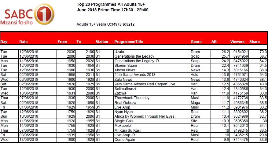
SA TV Ratings: SABC 1 — primetime top 20 for Jun 2018

by MarkLives (@marklives) The hottest primetime shows on SABC 1 in South Africa revealed: TV ratings for June 2018.

SABC 1 June 2018

BRCSA TV Ratings June 2018 primetime SABC 1
Click to enlarge to view clearly

Source: BRCSA June 2018

In 2016, the Broadcast Research Council of South Africa (BRCSA) changed its policy about giving away TAMS and now only monthly reports, highlighting the top 20 or 30 primetime shows on several popular channels, are available.


Broadcast Research Council of South AfricaThe Broadcast Research Council of South Africa (the BRC) is a non-profit, industry body that was incorporated in 2015 to cater to the audience research needs of the radio and television industry in South Africa.

— One subscription form, three newsletters: sign up now for the MarkLives newsletter, including Ramify headlines; The Interlocker, our new monthly comms-focused mailer; and Brands & Branding, launching soon!

#AgencyFocus: Family-run agency plays by own rules

by Carey Finn (@carey_finn) Joburg-based design and branding agency, Xfacta, isn’t trying to be the biggest name in adland. MD Nick Schilperoort says that the small(ish) company is happy to be the little ankle-biters who have fun while showing the industry what they can do within the design space.

Extensive portfolio

While the agency has made only an occasional blip on the industry news radar, it has an extensive portfolio of clients. Among these are King Price Insurance, for which Xfacta has served as branding agency for five years (it did the strategic overseeing of that tractor ad), Accenture, Bigen Group, South Point, Interwaste and Vumatel.

https://youtu.be/W2zLQS-ZKqk

The relative silence is a result of CEO Kees Schilperoort’s focus on making his clients famous, rather than the agency itself, he says. He believes that recognition and awards ought to go to the brands, and urges his employees not to get too distracted by the prospect of accolades. “It’s a thin veneer that exists in our industry,” he says. “I judge on whether we’ve done our best, and at the end of the year the numbers talk for themselves. The fact that we keep on getting clients who want to work with us is our reward.” He cites the agency’s recent work with luxury resort, Miavana, as a particular talking point.

Kees is Schilperoort senior, and Xfacta is his second venture in life; he was a creative partner in Pentagraph (which became Brand Union and then Superunion) and, after a long career in large agencies, was eager to make a fresh start. “You gravitate back to your roots, and it’s a lot of fun to do the things you weren’t able to,” he explains, describing parts of his history as people buying bakeries without any interest in their recipes. “My job was to create the recipes and sprinkles.”

Frustrating

Schilperoort says that he found it frustrating, as a creative, to come up against limitations in the corporate environment, something he sought to remedy with the launching of Xfacta in 2006. “I decided to start a bespoke company and flip it around so I could choose the clients — it was an operation filled with idealistic aspirations.” His plan seems to have worked, with the agency rapidly gaining traction. “We were easily accepted by a client base and, quite frankly, at the beginning it wasn’t even about growth — it was about doing what we loved,” he says.

Nick, whose studies were in commerce, came onboard in 2012, after cutting his teeth at TBWA\Hunt Lascaris. His interest in the industry was seeded much earlier, however; he found himself immersed in the creative field ‘from day dot’, spending a lot of time in agencies with his father while growing up. “It formed a big part of my life, and this is a passion that we as a family share,” he says, adding that the idea of a family-run business doesn’t stop at the two of them. “The agency operates like a design family, which sees us not only eating lunch together each day but tackling every brief as a consolidated unit.”

When Nick joined the ranks at Xfacta, the team was five-strong; it’s since grown to 20 — and the Schilperoorts say that’s where they’d like to keep it for now. The average age (minus his father, quips Nick) is in the mid-20, a factor that the pair say helps the studio thrive.

“Seedlings”

They prefer “seedlings to old dogs who don’t learn new tricks and are not flexible,” explains Kees, and all of the talent is multiskilled. “People come in thinking they’re graphic designers but before they know it they’re interior designers, then they’re doing product design and directing a TVC — and that’s simply the nature of the business,” he says. This applies to their account executives and those in other roles, too. “The person who meets you at the door has to understand how the whole business works,” he says. “I believe that we are running a team of 20 entrepreneurs here.”

The variety of skills expected of the team reflects the wide scope of work Xfacta undertakes. “We can go from working on a blue-chip company to a school bookfair,” says Nick.

“We have some of the very best talent in the world,” adds Kees. “We can go from super-luxury to technology, specialist services and then the casino business all in one day. The cross-pollination of thinking is very important.”

Without wanting to come across as arrogant, however, the agency is selective about its clients, says Kees. “The fit has to be right,” he says. “A lot of people say it, but we try and walk it here — we ask do we like the client and does the client like us? We need to be happy on a two-way street, and we find that it works. The phone rings.”

Works differently

Nick reports year-on-year financial growth of 50% over the last three years. Being a designand  branding studio, Xfacta works differently to many in the world of advertising, where massive retainers or accounts might be sought after, he says. “But we do buck the [project-based] trend, because a lot of our revenue seems to be retainer-based income, purely on the fact that we are brand custodians for the majority of our clients.”

Going forward into 2019, Xfacta is focused on two major goals: continued collaboration with industry experts, something the agency already does “unashamedly” to deliver to its clients, and continued integration and positioning of creative digital technologies in its offerings. “What we’re seeing as a global movement in the design space, particularly in branding, is this idea of bringing digital seamlessly into the idea of building brands, without it being a separate entity,” says Nick. This is something being focused on internally, while leaving the social and community management side of digital to others.

Xfacta logo
xfacta.co.za

  • Office locations: Joburg
  • Revenue band: R10–15m
  • Staff count: 20
  • Key clients: Accenture, Bigen Group, Interwaste, King Price Insurance, Leadhome, Metier Investment and Advisory Services, South Point, Trackmatic, Time + Tide, Vumatel.
  • Services: Insight generation, brand strategy, name generation, communication design, motion graphics, wayfinding


Carey FinnCarey Finn (@carey_finn) is a writer and editor with a decade and a half of industry experience, having covered everything from ethical sushi in Japan to the technicalities of roofing, agriculture, medical stuff and more. She’s also taught English and journalism, and dabbled in various other communications ventures along the way, including risk reporting. As a contributing writer to MarkLives.com, her new column “#AgencyFocus” is an ongoing weekly series updating the market on agency performance, including business performance, innovation, initiatives, the work, awards and people.

— One subscription form, three newsletters: sign up now for the MarkLives newsletter, including Ramify headlines; The Interlocker, our new monthly comms-focused mailer; and Brands & Branding, launching soon!

Behind the Absa brand relaunch

by Paul Hinch (@paul_hinch) & Yatish Narsi (@YatishNarsi) Rebranding one of South Africa’s biggest brands, Absa, as a digitally led bank in a sector undergoing massive change — and launching it into Africa after global partner, Barclays, withdrew — has been a momentous undertaking and one of the most talked-about brand relaunches that the continent has seen in recent years. It’s required a deep dive into strategy and culture.

Something new and fresh

The challenge was to take a leading brand such as Absa, that has gone through more than one rebrand iteration, and revitalise the brand identity to make it digitally led and approachable — to appeal not only to the market and consumers but to existing and the new staff, the Barclays employees — to create something new and fresh for the African market.

It was about being brave, passionate and ready. Whatever the logo looked like, it had to speak to community, be holistic, inclusive, a 360 solution, nurturing. We needed to create something that could permeate and amalgamate two distinct brands across Africa. A ‘oneness’ was key, a sense of uniting a continent of colleagues and customers; being one entity with people inextricably at our core.

The brand redesign has been about what’s behind the logo: the entire brand experience, new business strategy, and Absa’s move to being a digitally led bank and an African bank. At the same time, it has to work well as a tile on screens and phones as banking embraces the challenges and opportunities of the digital era. Most important is that Absa is a proper African bank, built through scale and philosophy, to become a human-centred bank, considerate of what its customers need.

There’s an entire visual set is driving and supporting the meaning behind the logo, a visual language. We want the logo to be a word, not an acronym. We want a dynamic brand identity, fully integrated, a logo that comes to life, not an icon sitting in a corner.

Steeped in symbolism

The bespoke new Absa font has been created by the globally renowned logo and font specialist, Miles Newlyn, who is based in London. The circle is dynamic, and frames the lower-case “absa”. While put to use as a warm, embracing frame for the new logotype, the circle is steeped in symbolism. The business may be understood as an almost infinite number of parts — divisions, regions, campuses, offices, floors, teams, individuals, families, relations, communities — all arranged around our philosophy and common goal: to bring your possibility to life. This is focused, unidirectional dynamism…

As part of the rationale of catering to an audience as geographically and culturally diverse as Africa, we’ve sought out a communications solution removed from language and syntax yet still capable of creating, conveying and deepening the meaning of our messages. A brand is about more than a logo; it’s about how you make people feel. We need to have these conversations around design, about what it is and how it looks and acts: it needs to mean something.

Absa rebrand artboard collageThe Absa rebrand has been unprecedented in the number of touchpoints needed to be considered from an experience point of view. We looked at all brand asset: from how customers use the brand to the ATM housings, ATM sounds and animations; app sounds; frame animations for the TV commercials; curation of sound design, from mnemonics to audio haptic; the brand overlay on the digital interfaces; brochure holders; branch design; branch furniture; mobile ATMs; billboards; and the web interface to the bank cards. A notable aside is that the height of the couches in the branches have even been raised a few centimetres to make them more comfortable for patrons to sit on.

Principle-based brand

The brand is intended to operate as a principle-based one, meaning that other creatives may take elements of the brand and adapt it and let it communicate as they need it to in other spaces. The bespoke colour palette developed has a wide range of ‘reds’ to allow for that creativity, or even climate impact on outdoor branding or colour variations in printing; it also provides a nuanced experience of the colour that isn’t absolute. Colours range from ‘passion red’ to ‘smile red’ to ‘surprise red’ and ‘calm red’.

Generally, banking is a category of compliance, risk management. That’s what you do. How you make people feel is at the core of this iconic rebrand.

Absa represents “Africanacity”, which stands for entrepreneurial, pushing boundaries, flexible and expressive. It is a new mindset for the organisation, culturally. The primary focus is how customers engage with the brand and how the brand makes them feel. This is the culture for brands today and the new human-centred approach of Absa.

See also


Paul HinchYatish Narsi Paul Hinch (@paul_hinch) is ECD and partner, and Yatish Narsi (@YatishNarsi) is chief experience officer at GRID Worldwide. Paul has worked on brands such as African Bank, ACSA, Brand South Africa, Boardmans, BP, B&G, Converse, eBucks, Edgars, FNB, IMC, Investec, KFC, Liberty, MTN, Nissan, Skye, South African Tourism, Ster-Kinekor, dti, Uganda Telecoms, and Virgin Mobile. Yatish has worked with Standard Bank, the TFG Group, Due South, Markham, Tile Africa, Wimpy, Steers, Mugg & Bean, Nandos, MTN, Jet, Coricraft, and Toys R Us. Both have worked on Absa, obviously.

“Motive” is a by-invitation-only column on MarkLives.com. Contributors are picked by the editors but generally don’t form part of our regular columnist lineup, unless the topic is off-column.

— One subscription form, three newsletters: sign up now for the MarkLives newsletter, including Ramify headlines; The Interlocker, our new monthly comms-focused mailer; and Brands & Branding, launching soon!

Online CPD Courses Psychology Online CPD Courses Marketing analytics software Marketing analytics software for small business Business management software Business accounting software Gearbox repair company Makeup artist