by Marguerite Coetzee. As technology evolves, so, too, do our methods of research, communication, interaction, shopping and consumption. Consumers are looking for intuitive, convenient, seamless, smart, instant, predictive, adaptive, ethical, meaningful and informative solutions. Technology has filtered through to almost every aspect of our lives; what matters now is how we use it to our benefit, to enhance the consumer experience, and to shape the future in a positive way.
There are generally two polarised reactions to the developments in tech (particularly when thinking about the future): enthusiasm for the advancements in science, medicine, and education, or outright fear and dismay. The latter is usually directed towards the dread of losing jobs to automation, or the panic of robots going rogue. It’s up to us to make wise, considerate and purposeful decisions when using technology.
Quantum leap
In 1889, French artists painted their predictions of what the year 2000 would look like. They were preoccupied with ideas of flying machines, underwater adventures and purposeful technologies (such as cleaning machines or educational transferences). In the late ’80s, in the movie Back to the Future II, Marty McFly and Doc Brown travel to the future, to 21 October 2015. We saw predictions of hoverboards (which sort of came true), video calls (which we have now in Skype and FaceTime), drones (even partnering with GoPro for creative use), video glasses (although Google Glasses weren’t as popular as anticipated) and biometrics (such as Apple Pay that allows you to validate payments with a glance).
https://youtu.be/tbgeZKo6IUI
What’s next
The imagination never ceases to amaze (and sometimes amuse). We’re increasingly becoming more imaginative as technology develops and shapes our world views and ideas of what is possible. We’re ever more creative and resourceful, making improvements to our lifestyles, formulating new solutions to old problems, creating transformational value, making more-informed decisions, modifying reality, becoming more efficient, and developing cleaner ways of living — all through technology. We’re even entering a new space age.
As researchers, consultants, brands and advertisers, it’s not enough to simply keep up with the times — we have to imagine, innovate and implement. We can do this by exploring:
the relationship between people and digital-era technology: understanding the consumer experience, their attitude towards technology, and their access to technology
investigating how online (artificial) and offline (natural) worlds interact or merge: artificial intelligence (AI), augmented reality (AR), computer-generated experience, simulated reality, virtual reality (VR), wearable tech, smart objects, or
even taking a digital approach to research: conduct online focus groups, join virtual communities, document digital conversations
It’s important to frame the consumer’s digital experience in terms of a human experience — what’s the core sociocultural need that drives their interactions with the digital world?
Marguerite Coetzee is an anthropologist at strategic marketing consultancy, Kantar Consulting. FastForward, the latest series in her regular column on MarkLives, takes an intellectual, scientific and artistic approach to the future – particularly the future of Africa.
San Francisco-based publishing company, McSweeney’s, promotes contemporary writing in printed form through its website, driving awareness of new and relevant authors across media. Refreshing in its angle, with lots of shelf appeal, #53 of McSweeney’s magazine is more reminiscent of a children’s lucky packet with its bespoke Ziploc-style packaging. This issue is similar in approach to a local South African publication called MK Bruce Lee, published by established South African designers, Peet Pienaar and Hannerie Visser, and produced several years ago through their now-defunct Cape Town-based design studio, The President. Perhaps the most-striking aspect of this issue are the eight party balloons, which need to be blown-up for one to access and read the stories that are printed on them. The vinyl-bound hardcover is also a quality piece of magazine craft, illustrated by a yet uncredited illustrator.
Most university graduates may relate to the traditional tossing of their oxford hats into the air at graduation ceremonies. But, after that one short moment where everything seems possible, life kicks in and the question often arises, what now? It’s an age-old dilemma; nobody teaches us as students in university how to be savvy with our lives after graduating, particularly when it comes to finding a job, paying taxes, avoiding debt (other than student loan debt), etc.
A special section of the New York Times, titled “Life After College”, tackles this topic in an accessible and approachable way. The clean, structured, and minimal cover and layout inside are art-directed by Andrew Sondern, supported by illustration from Eden Weingart who poetically depicts this important university experience as the motion of the oxford hat rising up and then falling. In an odd way, the cover reminds one of Richard Longo’s series titled “Men in the Cities”, made famous by the film, American Psycho, adapted from Brett Easton Eliss’s infamous novel. The supplementary website for this special section follows the same design sensibility, imbued with synergy and continuity, and offering a microcosm into the world out there after graduation day.
For many a fashion institution, the Parisian department store, Galeries Lafayette, has recently added to its iconic retail brand with its own online magazine. Launched in September this year, #1 is a tastefully designed website that exhibits a strong awareness of web design, and follows the latest media standards and trends. The site speaks in an apt tone of voice, supported by considered art direction, dynamic layouts, animated visuals, subtle transitions, well-directed and styled photography and video content, all crowned by a solid ecommerce platform and intuitive navigation.
Accessible sections, including features and articles about the latest fashion trends, fashion advice, and happenings, make the site ever more engaging. With all its attractive content, arguably the most attractive section is “Go for Good”, which is spearheaded by the call to action #GoForGood, a movement for ethical fashion. A collaboration with fashion designer, Stella McCartney, who emphasises sustainable luxury fashion with her own brand, #GoForGood is a social awareness campaign that promotes the idea of looking good while doing good. “The Good Spot” is a section of the site that showcases products that adhere to the ethics and values that apply to the movement. #GoForGood launched on 10 October; find more info here.
Edited by art critic, Jennifer Sorrell, ADA was a South African cultural magazine first published in 1986 during the height of the apartheid era. Its name is an abbreviation for “Architecture, Design, Art”, which also acted as the magazine’s tagline and effectively defined the focus of the publication. Most issues were printed using a large A3 format, with a design approach typical of the late ’80s zeitgeist in South Africa concurrent to the resistance movements fighting against apartheid, just before independence and the rise of democracy. As such, the magazine delivered an alternative type of journalism that was metropolitan and interdisciplinary, true to the spirit of resistance and transformation in SA at the time, and envisioned a prospective post-apartheid cultural identity.
Fourteen issues were sporadically published between 1986 and 1996. Although it could be argued that architecture is design within the scope of the magazine, art was seen to be a looser term comprising various art forms, including the fine arts, music, literature, dance, theatre, and many more. ADA discovered and supported now-important local talents, all historical contributors to SA culture, many of whom have themselves become cultural establishments.
There are too many significant moments in the magazine’s history to mention but some highlights include #1, which introduced Manfred Zylla; #7, which featured Helen Sebidi; #8, which featured Fook island ‘citizen’ Norman Catherine on the cover; #9, which profiled George Pemba; #11, which included an early Bitterkomix comic-strip titled “Suidoos” by Conrad Botes; #13, which had a photomontage of president Nelson Mandela by Lien Botha and an interview by Pieter-Dirk Uys with Madiba — the list goes on. The final issue, #14, published in 1996, featured contemporary legends David Goldblatt, Steven Cohen, William Kentridge, and Penny Siopis, to name a few.
Perhaps the most-popular issues were the cultural “A to Z” profiles, which focused on the three largest cities in SA — Cape Town (#11), Durban (#12), and Johannesburg (#14) — which gradually developed a quasi-avant-garde narrative surrounding each scene. Based on the creative energy and cultural verve of the time, perhaps there’s a lesson to be learned from ADA’s prolific formula: intentionally producing culture as opposed to blindly consuming it.
Special mention
Before this becomes old news, a brief visual association to illustrate how meaningful Banksy’s recent performance is, where he made his ‘Girl with Red Balloon’ artwork self-destruct seconds after it was sold at a Sotheby’s auction in London for close on R20m — if not for its commentary about the current socioeconomic state of the world, then at best for the storytelling potential of intertextuality, parody, and appropriation, particularly the way this event riffs off Marcel Duchamp’s infamous large glass. Some more parodies here.
Shane de Lange (@shanenilfunct) is a designer, writer, and educator currently based in Cape Town, South Africa, working in the fields of communication design and digital media. He works from Gilgamesh, a small design studio, and is a senior lecturer in graphic design at Vega School in Cape Town. Connect on Pinterest and Instagram.
Media Design, formerly Cover Stories and MagLove, is a regular slot deconstructing media cover design, both past and present.
by Leeya Hendricks (@LeeyaHendricks) With the ongoing shift in enterprise focus to the needs of the customer, the role of chief marketing officer (CMO) is changing to become more in sync with customer needs and business challenges. At the same time, however, chief customer officers (CCOs) are becoming more prevalent at the cost of CMO numbers, to give supposedly better effect to this shift. What can we read into this evolution?
Is it a welcome segue into a new customer-centric age, or a worrying miscalculation of what marketing is and does? Perhaps a more-pragmatic question is whether it’s finally time for marketing to refocus and rebrand. At the same time, organisations must also restructure to support this pivotal evolution.
So, what may CMOs learn from the rapid ascent of the CCO?
Focusing on the customer journey
CCOs are claiming a seat at the table at more and more top brands, leaving a clear lesson for marketing teams — how to add more value through an understanding of the customer’s buying journey and by nurturing the customer experience (CX) at every touchpoint through their lifecycle as a customer.
In a sense, the rise of the CCO needs not have been this swift: Marketers, too, should have been focusing on the customer journey, rather than just their traditional remit of marketing communications and brand-building. The classic marketing structure is increasingly a thing of the past for many businesses today and, as a result, marketing is taking on a different role in different sectors.
The constantly changing technology industry in particular is beholden to supremely empowered customers, who are more dynamic, agile and demanding as a result of technological enablement. Taking a leaf from that sector, a more customer-centric marketing function must embrace digital transformation.
In short, leading CMOs realise that customers expect marcoms and digital to be fully joined up and integrated, ebusiness to be a reality, and the end-to-end customer journey to be top of mind for vendors.
Mapping competencies
Business-to-business (B2B) research firm, Sirius Decisions, highlights that:
89% of chief experience officers (CXOs) say vendor brand perception has a moderate-to-significant influence on their supplier short-list creation
80% of a CXO’s final choice of vendor is based on personal experience with a company, or others’ experience
And who is entrusted with perception but marketing? Bearing that in mind, CCOs don’t hold all the aces in the developing B2B customer marketing arena — CMOs are uniquely skilled to help bring the organisation’s customer-focused message to life, highlighting its best aspects and the benefits of its offerings throughout the post-sale customer journey.
The expanding role of the CMO
To accomplish their goals, customer marketing leaders and their teams must therefore possess a diverse set of competencies.
Sirius Decisions defines customer marketing as a function that develops engagement, loyalty, advocacy, growth and community participation for current customers. It likens the marketing function to that of a film director, who controls the dramatic, artistic and overall tone of a film, bringing a script to life while guiding the technical crew and actors to fulfil their vision. In this, the director plays a key role in selecting the cast, production team and creative direction of the filmmaking process, coaching and directing each cast member and helping to shape the overall film experience.
The CMO role is becoming no less nuanced and varied, playing a role in shaping and guiding the user experience by working with UX, front-end and digital teams in addition to the more-traditional functions of directing creative and placement, and working with the business in shaping the marketing direction.
The marketing organisation of the future
Marketing Week research done in partnership with MiQ shows brands have some way to go in structuring their marketing departments around customer-centric business models. This end state is currently the least prevalent model of all, with most departments either being product-centric or structured around marketing disciplines.
Ironically, finds the Future Marketing Organisation study, conducted by MiQ, 42.2% of marketers believe a customer-centric model is the way to go, but only 5.8% of respondents’ companies follow this approach. By comparison, 37.3% say their department is set up around individual products or brands, and 19.4% say one or another marketing discipline dictates structure.
What can we learn from this?
There’s clearly a desire to change marketing to fit better with customers’ lifecycle, behaviour and preferences. That being so, marketers should devote much thought and planning to moving their organisations towards a more customer-centric business model.
Mapping your organisational structure, competencies and technology platform to customer needs at every juncture, and doing so now, will make the business hyper-aware of and responsive to any shift in attitudes and customer preferences down the line.
Leeya Hendricks (@LeeyaHendricks) is a designated chartered marketer, global marketing strategist, digital driver and a Women in Tech leader. She holds a BA degree in fine arts, a BA honours degree in brand marketing management, an MBA in business management and is completing her PhD in marketing management. She is now director of customer first marketing at ORACLE UKI, responsible for driving customer success through customer advocacy, and building strategic partnerships focused on emerging technology and the changed customers’ buying behaviour. Leeya contributes the monthly column “Gestalt”, about putting customers first for sustainable business success, to MarkLives.
Cheryl Hunter (research at marklives.com)’s weekly wrap of the latest market and consumer research:
Getting the right data
Wine exports up
Gigs and side hustles
‘You can(‘t) always get want you want’
Over the next few weeks, WhyFive Insights will be sharing a selection of insights from the 2018/19 BrandMapp survey, including what’s worrying the youth; why banks should be nervous; the future of money; the rise of Uber; and SA exit strategies. This week Brandon de Kock, WhyFive Insights director, explains why ‘you can(’t) always get want you want’ in research.
by Brandon de Kock. When it comes to finding the right data for the job in South Africa, Mick Jagger’s words certainly apply. Then again, “If you try sometimes you might find/You get what you need!” As always, strategists with brands aimed at the top 30% of income earners will probably not find what they need in the data offered by the recently released ‘AMPS replacement’ studies.
In a nutshell, establishment surveys (ES, PAMS etc) aim to paint pictures of the entire 40m adult consumers in the market. They rely on old-fashioned, face-to-face methodology and are obliged to find representative quotas. So, when it comes to the bottom 70% of the market, they do an excellent job: perfect if you’re selling maize, soap or anything else that resembles ‘low unit cost and high volume’.
But, if you’re trying to sell goods and services into more sophisticated consumer segments, the sample sizes aren’t viable and the practical value of the data is cloudy, to say the least. This ‘sophisticated’ segment we’re talking about takes home (and spends) about 80% of total income in the country, but they’re a minority in establishment survey data.
Simply put, the 25 000 plus people surveyed annually fall into that elusive upper 30% income segment of SA — that’s only 12.5m adults who live in households earning more than R10 000 monthly income but it’s the 12.5m who have meaningful disposable income.
The BrandMapp study offers a comprehensive view of those customers — their demography, their needs, their perceptions and behaviors and their brand usage across more than 1 800 filters. It’s a sophisticated interrogation of a sophisticated audience using sophisticated methodologies. And if you serve this market, you can actually get what you want.
Wine exports have seen a surge in volume, making up the majority share of the total volume share for 2017 as international demand for wine has increased tremendously over the past few years. This is according to a new BMi Research report, “Wine in SA — Feedback Report”.
The weak rand exchange rate has made the export trade more attractive for local producers. It’s also believed that certain parts of Europe experienced a bad harvest which has led to a rise in imported wine from South Africa.
Locally, the wine industry performed below par, as the volume declined compared to 2016. The only region that recorded a growth in volume for the base year was Gauteng. Lower disposable income, due to the weak economy, may be one of the contributing factors to the reduced demand for wine in the on-consumption channel, as consumers may be going out less often than previously.
The poor performance of the category may also be attributed to cheaper alcoholic beverages that offer greater value for money than wine. Wine has also had to compete with other alcoholic beverages, such as beer, which saw an increase in volume for the same period.
The industry selling-price increase in wine far exceeded annual CPI. It’s said that the drought has been a major driver of the price hike, as many vineyards are situated in the areas that have been hit the hardest. This has had a knock-on effect on production costs.
A new Market Data report examines the fast-growing “gig” economy. Gigs, or short-term, part-time jobs, have become more popular among US consumers who want to diversify their income streams, with technology playing a big part as mobile apps and online platforms make it much easier to connect with customers and get paid quickly.
The report examines the evolution of gig work, its pros and cons, the reason that demand has risen among young and older workers, average earnings, and profiles of leading gig work sectors (ride sharing, temporary staffing agencies, food delivery services, personal coaching, home rentals, freelancer platforms).
Competitor profiles are provided for: Airbnb, Uber, Lyft, Door Dash, Postmates, GrubHub, Instacart, Fiverr, Upwork, Udemy, Coursera, the personal coaching industry, temp-help staffing industry, and more.
Cheryl Hunter (@cherylhunter) has written for the South African media, marketing and advertising industries for more than 15 years. A former editor of M&M in Independent Newspapers and contributor to Bizcommunity, AdFocus, AdReview and the Ad Annual, she has also produced for various television networks and currently consults on communication strategy and media liaison. She now does the new weekly “Market Research Wrap” column for MarkLives.com.
by DK Badenhorst (@BrandCultureSA) Parody is an interesting feature in the face of literature and culture and, as with like most cultural concepts, it’s difficult to throw hard and fast borders around it. We all know it when we see it but even someone like parody artist, Weird Al Yankovic, sometimes creates pieces of work that simply replace the words of the original to make an entirely new narrative.
It’s not strictly a parody, which should in some way talk to the essence of the original piece. Take, for instance, Yankovic’s remake, Eat It, which really just encourages listeners to eat anything, while Michael Jackson’s Beat It is centred more on the king of pop’s take on street gangs. The former is in no way commentary on the latter.
A useful function
A good example of parody is Key of Awesome’s take on Lorde’s Royals. The original describes middle-class life in New Zealand as sidelined, boring and even “torn up”. The parody comments that Lorde is in no way subject to this life, making a fair income off her music and that she may even be seen with Jay Z. While this commentary might not be fair, we can see how it addresses something that Lorde has even explained on radio —that her no. 1 hit at the time wasn’t about her own life at all.
That aside, if we look at parody then, it serves a useful function. Like the jester, it’s the fool who can address the elephant in the room. Jesters hide behind comedy, which allows them to speak over the tyranny of power. They, however, are no buffoon and use language skillfully to navigate the perils of the joke potentially not landing, rendering their defence useless.
Nando’s More South African Flavour
So, let’s then look at a much-written-about commercial that recently hit our computer screens. On Monday, 3 September 2018, Nando’s launched Afro-tising/More South African Flavour. Its formula is simple but effective — take the dramatic imagery that’s become dominant in South African advertising and call it out for what it is.
Since 2015, when Guinness launched the Made of Black ad, this treatment has become more and more prevalent and, over the years, very little has changed in the visual language. This is why Nando’s can now, in 2018, call the tropes out by name. What’s curious about it is that the mechanic at work is something we very often see when people call signs out and disregard their meaning in order to undermine the symbol. A comment such as “Just because your shoes has three stripes on it doesn’t mean you’re original” is an effort to discredit the symbolism and undermine the statement the brand makes. And, in a way, that’s what the fast-food chicken brand is doing.
What makes Nando’s critique of the symbolism different to someone’s opinion of adidas is that the signifier-meaning relationship is different in the case of adidas.
Afrofuturism
What do I mean when I say that? The ads in question all borrow language from the global phenomenon of Afrofuturism. It’s an enormous cultural movement that seems to be bigger than any particular celebrity. Many celebrities take part and blockbusters such as Black Panther fit in, but none may individually be seen as the vanguard of a movement that stretches far into the future and reaches deep into history. It simultaneously articulates the past and the future in a present day where technology and our environment are evolving faster than our symbolism can keep up with.
So, if we had to think back to the role of the jester, what does Nando’s call out? What is the elephant in the room? It’s this connection between signifier and meaning that’s been weakened.
The smoke bombs got their original meaning from war as part-camouflage but largely as a signaling tool to either call for reinforcement or extraction. It’s been adopted into the sports spectator world, performance art and now Afrofuturism, and has an interesting way of combining combat with togetherness. Smoke bombs seem to appear when the representative is speaking on behalf of others — be it during demonstration, sporting events or even art.
Steeped in symbolism
The cathode ray tube TVs, stacked and burning, are also steeped in symbolism. The stacked TVs made its first debut in store windows and quickly became a symbol of consumerism: the now-nostalgic image of people watching a sporting event on the same stack of TVs in the shop window, the experience allowing you a taste of ownership in as much as you were willing to stand in the cold. The CRT screen also has links to Orwell’s 1984 dystopian sci-fi novel as the ears and eyes of Big Brother and it’s this meaning that Apple leveraged to bring the idea of ‘free thinking’ to life in its commercial named after the book. CRT screens seem to be a symbol of Big Brother, The Man or subversive forces that funnels our mind into a single direction.
Here we’re just touching on the web of meaning that lurks beneath the surface of any signifier when seen in its context. It’s by no means a comprehensive understanding of the symbolism but it serves to illustrate their complexity and how, when we stack these symbols on top of each other, the narrative and symbolism become even richer.
How much of this meaning or intent was transferred to the commercials in question? Did the burning TVs bring with them the full weight of the original symbol? Or is it simply, as the TVC states, “how we sell things these days?” The growing gap between what we show and what we mean has allowed for a bit of room into which Nando’s could launch its parody.
Not necessarily negative
Being parodied isn’t, however, necessarily negative; Jackson is said to have enjoyed Yankovic’s work. And beyond pop music, it can tackle serious issues and stands to bring a human face to concepts and ideas that could otherwise be difficult to address or shed light on. What’s important, though, is to understand what the parody’s trying to do.
In our case, it’s firstly important to acknowledge that the ads that leverage the visual language of Afrofuturism are impressive to watch; indeed, they can be watched over and over again. The language is compelling and impressive, and we should engage with it and understand it. But it does flirt with a cultural movement that might be articulating things that stands beyond the purview of the brands in question. Are they really repositioning to embrace the meaning of the language they’re using? Or, a more-constructive question: how can these brands credibly take part in the bigger shift at work?
Not too long ago, we had all sorts of brands claiming that something ‘must fall’. It took away from the original movement and it made for a clumsy brand message, but the phrase was popular and on the tip of everyone’s tongue and it seemed like a good idea. The language of Afrofuturism is visually more complex than the razor-sharp message of the Fees Must Fall movement; the principle, however, remains the same — symbolic imitation doesn’t guarantee cultural relevance.
Cultural relevance
So how do we ensure cultural relevance and why should we bother?
While this is a relatively big question, I would like to touch on a few ideas. First, we need to appreciate and understand the cultural meaning of the space we’re planning to operate in. Semiotics has proven to be one of the more-useful tools in the toolbox of strategy and cultural insight, and sheds light on the connection between a signifier and the meaning just below the surface. It allows us insight into the world of consumers in a way that they often struggle to articulate. While someone can tell you, “I like Superman because he is strong”, cultural insight tells you why strength is valued and why we even have superheroes. From this viewpoint, it’s easy to see how, if you move from trying to look like Superman, you’ll instead try to tap into the real need for heroism and potentially address a deeper desire.
The ultimate goal is to discover the narrative that underpins the meaning in order to create brands and brand values that reflect desires, aspirations and hopes of the future, rather than simply what the present looks like.
Refreshing
I’m sure there’s no malice behind the Nando’s ad. The piece is a perfect representation of who the brand is and echoes the long relationship it shares with South Africans. Over the years, it’s taken aim at politicians, xenophobes and dictators. This lighthearted parody is also refreshing in a time where the news almost satirises itself on a daily basis. It’s innocent and fun and uplifting and, if anything, it will make us think twice before reaching for the face paint and urge us to dig a bit deeper and find a connection where it matters.
DK Badenhorst (@BrandCultureSA) brings cultural context and long-term trend insights to brand communication through cultural insight and semiotics. He is back to contributing the monthly “Brand Culture” column, exploring the value and meaning interaction between brands and society, to MarkLives.com.
by MarkLives (@marklives) This week we feature insight into the brief, creative idea, production challenges and results of the Afro-tising campaign for Nando’s from M&C Saatchi Abel.
Client: Nando’s Ad agency: M&C Saatchi Abel Title: Afro-tising/More South African Flavour
Information supplied by M&C Saatchi Abel.
Rationale
There’s this new look to South African ads and we see more of it every day:
It’s Ponte Tower piled high with garbage.
It’s oiled up black men running through derelict streets in slow motion.
It’s dancers covered in neon face-paint, or influencers in gritty street fashion staring defiantly at camera, yelling about hashtags or waving colourful smoke bombs.
It’s youth culture, amiright?
Well, no.
It’s an African artistic aesthetic that’s been borrowed, copied and stolen by marketers to try and sell things to young people. Never mind that the aesthetic is borrowed from real African creatives who are building to the culture, but the strategy is so transparent. It’s lazy, cynical and a little insulting to the audience, and it’s made what once was an edgy, interesting aesthetic feel tired and formulaic.
There’s so much more to South Africa than this one narrow vignette, and we wanted to remind advertisers of that with characteristic Nando’s fire and humour.
Creative summary
When writing the script and researching the ad, we found over 40 examples of what we termed “Afro-tising ads/content” produced in just the last three years.
Our ad references all the well-trodden “Afro-tising” tropes: The neon, the hashtags, the style of voiceover, the burning gritty streets, the poverty porn, the thrones, and the fetishised African tribalism.
We open with a tip of the cap to Absa’s “Africanacity” campaign as the best recent example of this type of a brand latching on to “Afro-tising” to try and connect with the youth.
We reference how fashionable it has become to put a person with albinism in an ad — how this often feels more like fetishising than accepting and celebrating.
In the ad we see Khuli Chana, who partnered with Absolut vodka to make a ground-breaking, fiercely African music video, telling a copycat on a throne of garbage to get out of the way. This is a nod to the fact that Khuli, whose work helped establish this fierce gritty new African aesthetic, partnered with us because he’s also tired of seeing it copied everywhere by everyone.
Finally, our voiceover nails home the point with the line, “It’s all looking the same”.
Production
Hamilton Dlamini, our lead actor, was in a theatre play in London and he is an actor in the local soapy, “Generations”. Both of these productions clashed with our prep and initial shoot days, so we had scheduling challenges around his availability. The team wasn’t not prepared to compromise his role in the Nando’s ad, as he’s the deep voiceover from the Castle Milk Stout ad and played into the trope of the deep African voice. Our shoot date ended up shifting a few days later to accommodate his availability, which only left a week for full post-production.
The hyena was a massive challenge. You need special permits to travel wild animals and it would have taken two months for us to secure a permit. We used a dog styled as a hyena on our shoot date; however, Tebza, our director, wasn’t satisfied with this and determined to film a real hyena. He ended up filming one at a rehabilitation farm two days later, which was composited into the ad in post-production.
It’s near impossible to get road closures in JHB CBD on any given weekday, due to traffic congestion, yet we managed to negotiate with city officials to close off a section of Fox Street for a full day and set dress and shoot.
The biggest challenge was timing — we literally executed the job in four weeks, from production go ahead.
Measurement
On Twitter, the campaign received 260 586 paid and 1 182 861 organic impressions in its first week. The view through rate on organic impressions came in at 14.86%. On Facebook, it received 643 507 paid and 445 010 organic views in its first week.
So far, the reaction to the ad has been overwhelmingly positive from consumers and industry leaders alike and, while some have suggested this is an ad made more for the advertising industry than consumers, consumers have been very vocal online in picking up the many in-joke references and expressing relief that Nando’s called out the tropes they were sick of. Maybe, as an industry, we should start giving our audience more credit.
Credits
Brand
Nando’s
Chief marketing officer, Africa, Middle East, South Asia: Doug Place
GM brand & strategy IMEA: Su-Lise Tessendorf
Advertising & media manager southern Africa: Jake Johnstone
Agency
M&C Saatchi Abel
Founding partner & executive creative director: Gordon Ray
Chief creative officer, M&C Saatchi Abel Group: Neo Mashigo
Head of strategy: Makosha Maja Rasethaba
Creative group head & copywriter: Joshua de Kock
Art director: Wade Barnes
Head of account management/business unit director: Kim Stewart
Head of broadcast production: Bronwyn Henry
Production company
Star Films
Director: Teboho Malope
Executive producer: Adam Thal
Line producer: Ashley Kadish
Set designer: Bobby Cardoso
DoP: Adam Bentel
Key wardrobe stylist: Bee Diamondhead
Key makeup: Adie Cohen
Food stylist: Nicky Hattingh
Post-production
The Upstairs Ludus
Offline editor: Andrew Trail
Colourist: Michelle Wilson
Online editor: Michael Naidoo
Music
Tiger Fight Music
Executive producer: Garth Barnes
#Campaigns is the new weekly MarkLives column featuring insight into the brief, creative idea, production challenges and results of South African communication campaigns, both ongoing and recent. Have a campaign worthy of being featured in #Campaigns? Submit a short motivation to and we may well be in touch. Please include links to campaign material, when it ran/is running and why you believe it should be featured.
by MarkLives (@marklives) Following a five-month process, Ford Motor Company has announced a global redesign of its marketing operations. BBDO becomes its global lead creative agency, with Wieden+Kennedy joining as innovation partner for specific projects.
BBDO begins transitioning to its new role on 1 November 2018, working closely with Ford’s team of ad agencies and company marketing experts. Ford will introduce a new US brand campaign later this month, supporting a series of Ford vehicles.
WPP
WPP, which used to hold the creative account through GTB (Global Team Blue), remains a part of Ford’s multi-agency team, leading activation (including media planning, media buying, shopper and performance marketing, website development, customer relationship marketing and multicultural and Tier 2 dealer advertising).
AdAge quotes Pivotal Research senior analyst, Brian Wieser, as saying “that an account of that size would generate between [US]$500 million and [US]$600 million in annual revenue,” suggesting that just less than half would be leaving WPP. Ford was WPP’s largest client. According to AdAge, Ford’s China business, public affairs, the US dealer business and Lincoln brand were excluded from the agency review.
The motor company also announced it’s creating more than 100 new in-house marketing positions tied to brand design, media tools and partnerships, digital labs and more. It aims to yield US$150m in efficiencies annually through the redesign.
Statement
“Over the past five months, WPP has been working with Ford Motor Company on its future marketing and advertising relationships,” said WPP in a media statement. “At the conclusion of the review, WPP will be responsible for activating the Ford brand through key channels and regions, through its global Ford agency GTB as well as other WPP agencies, while Ford has appointed another agency as its lead creative agency.
“WPP agencies will continue to handle activation, including media planning and buying, digital and production. These responsibilities also include Tier Two advertising work in the U.S., the China advertising operations with its joint venture partner, all Lincoln advertising, and all the Ford public relations business.
“WPP will work closely with Ford on the shape of its future relationship and the impact on its people.”
Reducing costs
The marketing redesign comes as Ford prepares to launch a raft of new products in the US and elsewhere, according to Joy Falotico, Ford group vice president and chief marketing officer. Ford is also moving to flexible vehicle architectures and more common parts across models, cutting new product development time — from sketch to dealer showroom — and reducing costs.
by Julia Ahlfeldt (@JuliaAhlfeldt) We live in a world where design thinking surrounds us. So why, then, are there still brands that break the cardinal rule and build their businesses around their needs — and not their customers?
There’s no need to name and shame, even though some would benefit from a strong hint. Rather, many have gotten it right and the ones to watch will be those brands that continue to push the envelope with their customer-centric evolution. This requires thinking outside of the box while keeping the needs of the customer front-and-centre. That may be a difficult task to manage but it’s not impossible. Here are two of my favourite examples.
Be brave and go beyond your comfort zone
Locally, a great example of customer experience (CX) strategy is Yuppiechef. Having recently interviewed co-founder Andrew Smith, it was clear from the onset of our conversation that the now 12-year-old retailer was, and still is, built around its customers.
It takes customer satisfaction seriously, so much so that it has custom-built everything, from its website to warehouse operations, with the resulting CX in mind. This mantra comes from the top, with leadership remaining connected to the brand promise. Smith still writes some of the famous handwritten customer thank-you notes and, if a customer has an issue, there’s a chance he’ll respond himself, as he occasionally jumps in to help the customer support team.
Yuppiechef — now purposely not Yuppiechef.com — has enjoyed great success with its ecommerce offering. It would have been easy to remain in this channel, but the business recognised that consumers want both an online and traditional instore experience. Listening to its customers’ needs, Yuppiechef leapt out of its comfort zone and into the realm of physical retail. Many South Africans gasped at this unexpected move from a truly South African ecommerce success story. Did it signal the end of ecommerce? Was the company in trouble? The truth is Smith and team humbly acknowledged that ecommerce is still small in South Africa. Coupled with an entrenched mall culture, this suggested a retailer should integrate physical with digital. So Yuppiechef launched a store to give customers more choice and access to online products, as well as engage new customers who may be sceptical to ecommerce. The calculated gamble has paid off and its third store opened last week at the V&A Waterfront in Cape Town (it also has an outlet store at Westlake).
A prime example of lateral thinking
Then there’s Amazon. The original online business. It was launched in 1994, and Amazon has branched out many times over its two-and-a-half decades. Initially started as an online bookstore, it soon diversified into electronics, furniture, toys, and later into its own tech devices, and streaming services.
Netflix and other online content-streaming services have disrupted traditional TV, but it’s been surprising to see a brand born from ecommerce enter the online content streaming space so successfully. Perhaps we shouldn’t be too surprised, though. The company now has a base of 100m customers to learn from, and Amazon has become a titan of customer-centric innovation. Unfazed by the unknown, Jeff Bezos encourages his team to think big, constantly innovate, and not fear failure. Over time, this has fostered an environment that’s perfect for lateral thinking and continual innovation.
The Amazon Prime subscription programme is perhaps the perfect example of Amazon’s lateral thinking. Originally launched as a discount shipping service, Prime evolved to bring Amazon’s suite of streaming, shopping, and online storage services into a cohesive offering of lifestyle products. Pushing the boundaries has paid off. Despite a recent price hike from US$99 to US$119, Amazon Prime continues to thrive because customers love it.
Ask what the customer wants
Yuppiechef and Amazon are among a celebrated club of businesses that have truly geared their businesses around customers. These brands aren’t held back by their legacy but rather remain agile and ready to meet customers where they want to be. To follow in their footsteps, design thinking must be integrated into every part of a business, from website user experience, employee experience and HR to front of house, call centre and marketing. Outdated silos and traditional standalone channels don’t cut it in a commercial world where customers demand integration, seamless experiences and choice, at good value.
But, as Smith put it, businesses should put themselves in their customers’ shoes and ask, “Would they be happy with this?” Such a simple question, yet one that may be hard to fulfil. When integrated with intent, it could turn a flagging behemoth into an agile innovator and even disrupt the disruptor. It just needs to keep its eye closely on the market and understand what its customers want next. Simple.
Julia Ahlfeldt (@JuliaAhlfeldt) is a certified customer experience professional (CCXP). For more must do’s and don’ts on how to keep customers returning again and again to buy from your brand, listen to her podcast, Decoding the Customer. She contributes the monthly column “The CX-Files”, which looks at current issues from a CX perspective, to MarkLives.
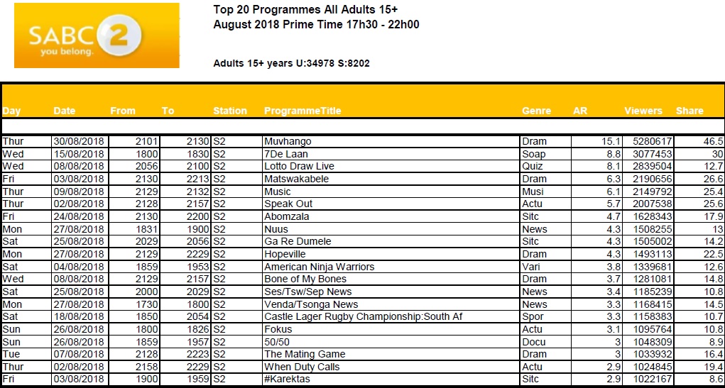
In 2016, the Broadcast Research Council of South Africa (BRCSA) changed its policy about giving away TAMS and now only monthly reports, highlighting the top 20 or 30 primetime shows on several popular channels, are available.
The Broadcast Research Council of South Africa (the BRC) is a non-profit, industry body that was incorporated in 2015 to cater to the audience research needs of the radio and television industry in South Africa.
by Sabrina Forbes. By definition, a grid is a network of wires by which sources of power are distributed, and Grid Worldwide does just that through its unique, design-led work.
“We cannot become what we want by remaining what we are” —Max DePree
The way Grid does business has shifted to keep up with global trends in the industry. Leading up to April 2018, the leadership at Grid relooked at its existing service offering, which purely focused on design, and began the evolution of building Grid into a 21st century ideas agency. It knew that, even though this level of change was daunting, it had to be done to survive: at the end of 2016, it’d noticed a global shift. Clients wanted things done better and faster but were coming to the table with much-smaller budgets. The Grid team looked at how it could become more agile and leverage its position in this new shift.
The plan is to remain a design-led organisation but evolve the offering into an integrated thinking model. This model has two arms: first, a real-time strategy model that offers real-time insights and cultural relevance by looking at what’s going on around the world and allowing that to shape the work; and secondly, an integrated creative model that uses specialist creative disciplines to solve big problems.
It has also brought in staff to fulfill previously unknown roles. For example, in April 2017 the agency hired its first insights disruption brand manager, from the TBWA group. This person worked with the Africa disruption team who helped build the insights unit. The outcome of such a role is, ultimately, to give a real-time strategy model that allows for playing in culture.
According to Adam Byars, joint CEO and partner, the traditional design model goes through three main steps: strategy, design, and execution. Although limiting, Grid used to follow this model for a long time. For Byars, design is no longer about just a new logo. You need to give meaning to brands and ask yourself constantly how you bring that positioning to life. As an example, for FNB, it wanted to know how “How Can We Help You?” would affect the entire organisation, and the work it does for this client keeps that at the core of its strategies.
https://youtu.be/X1ImJutdCWc
Masego Motsogi, who became managing director in January 2018, reiterates and builds on this, saying that design is a part of everything that Grid does while, at the same time, recognising that it’s in a fast-changing world. She mentions the rebrand the agency recently did for Telkom; core to this was the new logo with a subtle top-left plus sign that speaks to the variety of additional services the telco offers consumers.
How the logo is core to the brand came to light at the recent ITU Telecom World 2018 conference and exhibition, held in Durban mid-September. The strategy behind Telkom’s exhibition stall focused on experiential, rather than branding, elements. The logo formed the basis of the design, taking a typically rudimentary exhibition stand to new levels, especially considering the elite audience who was attending. A main feature was a room where, through augmented reality, visitors were given an opportunity to learn more about Telkom’s auxiliary products such as Business Connexion and OpenServe.
“If it doesn’t add value, it’s waste” —Henry Ford
Unlike most agencies in South Africa, Grid doesn’t service any retainer business and focuses solely on project-based work. Byars feels that retainers can breed mediocrity and complacency on both client and agency side, and Motsogi believes that being a value-based agency allows Grid to prove the value of its work through an evidence-based environment. Every project needs to be treated with the utmost respect and attention from everyone at Grid, because it’s that project that will lead to the next one, and the next one. This keeps the entire company hungry and consistently on the hunt.
Motsogi shared that Grid wants to be considered as more of a consultancy than an agency, and that its 2–3 year immediate plan is to become one of the best ideation companies in the world that’s proudly South Africa. To do this, and particularly because it’s a challenger brand itself which has taken big risks to get where it is, its client base needs to mirror this. Both agree that not everyone in life is going to like you, but that’s ok. For many, Grid is seen as too brave, too unorthodox. “We want to work with brands that make a difference and are meaningful players who are brave enough to catapult themselves into the 21st Century,” says Byars.
A case in point is the Michelin rebrand that Grid headed up, working in collaboration with the New York and Paris teams of lead agency, TBWA. The question that led the strategy was: “How do you give relevance to the Michelin Man in today’s world?” Bibendum, his real name and one of the world’s oldest trademarks, is also one of the most-valued and -easily identified characters on the planet. But what do Michelin tyres themselves stand for? Driving mobility and ensuring journey safety from A to B come to mind. The design work done for this project puts the focus on the journey with Michelin, using Bibendum in clever ways. You see just his arm, and you know it’s him and why he’s there.
Other work worth noting is what Grid has done with Qatar Tourism. Byars lives in Qatar and is available locally for the client. Hamad International Airport is the one of the most-connected airports in the world and the team at Grid believe so much in Qatar as a country, it’s there every step of the way in preparing it for the FIFA World Cup 2022.
“Great things in business are never done by one person. They’re done by a team of people” —Steve Jobs
Following a recent complaint by designer, Ndumiso Nyoni, that he wasn’t credited for his contribution to MTN illustration work which was entered into the 2018 Loeries, Grid committed to adding credits to award entries for freelancers going forward. Byars and his team are disappointed and concerned that this happened, and believe that any contribution should be credited, with the lead agencies holding the responsibility of the respective freelancers’ complete understanding of their role in the contribution and their access to the work’s IP. By having clearer parameters and stricter crediting measures, this issue should be a thing of the past.
Motsogi’s input is that the industry needs to change the way it works with freelancers, especially as the gig economy is growing exponentially. The last thing anyone at Grid wants to do is shortchange someone for work done.
“As is the king, so are the subjects” —proverb
Established in 2006, Grid is a ‘young’ agency with an average employee age of 26. Its staff come from very different backgrounds and are at the point in their life where marriage, children, and settling into life are becoming a priority. To match this well with work and its own set of demands, the agency focuses heavily on the culture it creates. It knows and appreciate that its staff members have a life outside work.
G in Culture
For Motsogi, the agency is small enough to build and manage the desired culture. It comes from the top: Nathan Reddy, founder and chief creative officer, and the rest of the leadership team are still involved in the everyday aspects of the business, but know when to step back and let the team be free. For Byars, G in Culture is an expression of how it positions itself in the world and how its clients’ brands form an expression of this.
Grid nurtures staff talent and understands how important succession is, with leadership aware that they’re molding the next generation of leaders. The entrepreneurial energy of the agency, with a focus on self-development and growth, has meant that many employees have gone on to start their own companies.
Updated at 12.56am on 10 October and 9.26am on 8 October 2018.
Sabrina Forbes (IG) is an experienced and published writer covering the food, health, lifestyle, beverage, marketing and media industries. She runs her own full-stack web/app development and digital-first content creation company. For more, go to moonwrench.com. She is a contributing writer to MarkLives.com.
“#AgencyFocus” is an ongoing weekly series updating the market on ad agency performance, including business performance, innovation, initiatives, the work, awards and people.

 Marguerite Coetzee is an anthropologist at strategic marketing consultancy, Kantar Consulting. FastForward, the latest series in her regular column on MarkLives, takes an intellectual, scientific and artistic approach to the future – particularly the future of Africa.