

Shane de Lange (@shanenilfunct)’s weekly analysis of media design from South Africa and around the world:
- Online: EDGAR defines the ‘new’ man in the Middle East
- Independent print: Fukt makes an important point about words in relation to consciousness, in a world dictated by anti-intellectualism and the overconsumption of culture
- Commercial print: TIME and Cosmopolitan India, albeit overlooked, make important statements about the current metanarrative of our zeitgeist
- Iconic: Wall Sheet Journal was perhaps one of the earliest lucky-packet-like avant-garde magazines, showcasing surprisingly important exponents of the late 20th century
Find a cover we should know about? Tweet us at @Marklives and @shanenilfunct.
 Want to view all the covers at a glance? See our Pinterest board!
 TIME (US), 2017–2018, and Cosmopolitan (India), March 2018
As the year nears an end, a few covers have clearly slipped through the cracks. On this occasion, two magazines, TIME and Cosmopolitan, need a special mention.
 The first is TIME’s ‘stormy’ Trump cover(s), which this week won Adweek’s Cover of the Year award. This series of three covers portrays US president Donald Trump in a hurricane-like scenario. The first cover was published in February 2017, wryly stating, “nothing to see here”, with a storm in full-swing happening inside the Oval Office. The second was released in February 2018, depicting Trump in the same pose and space but finding himself in the midst of a storm surge, complemented by one word, “Stormy”. The ambiguity of these first two covers are timely, because both Trump’s supporters and dissenters could draw different interpretations from them.
 The latest cover, however, has only negative connotations linked to this current North American president. Published in September 2018, the cover presents Trump neck-deep, barely keeping his head above water, with the Oval Office completely flooded. No matter which angle one sees it from, these covers represent the perceived chaos stemming from the White House at present. The reference to Stormy Daniels here is a clever footnote. These covers were also animated for Facebook, Instagram and Twitter, presenting the storm progressing, the water gradually rising and Trump progressively drowning. A subtle example of a good concept iterated across different channels, where print and digital marry happily.
The second cover, from Cosmopolitan India and published in March 2018, builds upon, more so evolves upon, the other Cosmopolitan cover featured this year, which showcases the infamous humanoid robot, Sophia. One must admit: it’s out there to feature the world’s most-advanced humanoid robot on a cover to Cosmopolitan magazine, no matter how poor the cover design may be or which Cosmopolitan it is.
Independent
Fukt (Germany), issue 17, October 2018
 Issue #17 of Fukt Magazine is themed “The Words Issue”, comprising various ‘written drawings’ reminiscent of local conceptual artist, Willem Boshoff, and his language-based art, which arguably riffs off the work of American conceptual artist, John Baldessari. This cover overshadows some others that seem to be overly dependent on gimmicky uses for QR codes which attempt to take advantage of shallow strategic insights, supposedly implementing ‘innovation’ and ‘disruption’, alongside superficial experiential and interactive elements. In fact, these cheap tricks do nothing more than simply obscure magazine covers, and miss the point entirely.
A proper cover, this issue of Fukt is Designed (with a capital “D”) by Ariane Spanier, and hails back to the concrete poetry of Stéphane Mallarmé and Guillaume Apolinaire. The entire magazine is a festival of words and the cover literally comes alive, thanks to augmented reality (AR) technology. The point here? Words can be a drawing platform. This is an extremely relevant approach, given that words are increasingly losing meaning, or rather meaningfulness, in a world deprived of a consciousness, lacking any real movement, brought about by increased anti-intellectualism and the blind overconsumption of culture.
Now, more than ever, the appreciation of well-written, meaning-filled words is needed. This issue certainly supports this message with some heavy-hitters, including Ed Ruscha’s word drawings, and Sol LeWitt’s notorious instructions on how to properly execute his drawings. Other important contributors include designer Paula Scher, artist Roni Horn, and poet Henri Chopin, among many, many others.
Online
EDGAR (Dubai, UAE), issue 69, October 2018
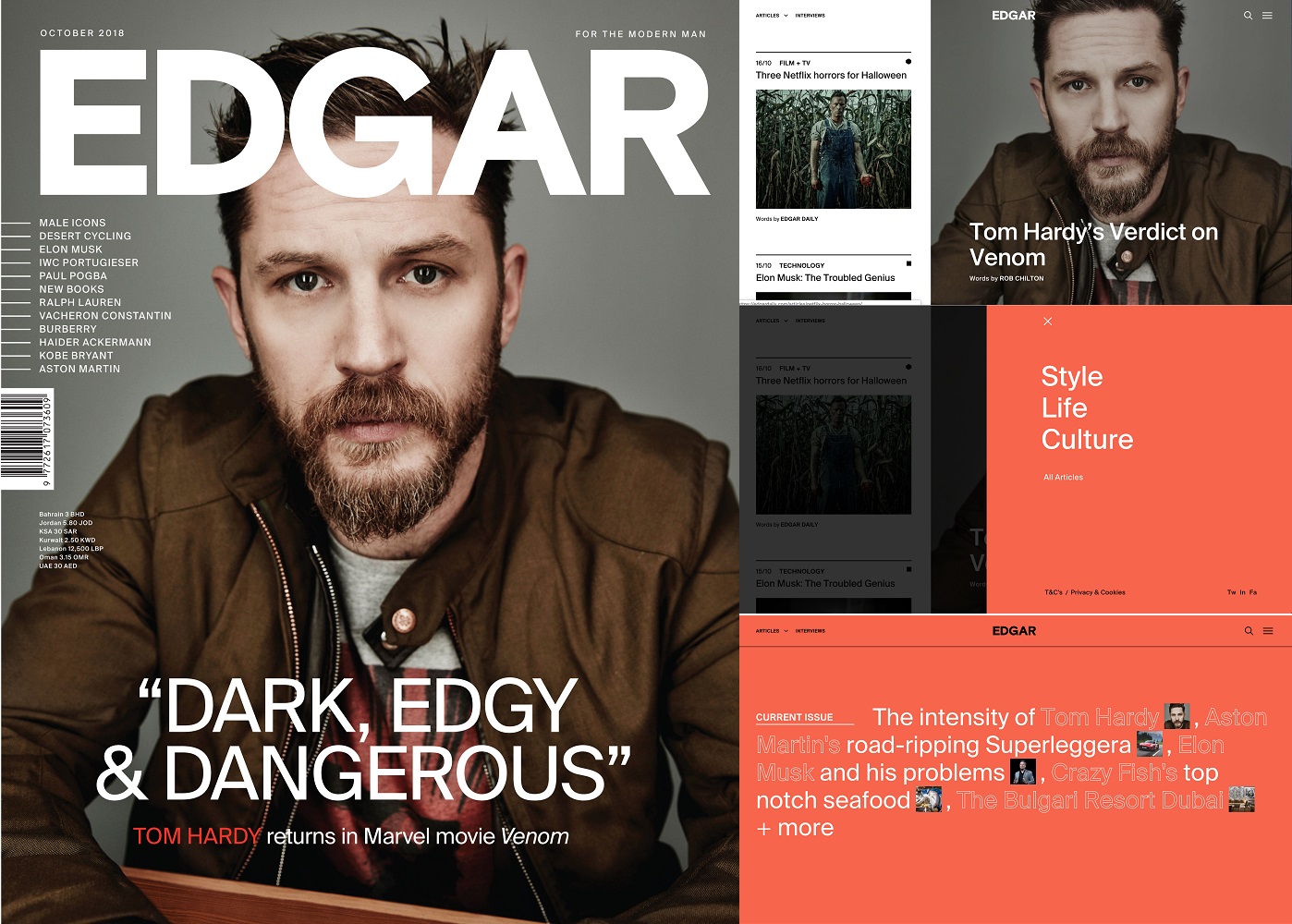 In a feminine zeitgeist, what are the traits of a ‘modern man’? Especially a cosmopolitan, affluent, urban man from the Middle East? EDGAR is an online and print magazine that focuses on luxury men’s lifestyle in the Middle East. It makes a concerted effort to portray this ‘new’ kind of man, one who seeks sophisticated content that doesn’t fall into stereotypical traps that other men’s magazines often fall into.
Published monthly, EDGAR tells modern stories about fashion, cars, devices, food and travel. The synergy between the print and online versions is very strong. The website is particularly well-designed, with a tasteful and considered understanding of typography, layout and design across the board. Great art direction, functional yet dynamic grid usage, and accessible content are all incredibly pleasing and noteworthy elements to this site.
Iconic
The Wall Sheet Journal (UK), issue 4, 1969
 While covering McSweeney’s magazine and looking further back in time to South Africa’s own MK Bruce Lee during last week’s column, a point was made about peculiar print formats, particularly lucky-packet-like packaging for publications. Looking even further back in history, this week we focus on The Wallsheet Journal, which was essentially an assortment of posters placed in a transparent plastic bag and stapled closed, with a folded piece of cardboard that held the masthead.
This limited-edition publication was a final student project edited, designed, and published by Pearce Marchbank while he was studying at the Central School of Art and Design (it’s worth noting here that other alumni of this school include John Berger, Eric Gill, and Bill Moggridge, to name a few).
Marchbank started his career designing covers for iconic magazines such as Friends, Oz and Time Out, and he was an important exponent of the British underground press, thanks in part to the notoriety achieved by The Wallsheet Journal. A closet modernist, he would become co-editor and art director of Oz for three issues because the magazine’s founders — Richard Neville, Richard Walsh, and Martin Sharp — were placed in jail due to their historic obscenity trial. Marchbank referred to The Wall Sheet Journal as a “magazine of multiples”, and the publication had surprisingly important contributions from various designers, musicians, artists and writers, including Pink Floyd’s Nick Mason, Monty Python’s Terry Jones, designer Richard Hollis, and typographer Alan Kitching, among others.
References
- pinpointmediagroup.com/wp-content/uploads/2017/12/EDGAR-Media-Kit.pdf
- madebysix.com/projects/edgar
- edgardaily.com
- time.com
- adweek.com/digital/qa-times-creative-director-on-designing-covers-for-the-news-cycle
- twitter.com/hansonrobotics/status/977908231715610633
- pearcemarchbank.com/Magazines/thewallsheetjour.html
- instagram.com/p/Bo7RP3Bh45Q/?hl=en&taken-by=fukt_magazine
- fuktmagazine.com/#/fukt-17
- arianespanier.com
- baldessari.org
 Shane de Lange (@shanenilfunct) is a designer, writer, and educator currently based in Cape Town, South Africa, working in the fields of communication design and digital media. He works from Gilgamesh, a small design studio, and is a senior lecturer in graphic design at Vega School in Cape Town. Connect on Pinterest and Instagram.
Media Design, formerly Cover Stories and MagLove, is a regular slot deconstructing media cover design, both past and present.
— One subscription form, three newsletters: sign up now for the MarkLives newsletter, including Ramify headlines; The Interlocker, our new monthly comms-focused mailer; and Brands & Branding, launching soon!