

by Oresti Patricios (@orestaki) In a print and poster series that targets the youth market, Joe Public scores a sure-fire hit with a funky, funny campaign for Steers: “Ridiculously Thick Milkshake”.

“What makes a great milkshake?” The answer to that perennial conundrum comes in two parts. The first is taste. Great milkshakes taste good; we all know that. But what most fast=food restaurants don’t seem to get is that the best milkshakes — the kind that brings all the people to your yard — are thick. Really, really thick.
Brands need to continue reinventing themselves
Fast-food brands need to continue reinventing themselves to stay fresh in the minds of their target market. And part of this is to offer a new twist on tried-and-trusted products. The kind of products that everyone wants all the time. There are only so many ways you can dress up a burger and fries, before your target audience starts suffering from a form of ‘brand fatigue’. Besides, Steers has solidly positioned itself as South Africa’s “leading burger brand”, the home of burgers that are flame-grilled to perfection.
- View all the Ads of the Week at a glance on our #AdoftheWeek Pinterest board!
The next territory to own is what everyone loves to drink with their burgers. The milkshake. And that’s shaky territory because I’ve had quite a few thin milkshakes in my time, and shudder at the very thought of those memories. Now that Steer’s has nailed the burger, what Joe Public has smartly decided it must do is own milkshake territory. Or, to be specific, the double-thick milkshake, because who doesn’t enjoy a drink that is made from almost-frozen ice cream? One that you need an extra-thick straw for, and that promises you brain-freeze if you slurp it down too fast.
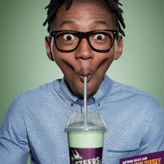
This brings us to the poster/print ad, which is, simply, a series of portraits. Yet what is eye-catching about these is the way the photos have been altered. These milkshakes are so thick they almost cause the faces to implode. The models are sucking so hard that their cheeks and mouths have shrunk down something silly — and the effect is funny and on point.
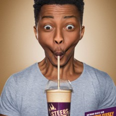
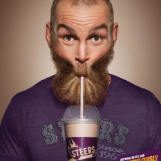
Your eye is initially caught by the models’ eyes: they engage directly with the camera, and we all know that humans will normally respond to eyes instinctively. The humour is created when your eye moves down to the mouth, and the distortion becomes apparent. Look further and you see how each one is really straining to suck the milkshake up the straw.
Ridiculous shapes and expressions
There are smartphone apps that do similar things to distort faces (although in a more rudimentary way), morphing people into ridiculous shapes and expressions. Snapchat has ‘lenses’ that allow you to turn your silly picture into something weird, like a zombie, or make rainbow ‘puke’ come out of your mouth… I know, I know, but it’s what the kids are doing these days. (I have to confess to having had fun in the early days of the Mac, with an app called ‘Kai’s Power Goo’ — or was it a Photoshop plugin?)
Getting back to the poster campaign, featured are the three main characters from the current Steers sitcom-inspired TV campaign, Tshepo, Matt and Sbu— young, ‘preppy’ and no doubt exactly the segment that Steers is targeting — as well as Soldier Boy, a balding guy with a beard and tattoos perhaps meant to appeal to the slightly older generation. My only complaint is there are no women.
The backdrops to the photos match the colours of the milkshakes, and the branding is subtle: just a little indigo-violet tab with the payoff line, “Nothing beats our ridiculously thick milkshake.” The only Steers branding is on the milkshake cup itself.
Joe Public has smartly positioned Steer’s as the place to go, not only for burgers, but also for the best milkshake… and looking at these posters makes me want to run down to my nearest Steer’s to try one out. Make mine chocolate, please!
Credits
Advertising agency: Joe Public, Johannesburg, South Africa
Account management: Kelly Bardon, Francois van Deventer
Agency producer: Tammy Chetty
Chief creative officer: Pepe Marais
Executive creative director: Adam Weber
Creative directors: Archie Malinga, Gert Laubscher
Art director: Tshepo Mogorosi
Retoucher: Simon Keeling
Photographer: Clive Stewart
Published: 2015
 Ad of the Week, published on MarkLives every Wednesday, is penned by Oresti Patricios (@orestaki), the CEO of Ornico, a Brand Intelligence® firm that focuses on media, reputation and brand research. If you are involved in making advertising that is smart, funny and/or engaging, please let Oresti know about it at info@ornicogroup.co.za.
— MarkLives’ round-up of top ad and media industry news and opinion in your mailbox every Monday and Thursday. Sign up here!