

by Shane de Lange (@shanenilfunct) Let’s delve into great media design from South Africa and around the world:
- Local/print: BitterKomix defined a vernacular in the South African creative industry
- Local/print: Financial Mail pieces together 36 frames detailing the rise and fall of Africa’s most-infamous dictator
- Online: Hopes&Fears continues the cause, creating evermore relevant discourse around various forms of art and design
- International/print: Icon proves how modernism and 20th century avant-garde tendencies remain influential today
- Iconic: RAW revived the notion of comics made for adult readers, and reformed a dwindling underground scene
- International/print: Wired and The New Yorker portray the forth industrial revolution as burgeoning and immediate.
Find a cover we should know about? Tweet us at @Marklives and @shanenilfunct.
 Want to view all the covers at a glance? See our Pinterest board!
Financial Mail (South Africa), 23–29 November 2017

So, it is set in stone, Robert Mugabe’s autocratic reign in Zimbabwe is over. With the inauguration of Zimbabwe’s new interim president, Emmerson Mnangagwa, Mugabe’s legacy has come to an abrupt, albeit belated, end. And he has undoubtedly left a legacy, one that the Financial Mail effectively portrays on the cover of this issue. The work of Zimbabwean artist, Michael Mathison, adorns it, using 36 images of Mugabe, one from every year that he was president. The opening image is a 2Z$ from 1980 and the closing one is a 2Z$ bond from 2017, illustrating on one page how one man may uplift and bankrupt a country. Despite this, the future looks bright for Zimbabwe, with increased openness to the outside world.
Wired (US), November & December 2017
The New Yorker (US), 23 October & 20 November 2017
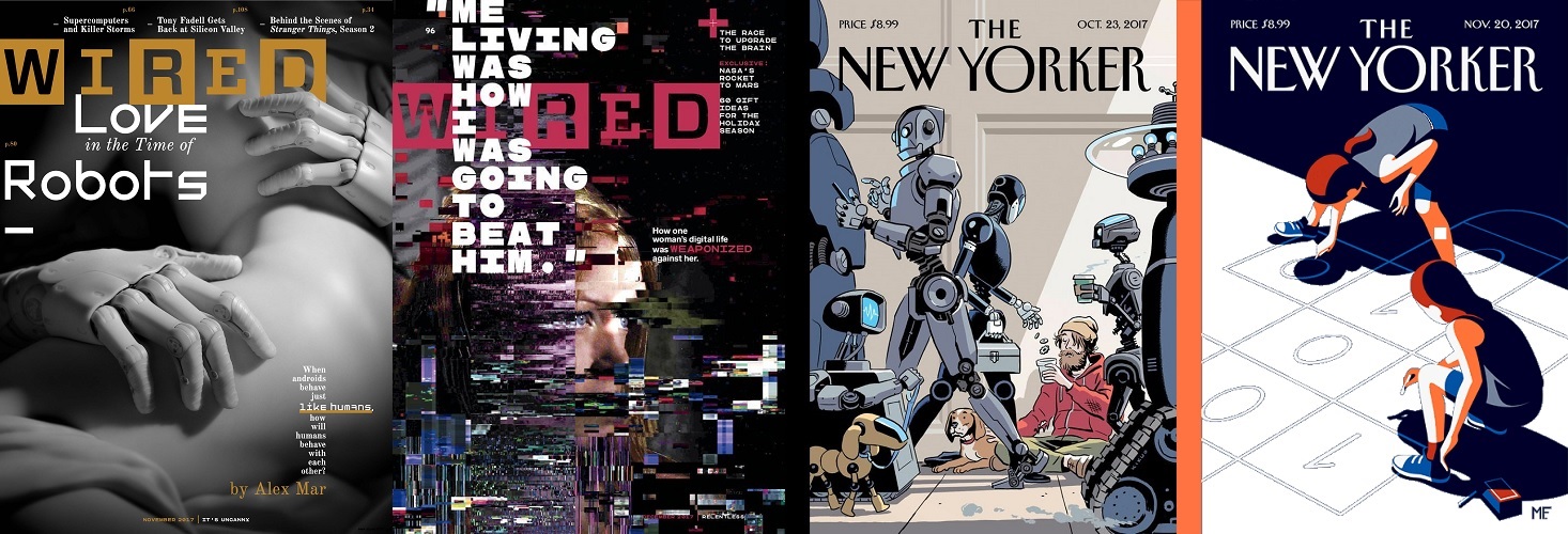
The fourth industrial revolution has been upon us for a while now, with an array of new technologies that are terminally altering the way we, as human beings, function and continue to evolve. It seems inevitable:,the fusion of the physical, digital and biological, affecting all facets of human existence — economic, social, political, environmental, biological, et al. The effects of existing and emerging technologies, such as the internet of things, autonomous transportation, 3D printing, quantum computing, nanotechnology, robotics and artificial intelligence, support the growth of a new revolution; one that could pave the way for the various narratives brought forward in the various covers issued by Wired and The New Yorker alike over the past few weeks.
Aside from Wired’s “love in a time of robots” and glitch identity covers, of particular interest is Malika Favre’s illustration for the 30 November 2017 edition of The New Yorker (the tech issue), titled “Coding 101”, which observes the future in a positive light, speaking about women who find themselves in a tech-centered profession, mostly dominated by men. The message here is that a solution may be found in education from a young age for both girls and boys, using games that children play in order to do away with the stereotype that only men can be in the technology industry.
Kikuo Johnson’s “Tech Support” illustration for the 23 October 2017 cover of The New Yorker (the money issue), is also pretty insightful, depicting a world dominated by robots. A human being sits begging, with his pet dog by his side, suggesting that the artist is not too phased by the prospect of machines replacing him. After all, one does not get into a creative field such as illustration for job security.
Bitterkomix (SA), annual #17, 2016

The most-recent incarnation of the legendary Bitterkomix canon is its 17th annual. Co-edited by established South African artists, Conrad Botes and Anton Kannemeyer, this annual is a tribute to renowned anarchist publisher, writer, artist and graphic designer, Tienie du Plessis (1949–2015). Du Plessis published the Bitterkomix duo’s first comic, called “Case no. 308”, in STET magazine. Aside from it being an ode to an historic SA publisher, this issue features the work of other key artistic talents from SA, including Gerhard Human, Joe Daly (The Red Monkey), Karlien de Villiers, and Kannemeyer’s own alter-ego, Joe Dog, to name a few. The cover, illustrated by Kannemeyer, is noteworthy as it illustrates the still-pressing topic of education in SA, related to the events that occurred during the #feesmustfall protests. It portrays student protesters celebrating while burning artworks taken from the hallowed halls of their university campus. All the while, Bitterkomix provides a satirical, almost macabre, critique of a predominantly conservative Afrikaner mainstream culture.
Icon (UK), #175, January 2018
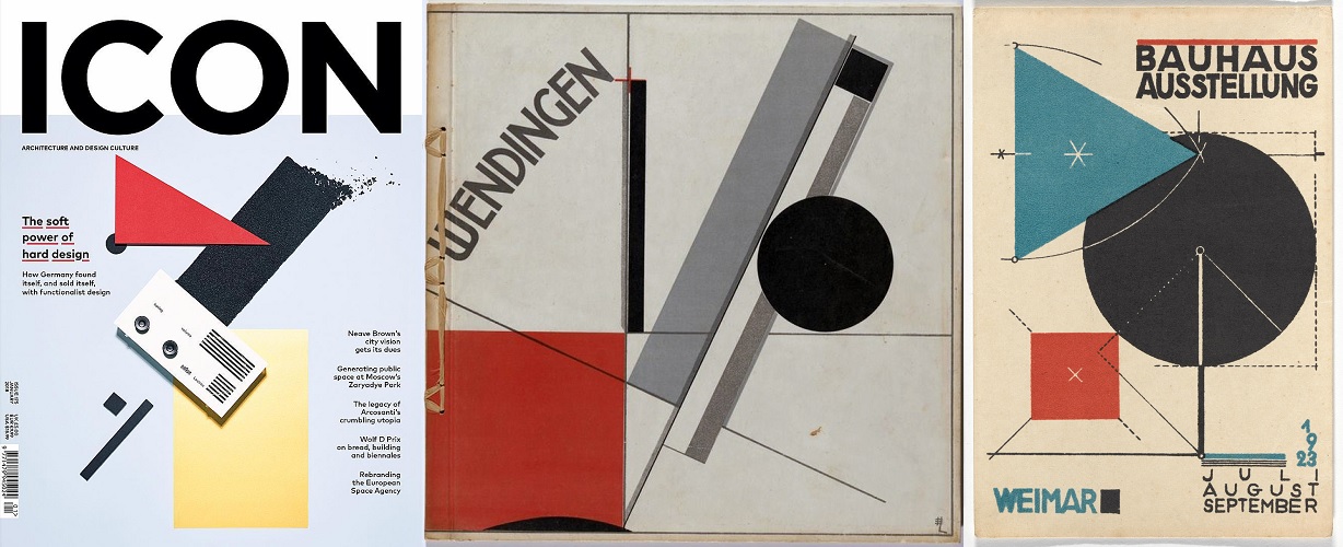
The forthcoming issue, #175, of Icon magazine continues to hint at the renewed interest within the global creative community in modernism, particularly the early-to-mid 20th century avant-garde designers. Themed, “The soft power of German design”, one is immediately drawn to post-World War II names such as Dieter Rams and his iconic designs for Braun (displayed on the cover), but not forgetting the pre-war legacy of the Bauhaus; all of this is neatly illustrated on this cover — an ode to formalism, abstraction and, to a certain extent, minimalism.
The cover is the result of a collaboration between Carlo Apostoli (art direction), Felicity McCabe (photography, and Morewnna Smith (graphic design). In keeping with the German design theme, the cover has a slight resemblance to the work of Herbert Bayer, who was at one time a student of the Bauhaus but later became the director of the printing and advertising workshop at the school’s Dessau campus, 1925–1928. Despite the clear connections to German design, the cover is more reminiscent of Dutch and Russian avant-garde tendencies, specifically the work of El Lissitsky, illustrated here with his cover design for the Dutch magazine, Wendingen, meaning upheaval (which was the first of eight Frank Lloyd Wright issues). Appropriation, intertextuality, and iteration at their best.
Online
Hopes&Fears (US), November/December 2017

Two important mechanisms in the creation of discourse are arguably relevant critique and critical thinking. And, if certain values could be attached to the process of being critical, hope and fear would be under the proverbial microscope. So, it seems apt that an online critical thinking magazine has called itself Hopes&Fears. As an online publication, it offers commentary on various cultural elements while remaining visually oriented and always keeping design in mind. The site is really well-structured and provides an unobtrusive experience, supported by functioning typeface combinations and well-curated visuals, especially when it comes to illustration. With some layered discourse to boot.
Iconic
RAW (US), various (#1, #3, #6 and #8 featured), 1980–1991
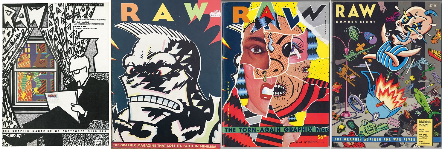
RAW was an influential collection of comics edited by Art Spiegelman and his wife, Françoise Mouly (currently the art editor of The New Yorker). Published between 1980 and 1991 and spanning two volumes, RAW was more-intellectually poised, as opposed to most other comics anthologies of the time.Hence it was an important entry point for European comics into the US, placing the publication at the forefront of alternative comic-book production during the ’80s.
Fearing that comics for adults could disappear, alongside the gradual decline of the underground scene, RAW took inspiration from independent punk and new wave publications, which tended to be very subversive and expressive. Veering slightly from their underground influences, Mouly and Spiegelman decided upon a large-scale, more-sophisticated format with the tagline “graphix magazine”, hoping to attract more adult readers into the comics fray.
Perhaps the most-notable comic to be showcased in RAW was Spiegelman’s “Maus”, which won a Pulitzer Prize in 1992 — the first graphic novel to do so. Recurring as individual chapters, Maus originally featured as a mini-comic placed inside each issue of RAW. Eventually, RAW shrank to mirror Maus’ size and format, culminating in the last three issues published as digests. After 11 issues, spanning two volumes, RAW ended production in 1991.
 Shane de Lange (@shanenilfunct) is a designer, writer, and educator currently based in Cape Town, South Africa, working in the fields of communication design and digital media. He works from Gilgamesh, a small design studio, and is a senior lecturer in graphic design at Vega School in Cape Town. Connect on Pinterest and Instagram.
Cover Stories, formerly MagLove, is a regular slot deconstructing media cover design, both past and present.
— Sign up now for the MarkLives email newsletter every Monday and Thursday, now including headlines from the Ramify.biz company newsroom service!