

by Oresti Patricios (@orestaki) In the late ’90s, when Steve Jobs returned to Apple, the company he co-founded and was unceremoniously booted from, the company was in trouble. Looking to rebrand and reinvigorate the company, Jobs went looking for a new agency. TBWA/Chiat/Day won the account, based on a pitch that included the now-famous “Think Different” slogan.
The TV version of this campaign included a monologue, delivered by Richard Dreyfuss, that began: “Here’s to the crazy ones. The misfits. The rebels. The troublemakers. The round pegs in the square holes.” It’s a celebration of the types of genius who go against the grain and innovate against all odds. The imagery that the campaign used included people such as Albert Einstein, Pablo Picasso, Mahatma Gandhi, Jim Henson and Jane Goodall.
- Want to view all the Ads of the Week at a glance? See our #AdoftheWeek Pinterest board!
Halo Advertising print campaign for Commercial Bank of Africa: “Be more”
The spirit of this campaign is echoed somewhat in the latest campaign for the Commercial Bank of Africa, with the simple tagline of “Be more.”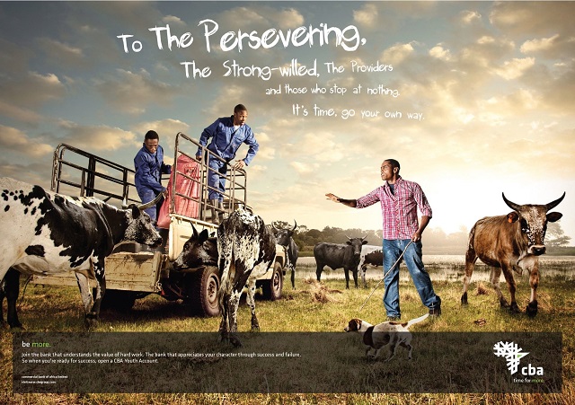
Lest you think I’m accusing the creators of the campaign of plagiarism, let’s be clear: even though it seems to pay homage to the Apple campaign, I can’t say for sure this was its inspiration. Although just about anyone in advertising has seen the seminal Apple campaign, there’s no reason a similar emotion shouldn’t be evoked in a different context. The treatment and copy are unique — and distinctly African — and I think it’s a really great print campaign.
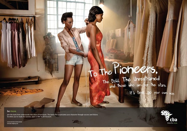
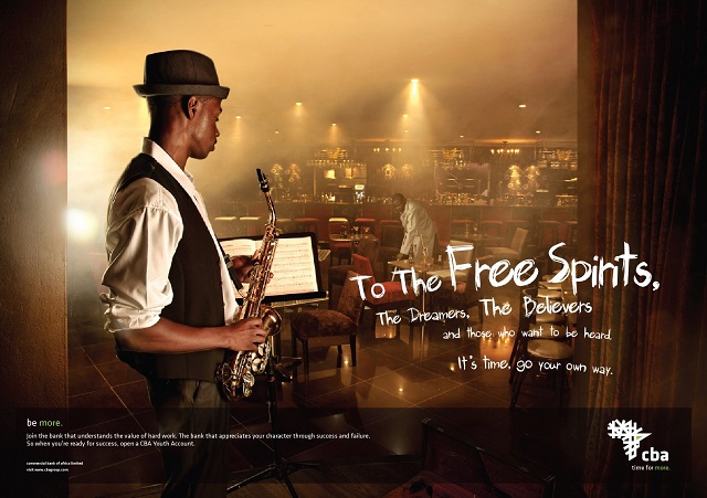
In a series of eight print ads, Halo Advertising provides salutations to different entrepreneurial archetypes: “To the Meticulous”; “To the Free Spirits”; “To the Fiery”; “To the Persevering”; and so on. Each ad is photographed by Huw Morris, in a brilliant style that is glossy and intensely colourful… almost surreal. Light seems to pour out of the pictures, much like a Vermeer painting. Each element is carefully placed in a tableau — it feels as if nothing has been left to chance, yet each composition is dynamic and interesting.
 For example, in ‘Persevering’, the scene is of a young farmer directing his farmhands. The blue-overalled workers are busy with a feedbag on the back of a typical rusted bakkie, and the scene is surrounded by the unique Nguni cattle. The location is a riverbank, and the sun is low in the sky; it feels more like early morning than evening.
The copy reads: ‘To the Persevering, the strong-willed, the providers and those who stop at nothing. It’s time. Go your own way.’ This is in a scratchy, distressed, handwritten font that is modern and bold. Not the Helvetica Neue you would expect of a conservative bank.
 The bottom copy, which is common to all the ads, reveals the call to action: “Join the bank that understands the value of hard work. The bank that appreciates your character through success and failure. So when you’re ready for success, open a CBA Youth Account.”
Targeting young entrepreneurs in Africa seems to make sense: in banking, people tend to stay with their bank unless they have a really strong cause for complaint.
 CBA is active in Uganda, Kenya and Tanzania. The bank was started in Dar es Salaam in 1962 by a Swiss-based consortium that included Bank of America, Commerzbank, Bank Bruxelles Lambert and Banque National de Paris. In the ’80s, Bank of America took over all the shares, and then sold its majority shares to local investors; eventually it sold all its shares to local investors in the three territories, making it one of the largest privately owned banks in East Africa.
Getting back to the ads — each one features an entrepreneurial role model: a farmer, a (female) boxer, a dress designer, a country vet, a car-restorer, a musician. While none is an absolute archetype, they all embody the spirit of entrepreneurship: determination, courage, passion, self-motivation and perseverance. Each character study is unique, which appeals to the unique sense of self every entrepreneur must have to succeed.
 The campaign is powerful, eye-catching and modern, from the imagery to the fonts to the copy. I think it works well, and is bound to hit the spot with its target market.
Credits
Advertising agency: Halo Advertising, Johannesburg, South Africa
Creative director: Greg Harrison
Copywriter: Clayton Bond
Photographer: Huw Morris
Retoucher: Paul Vermeulen
 Ad of the Week, published on MarkLives every Wednesday, is penned by Oresti Patricios (@orestaki), the CEO of Ornico, a Brand Intelligence® firm that focuses on media, reputation and brand research.
If you are involved in making advertising that is smart, funny and/or engaging,
please let Oresti know about it at info@ornicogroup.co.za.
— MarkLives’ round-up of top ad and media industry news and opinion in your mailbox every Monday and Thursday. Sign up here!